Elevated Product Experience
Paper Bags Revamp
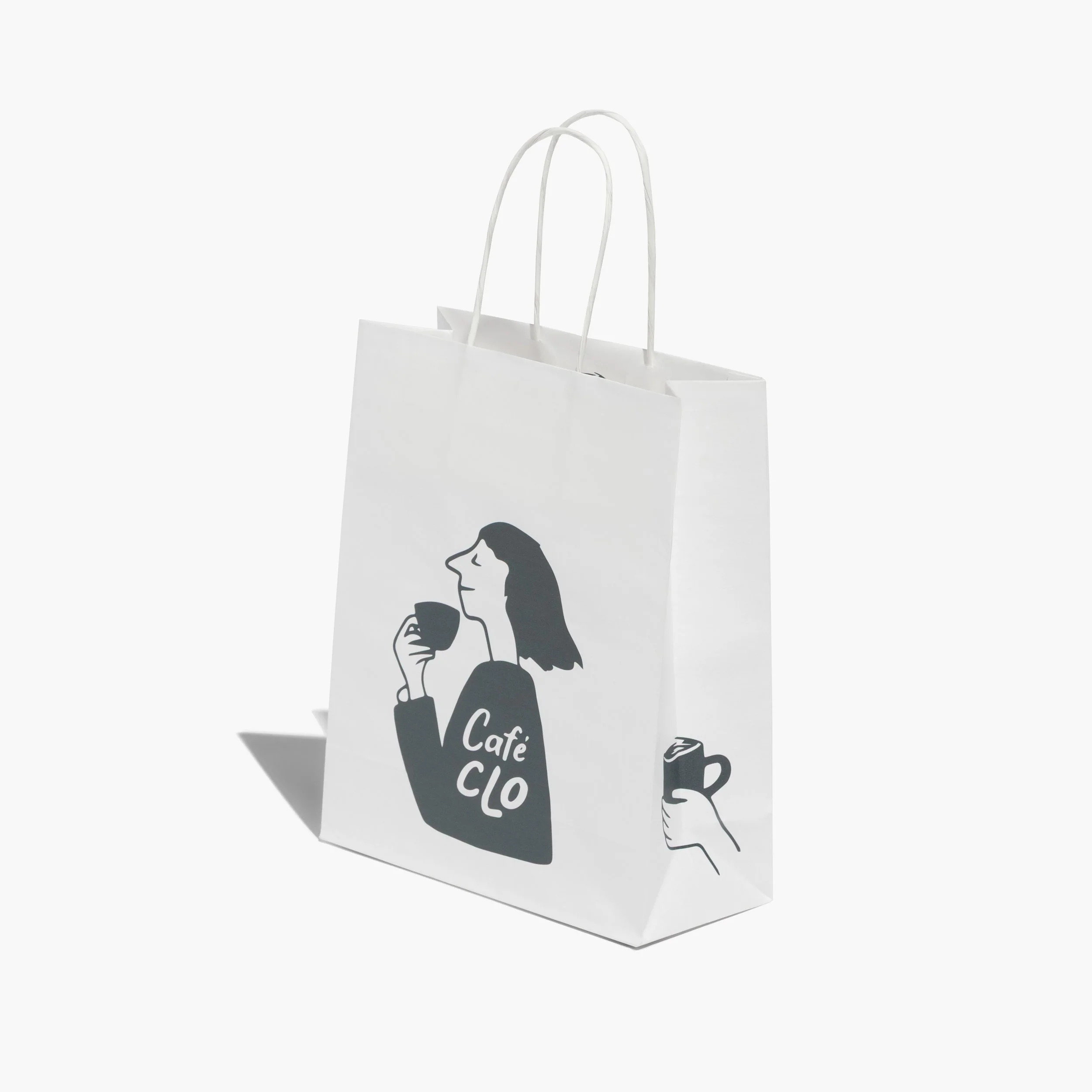
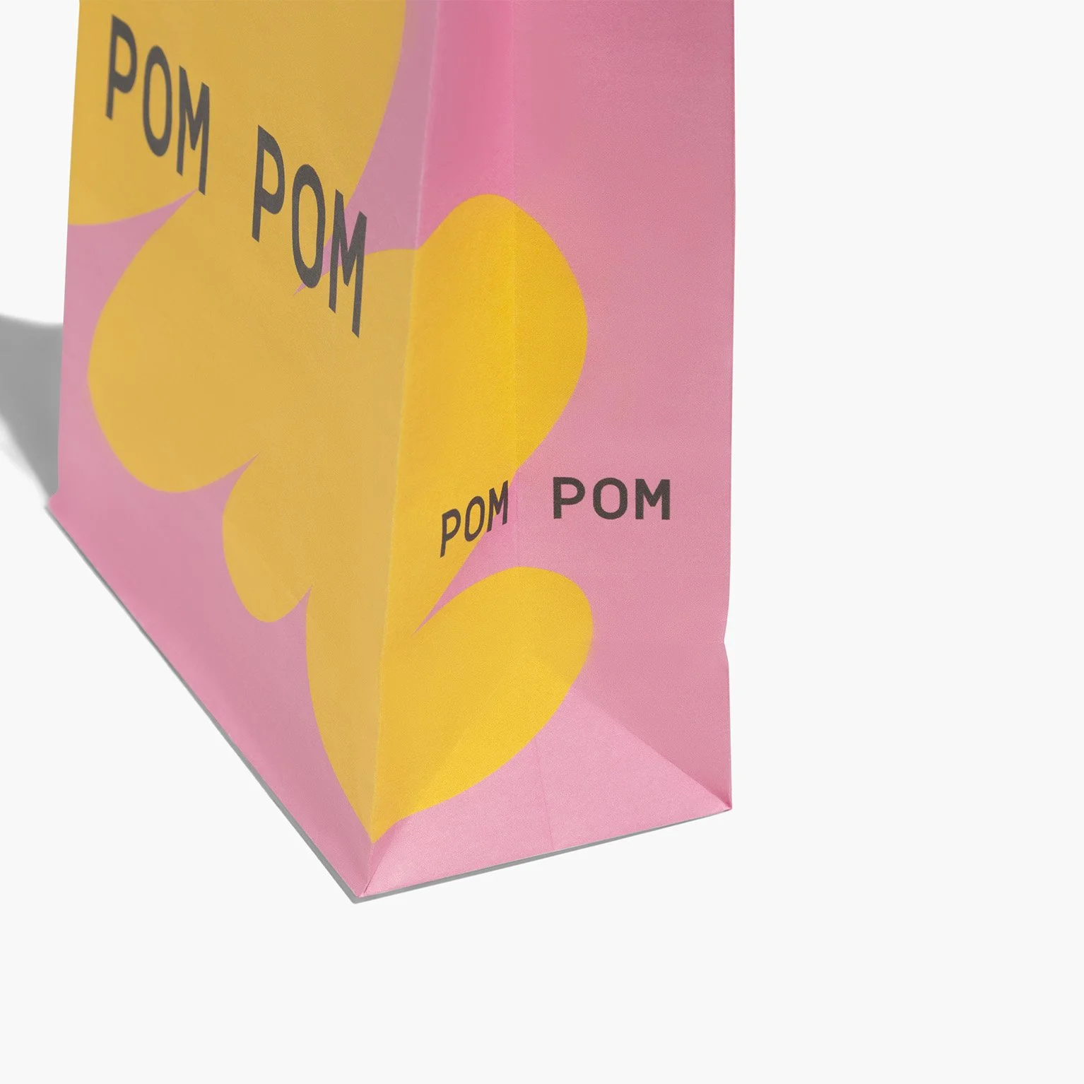
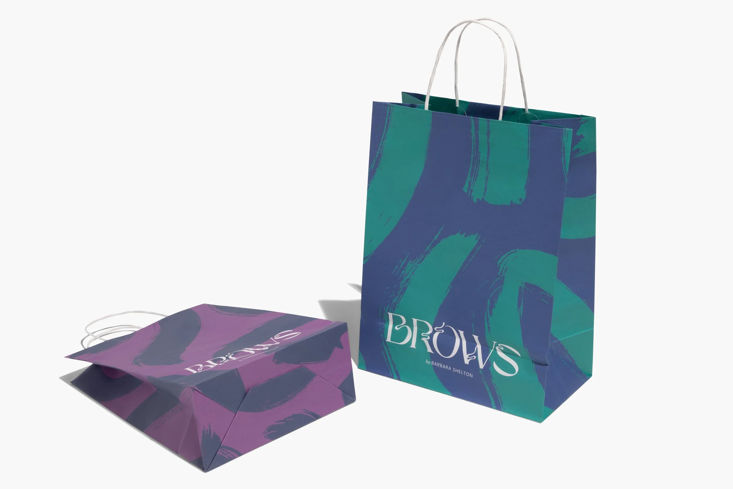
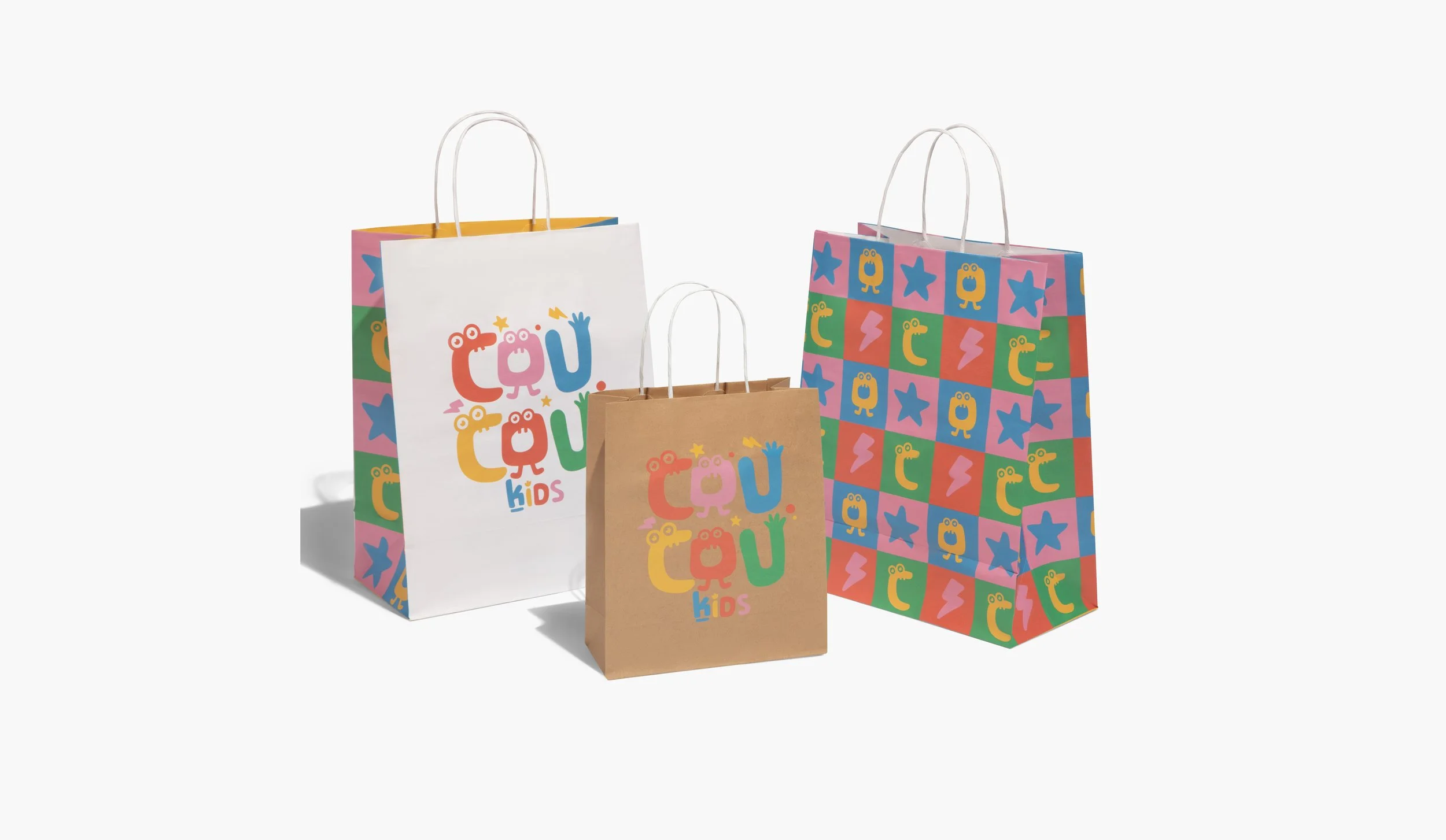
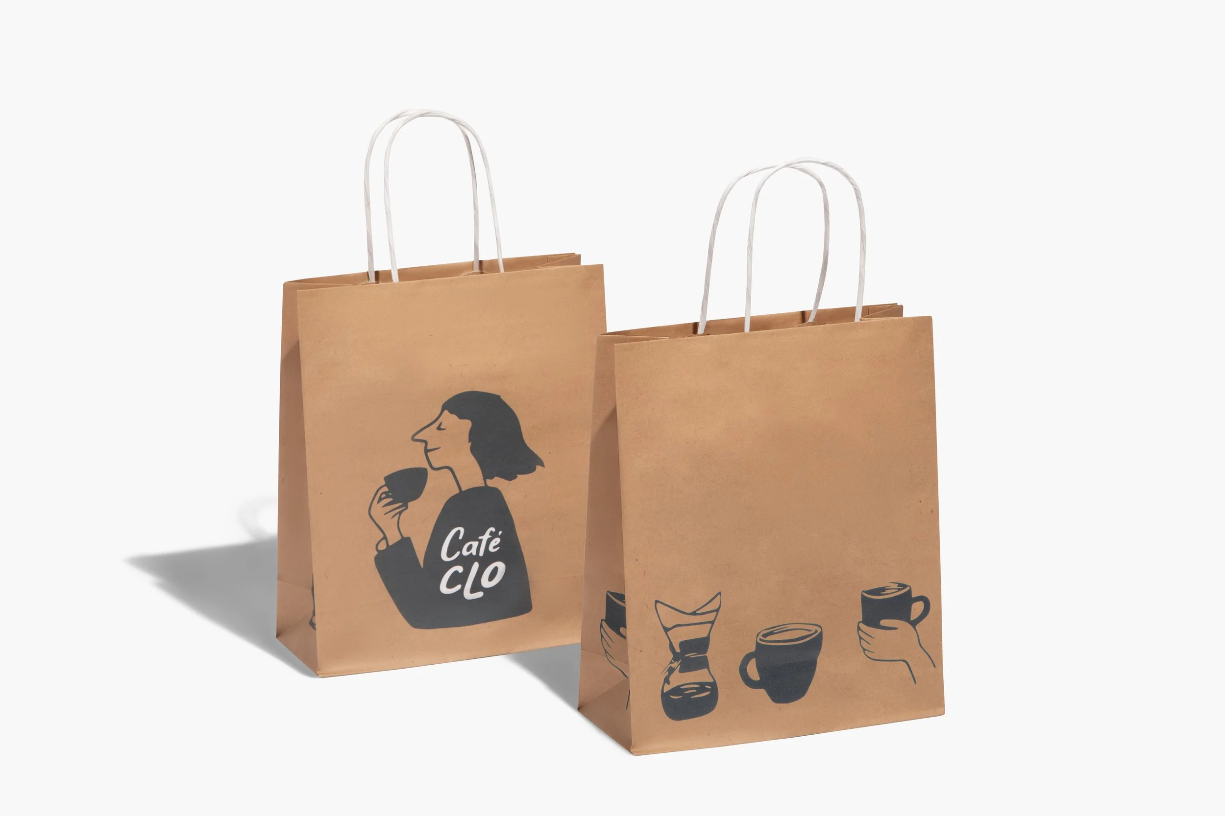
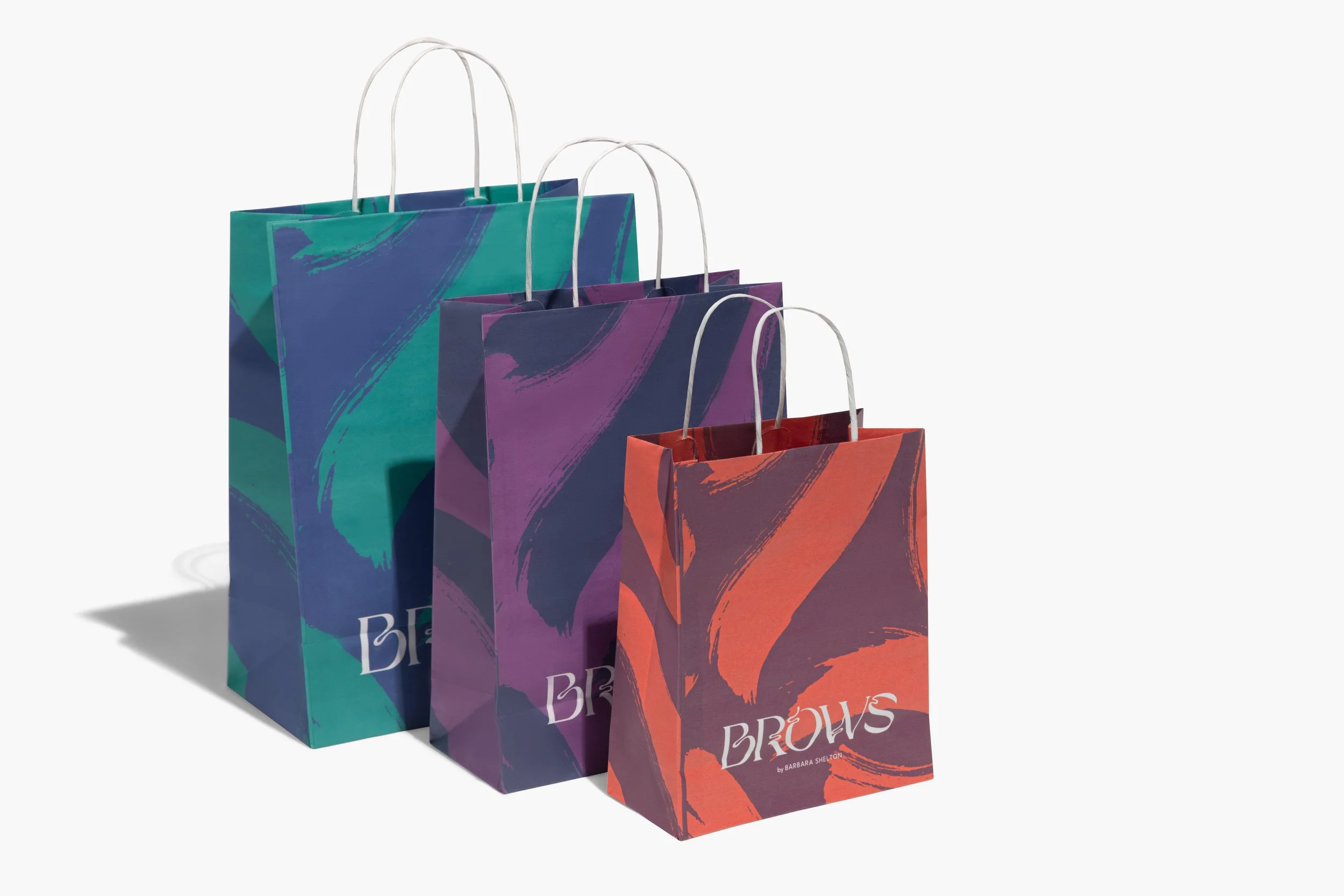
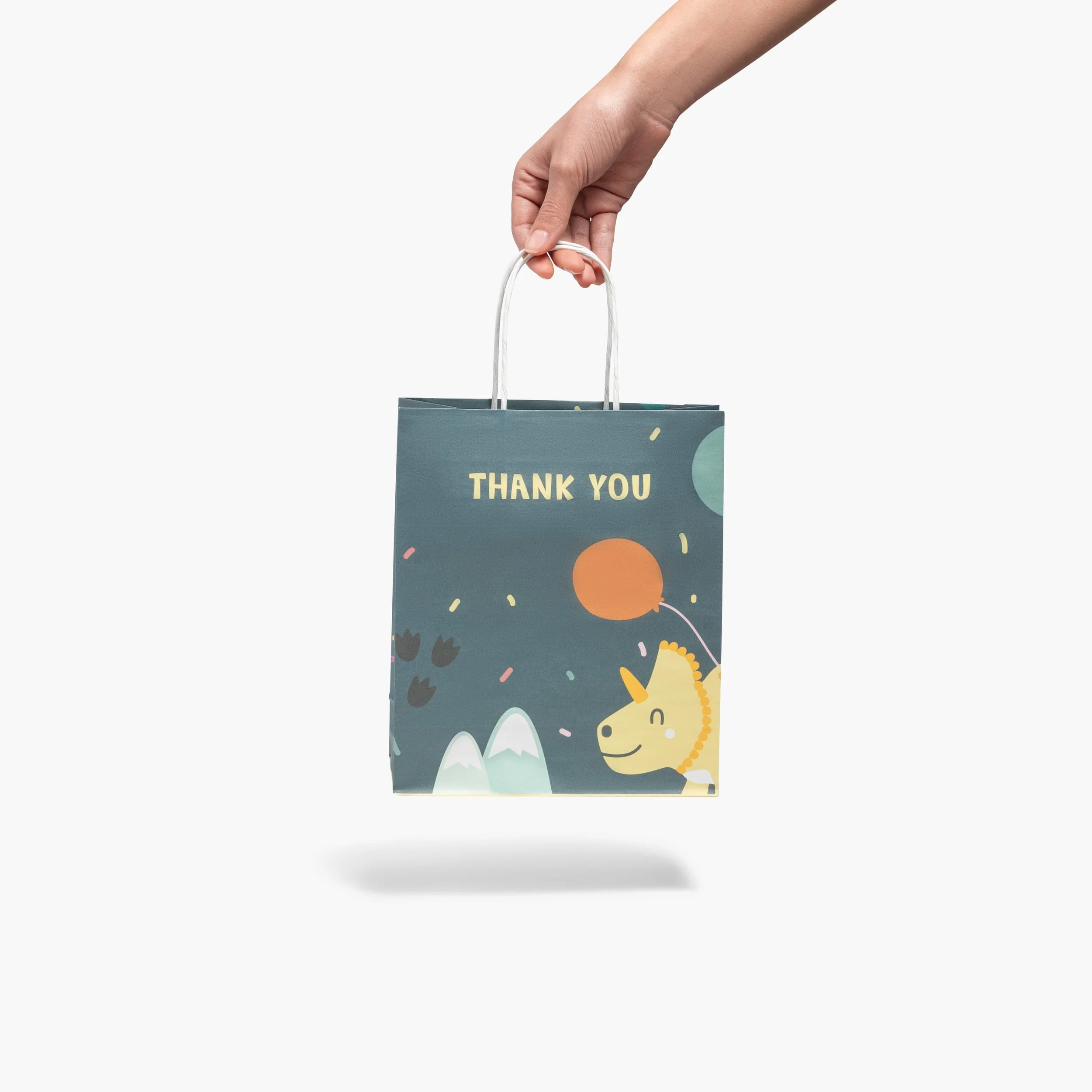
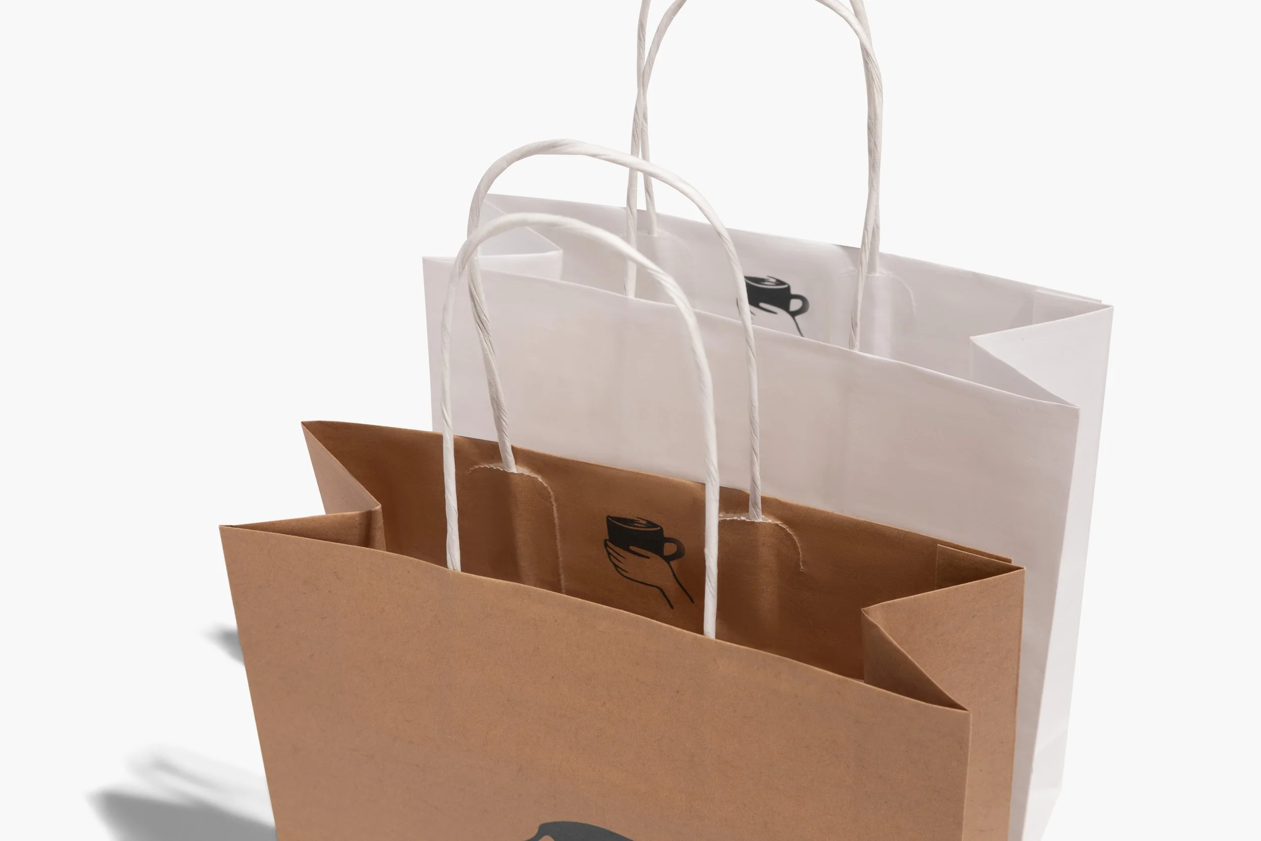
The Paper Bags subcategory is one of the fastest-growing areas in the company’s Packaging category, driven by its high level of customization and print flexibility. However, the existing visuals did not fully showcase the breadth of options or inspire customers with real use cases.
I led the art direction for an end-to-end visual revamp, defining a strategic and cohesive imagery system that helped users better understand and explore customization possibilities.
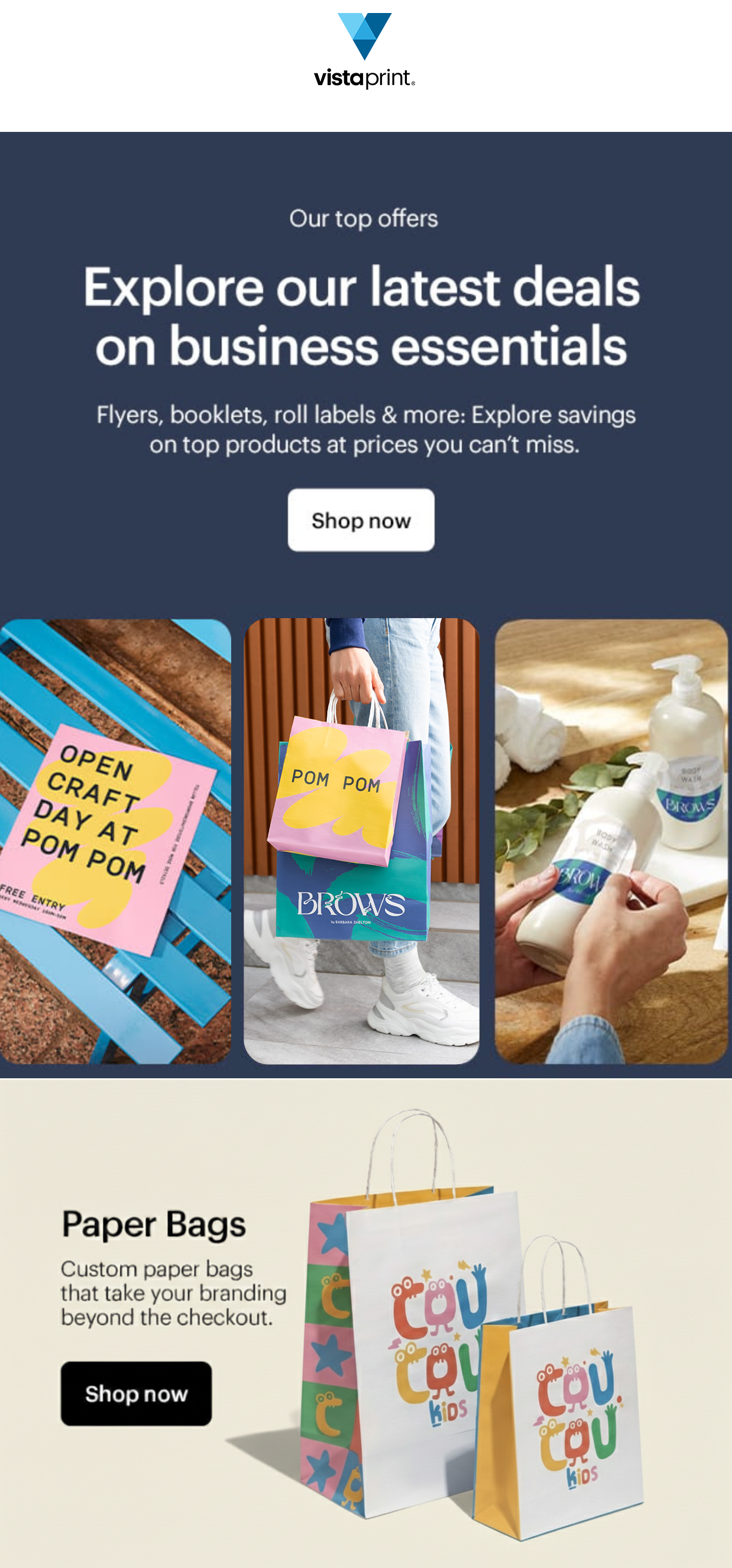
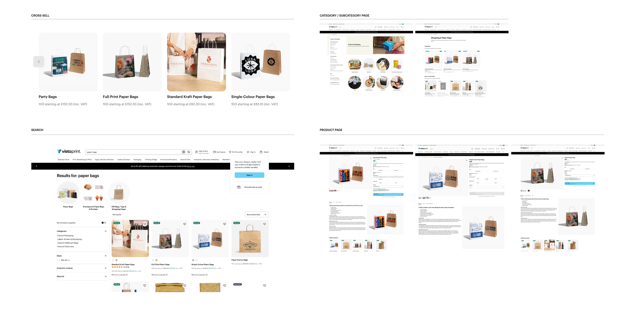
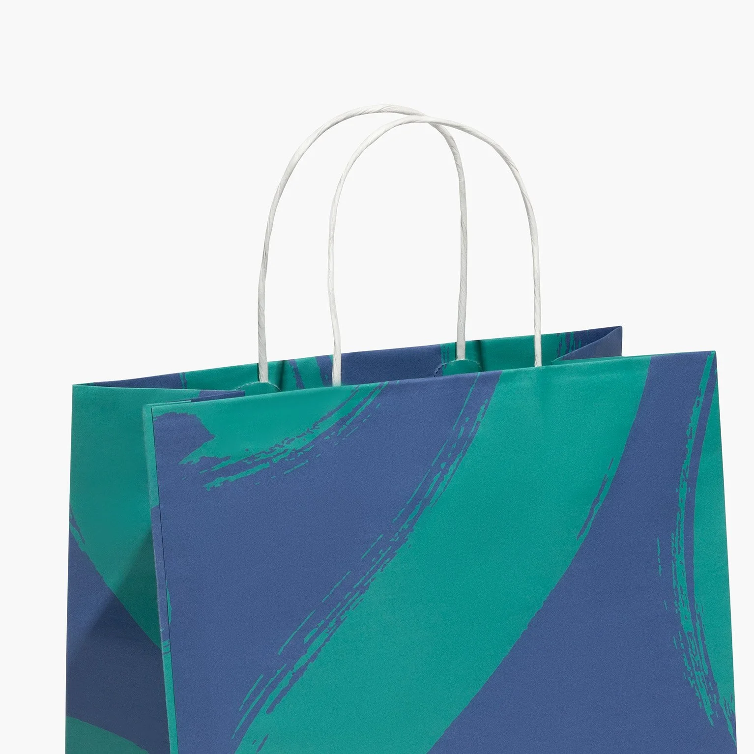
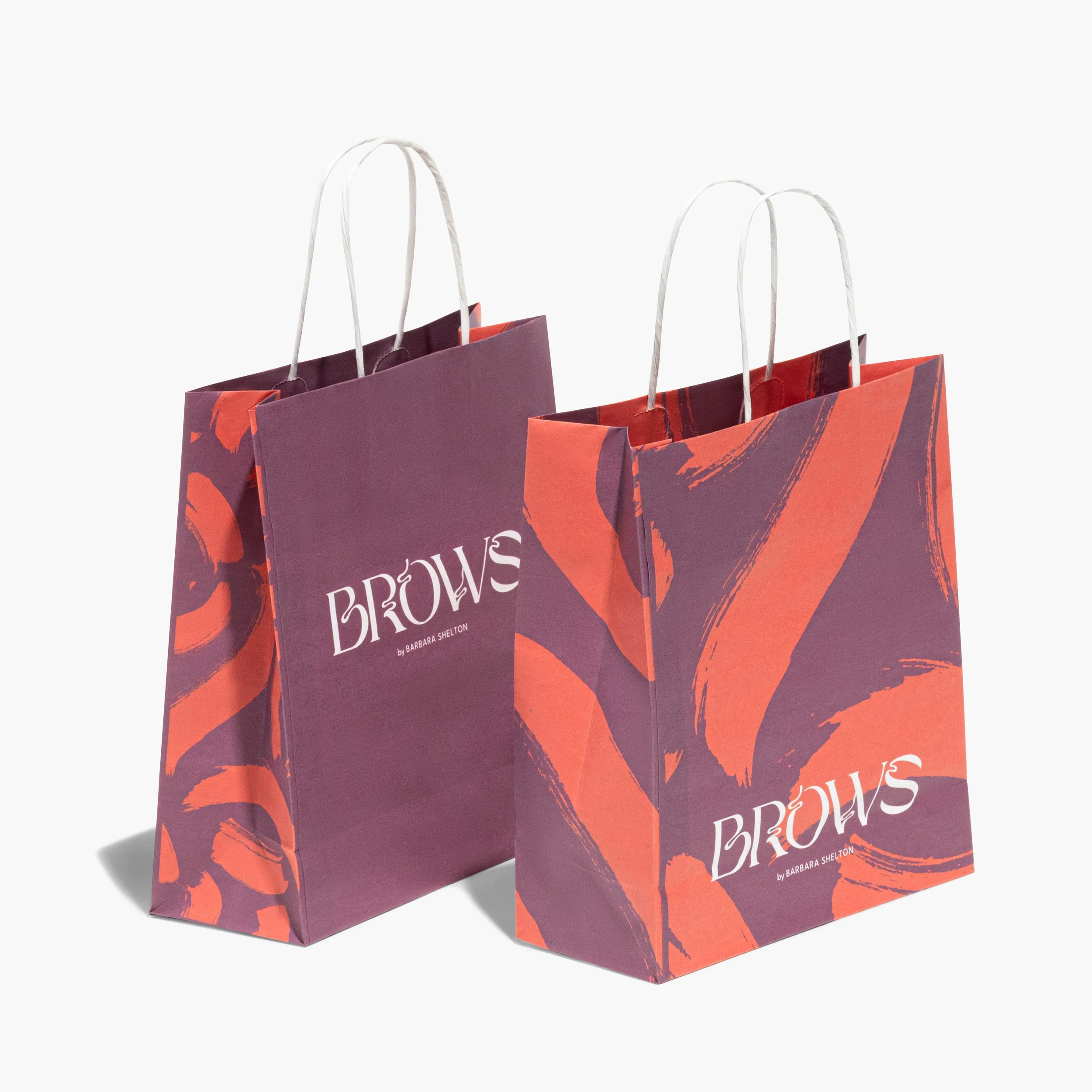
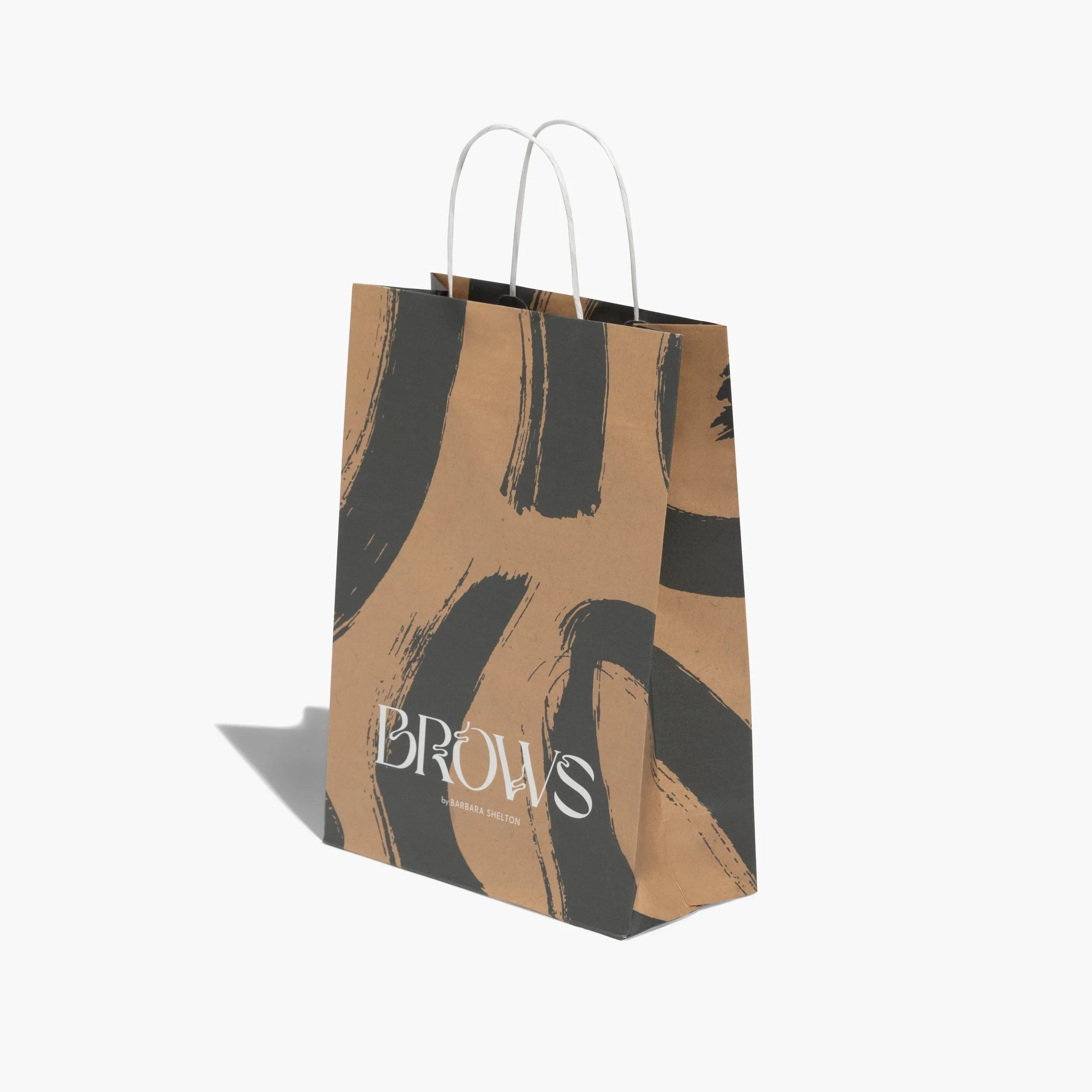
As part of this broader category refresh, we introduced 50+ lifestyle and studio images highlighting print options and real-life applications. During this period, the category recorded strong growth — including +68% Net Bookings, +92% VGP, a +0.5pp increase in conversion rate, and +45% new customers — reflecting the impact of multiple optimization efforts across the experience.
ROLE:
Art Director
CLIENT:
Vistaprint
TEAM:
Category Manager, PM, Photographer, Retoucher, Production Artist, Ops.
TIMELINE:
2025
Goal
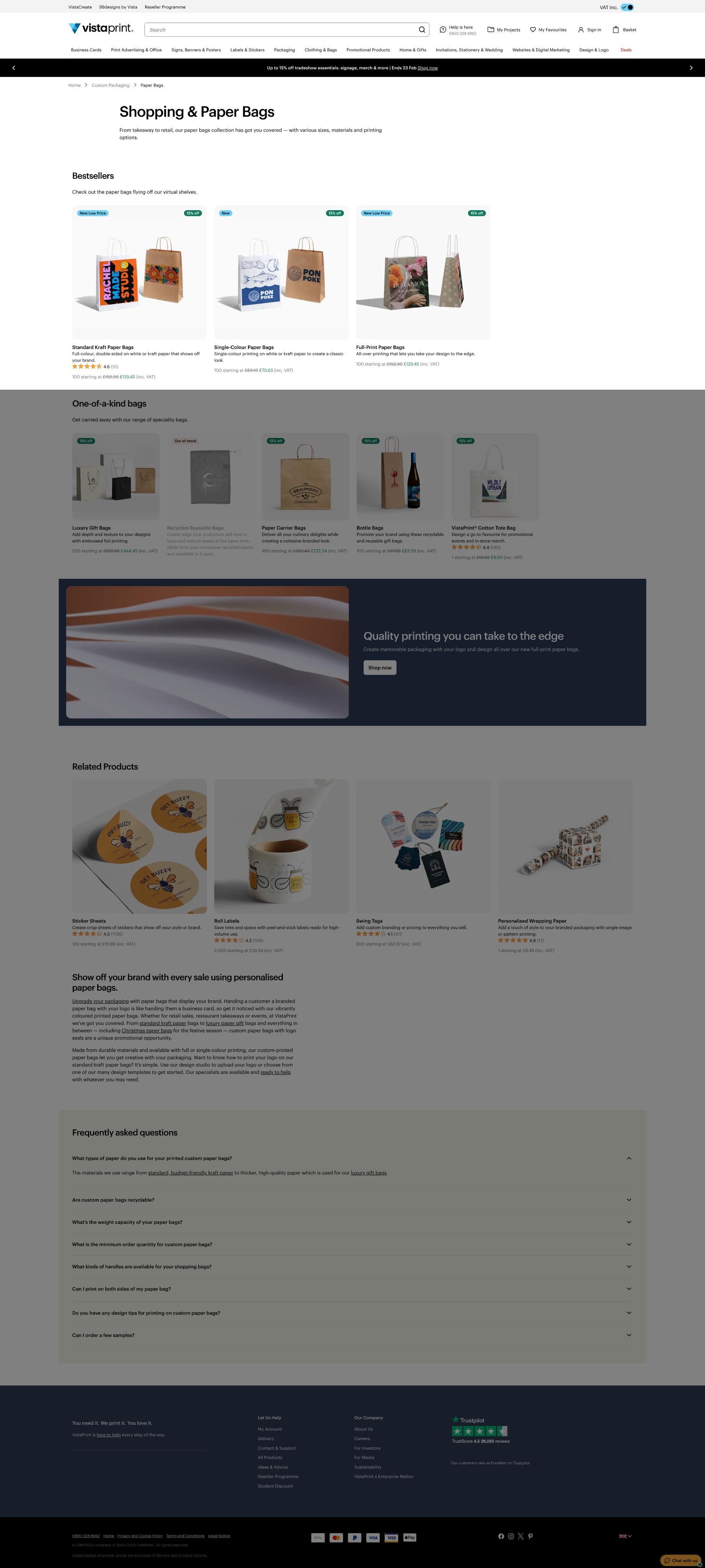
Refresh the Paper Bags subcategory page, by introducing new imagery that highlights the full range of print options and use cases. From category to product pages, the redesign aimed to create a more inspiring and informative shopping experience.
Challenge
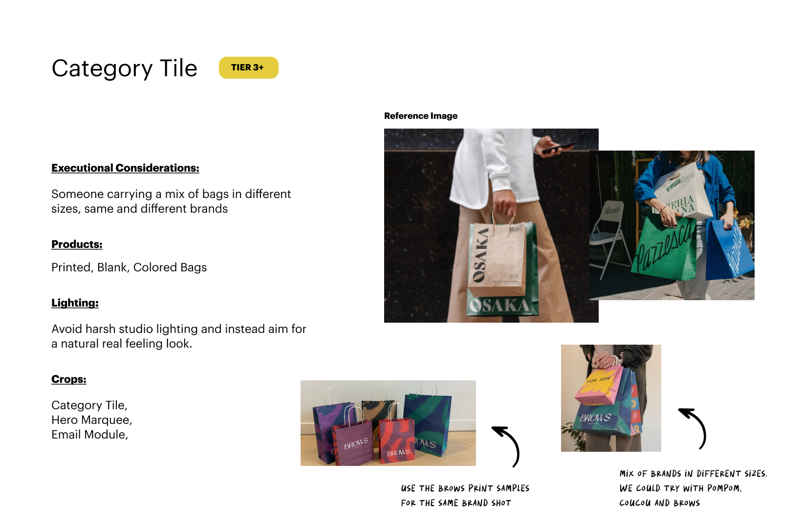
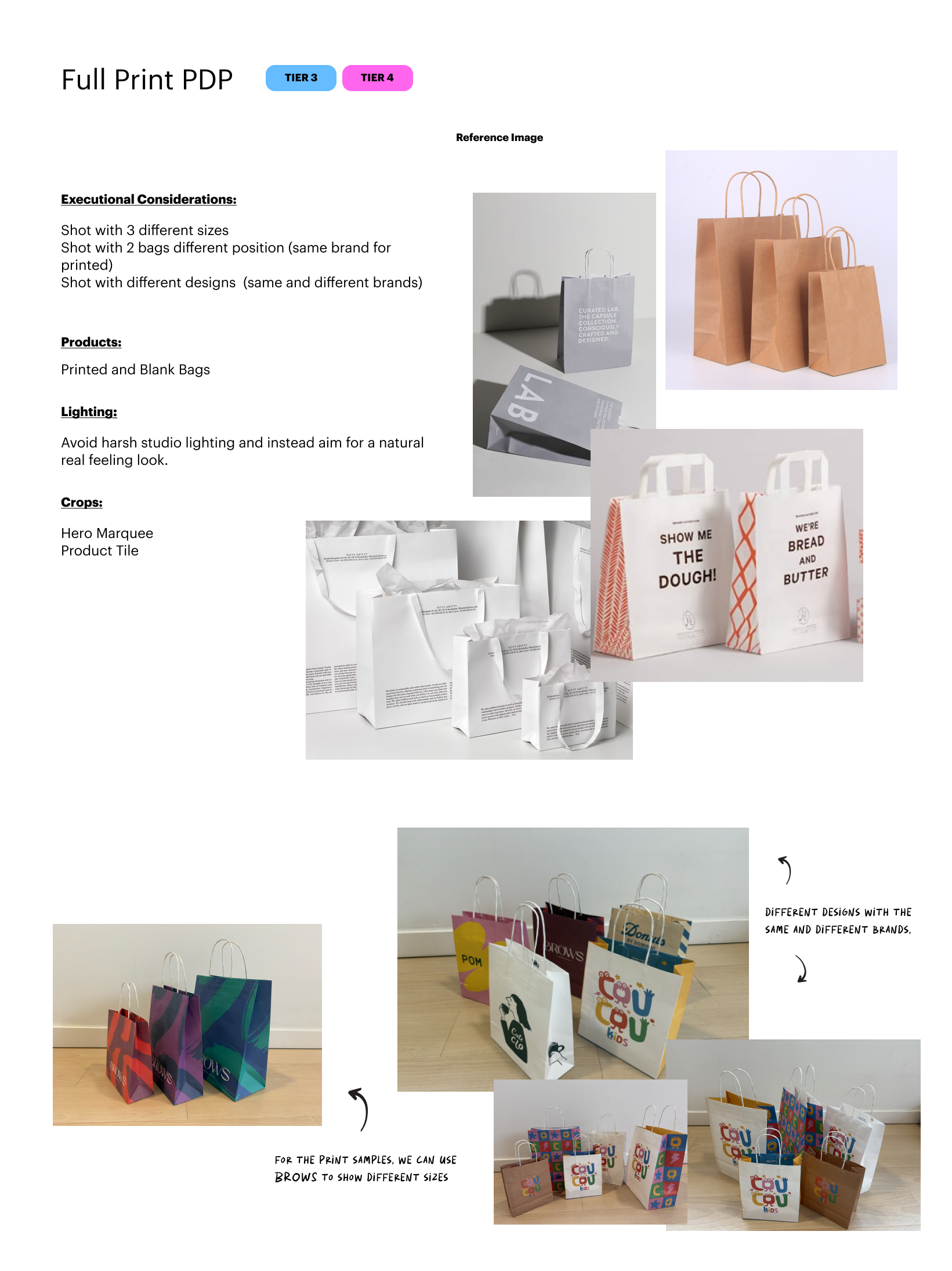
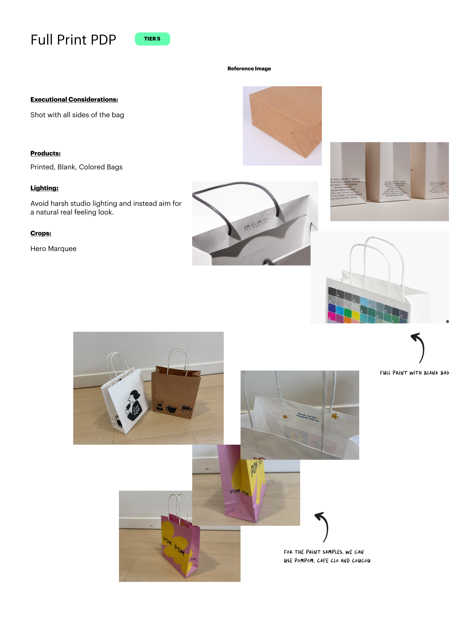
In the previous site experience, customers struggled to see the full range of print options and find inspiration, which made decision-making harder. On the creative side, we faced a tight timeline and limited samples for the photoshoot, yet we still needed to produce a large set of images that clearly showcased every printing variation, different use cases, and ensured each option was easy to understand and compare.
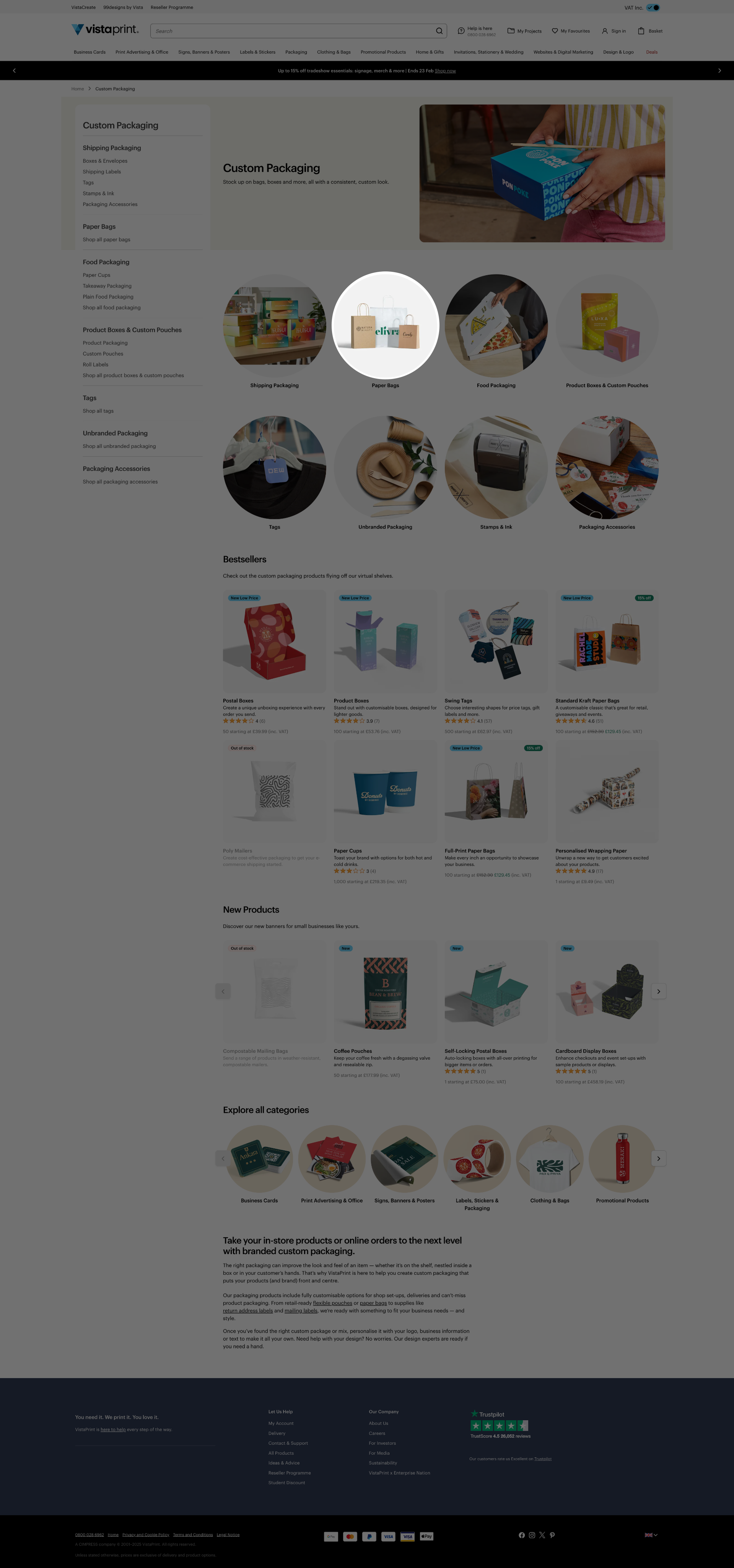
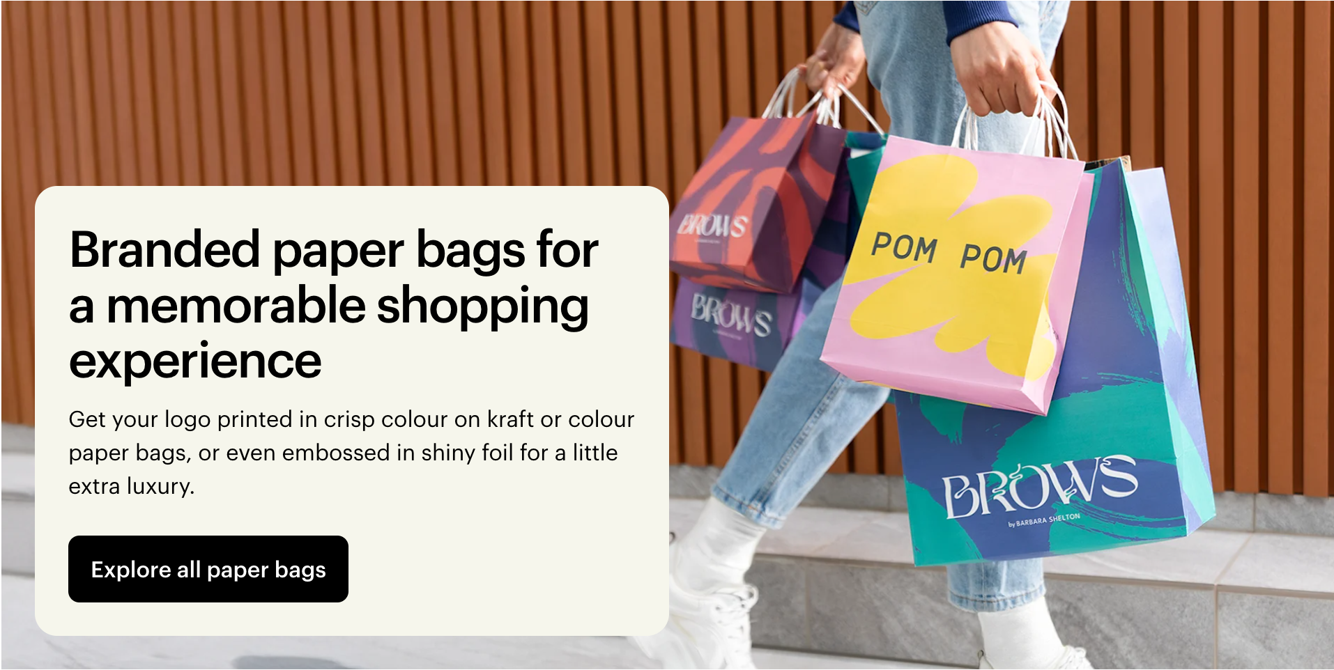
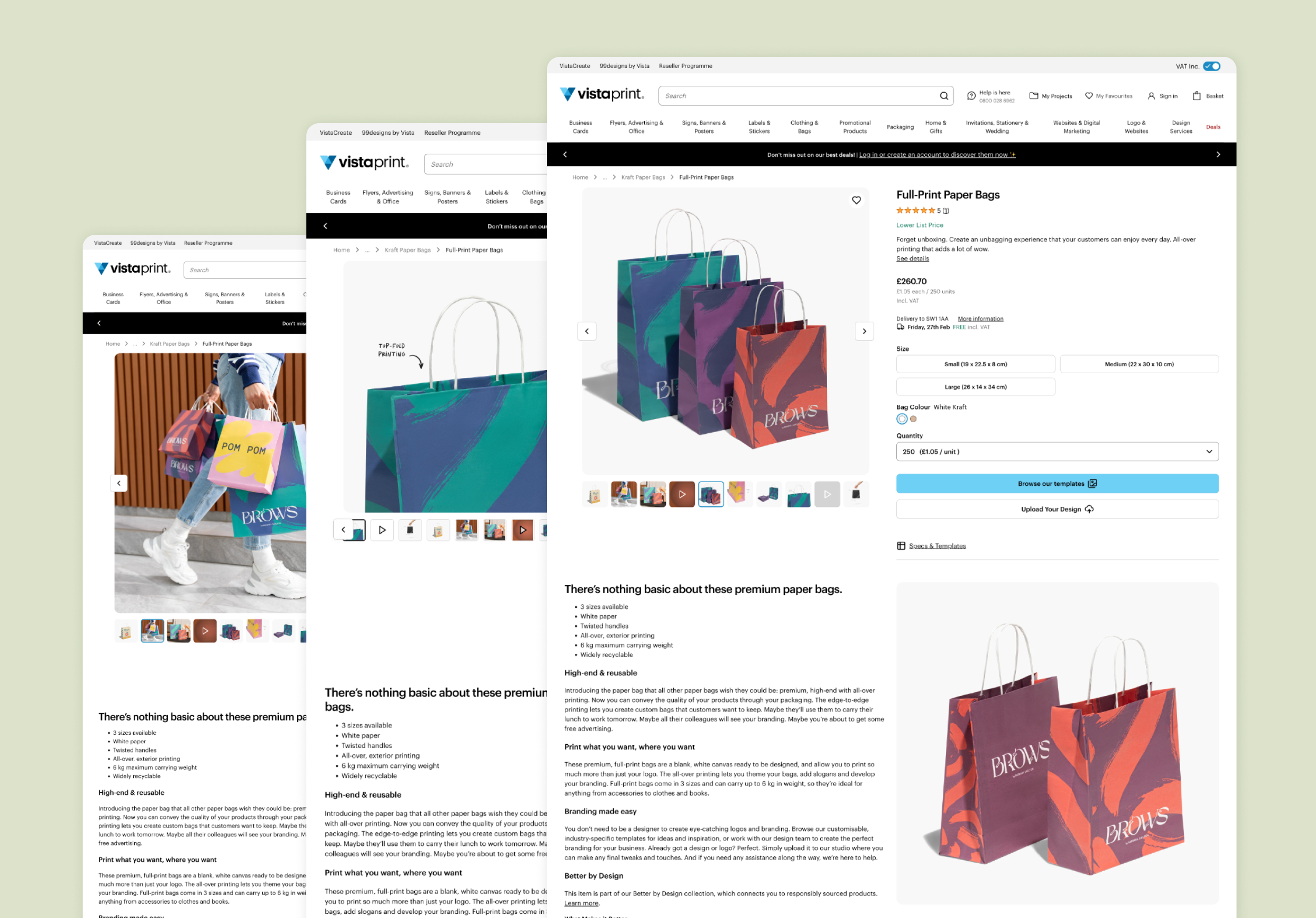
CATEGORY PAGE
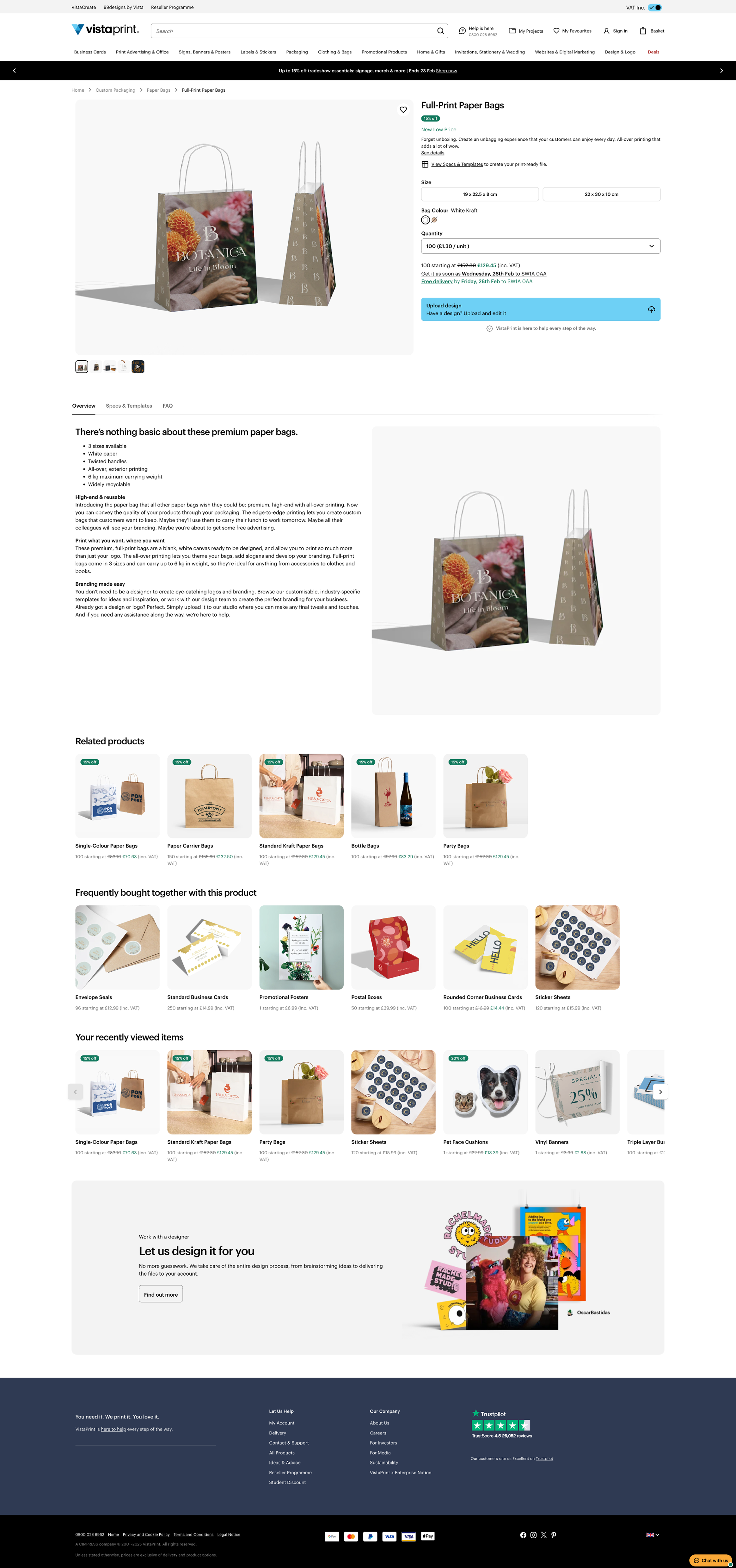
PRODUCT PAGE
SUBCATEGORY PAGE
Creative Strategy & Execution
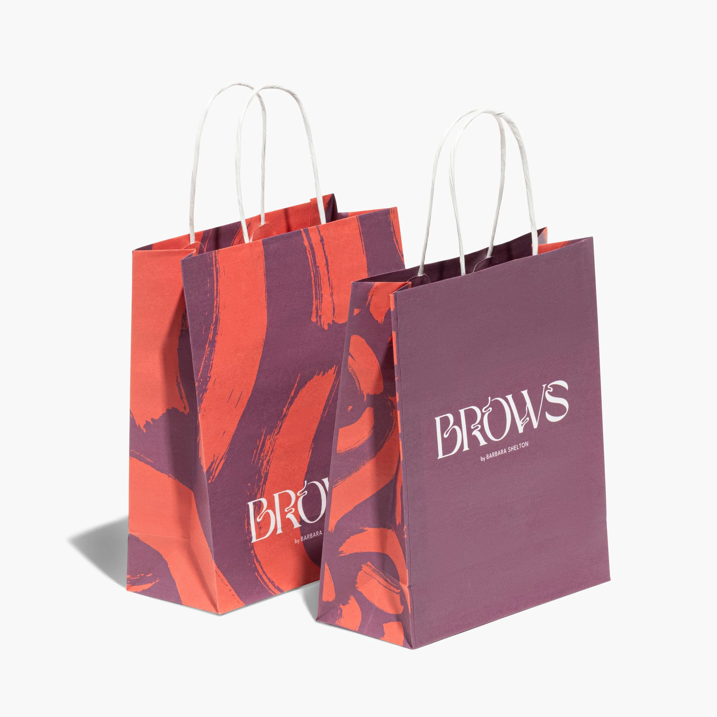
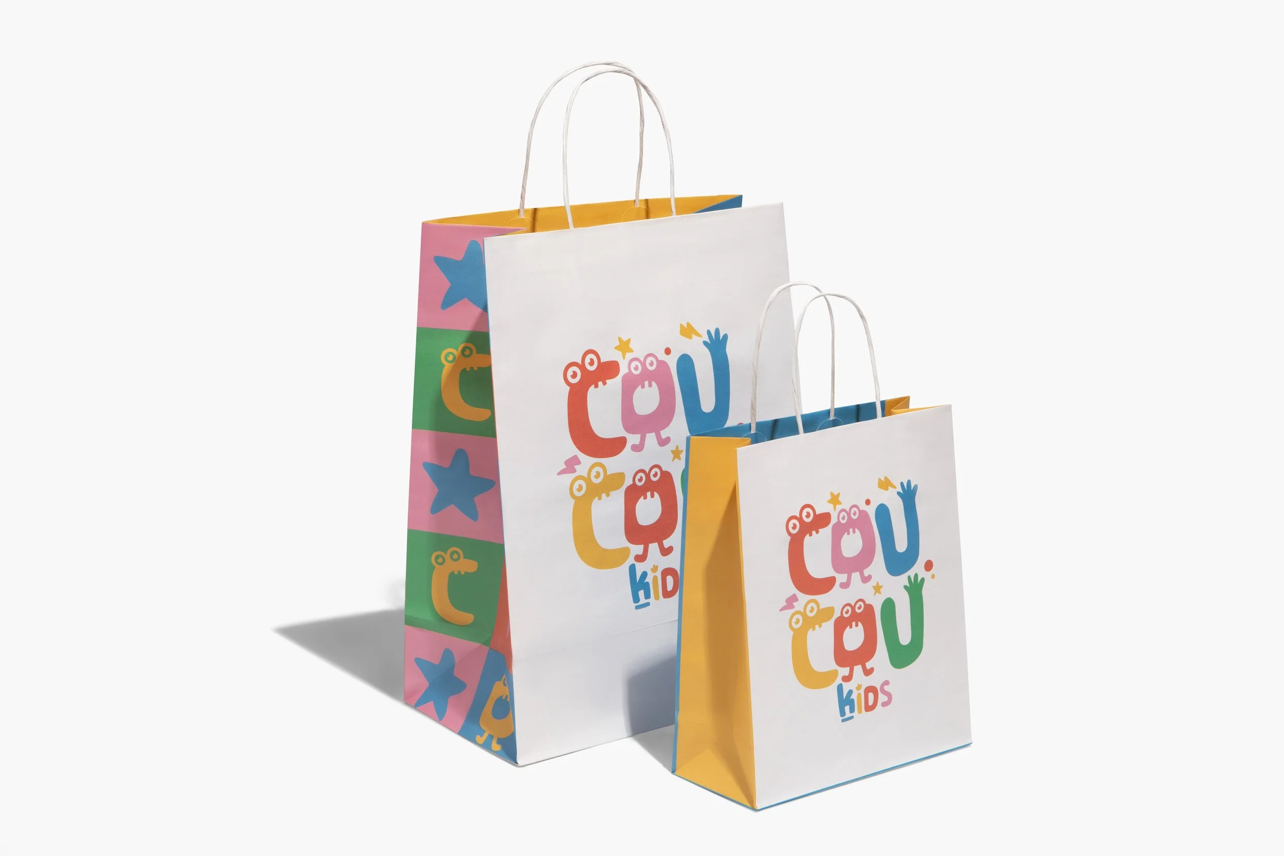
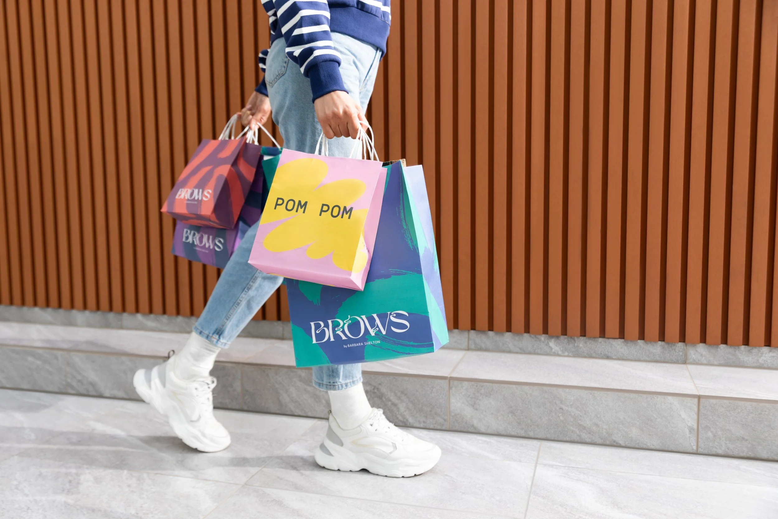
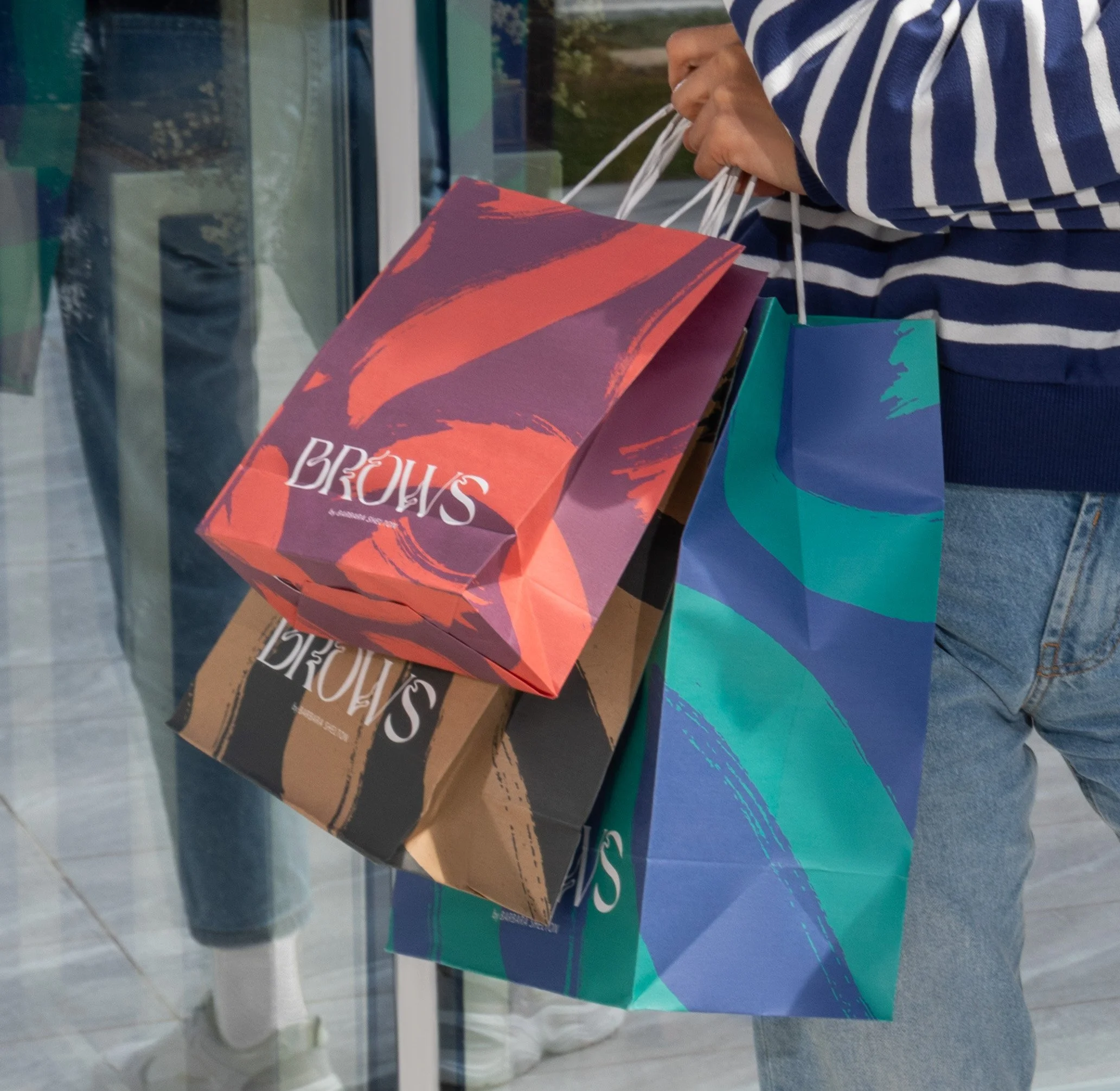
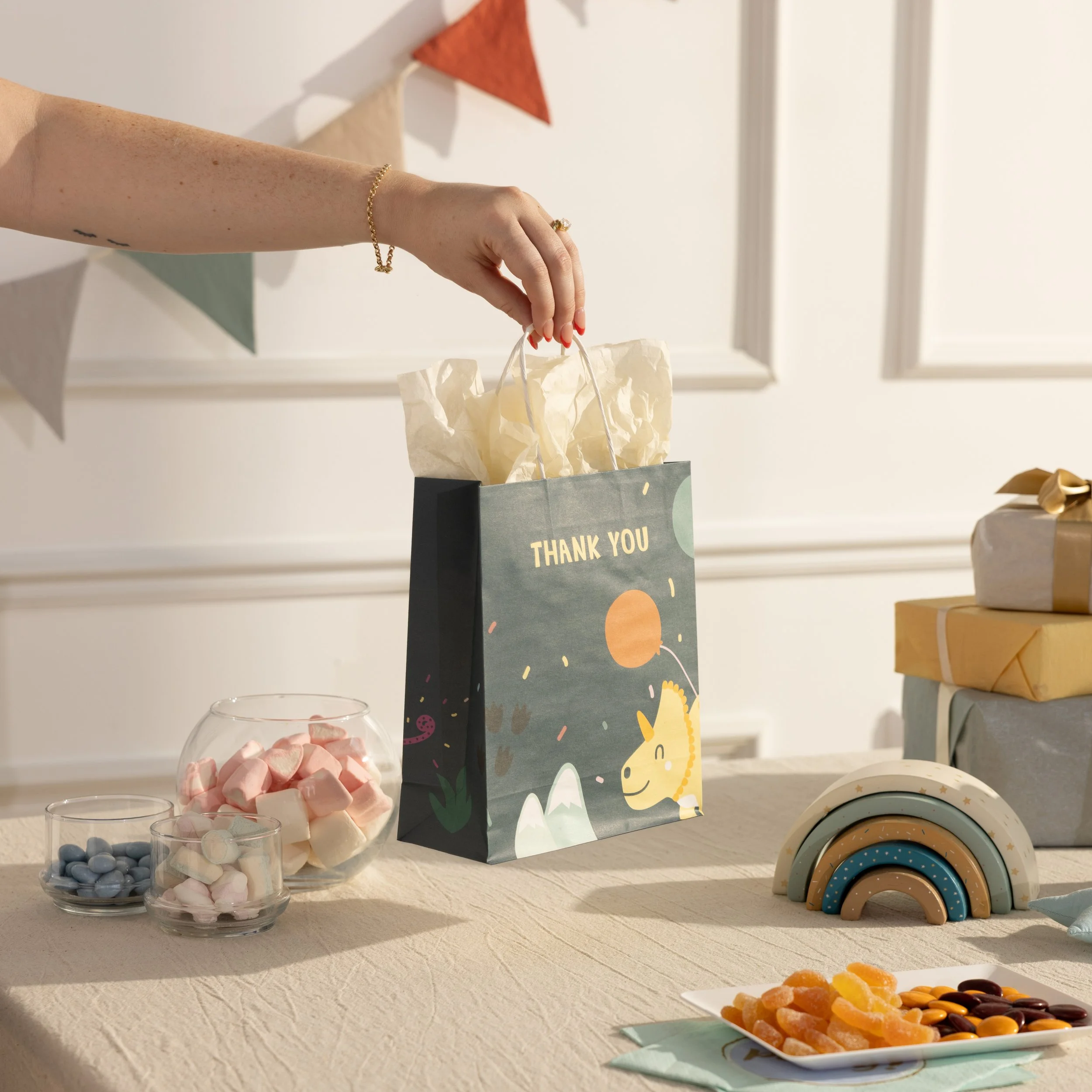
The strategy for this project was to create a complete set of images covering all print options, sizes, and touchpoints—from lifestyle to close-ups—so the site felt consistent and inspiring. I started by mapping existing images, spotting gaps, and creating samples across industries and brands to build a versatile visual library. A detailed photo brief guided the remote photographer, and after the shoot, the images were retouched and integrated, giving us a flexible system of visuals that worked across all touchpoints.

🔍 OVERVIEW OF EXISTENCE IMAGES
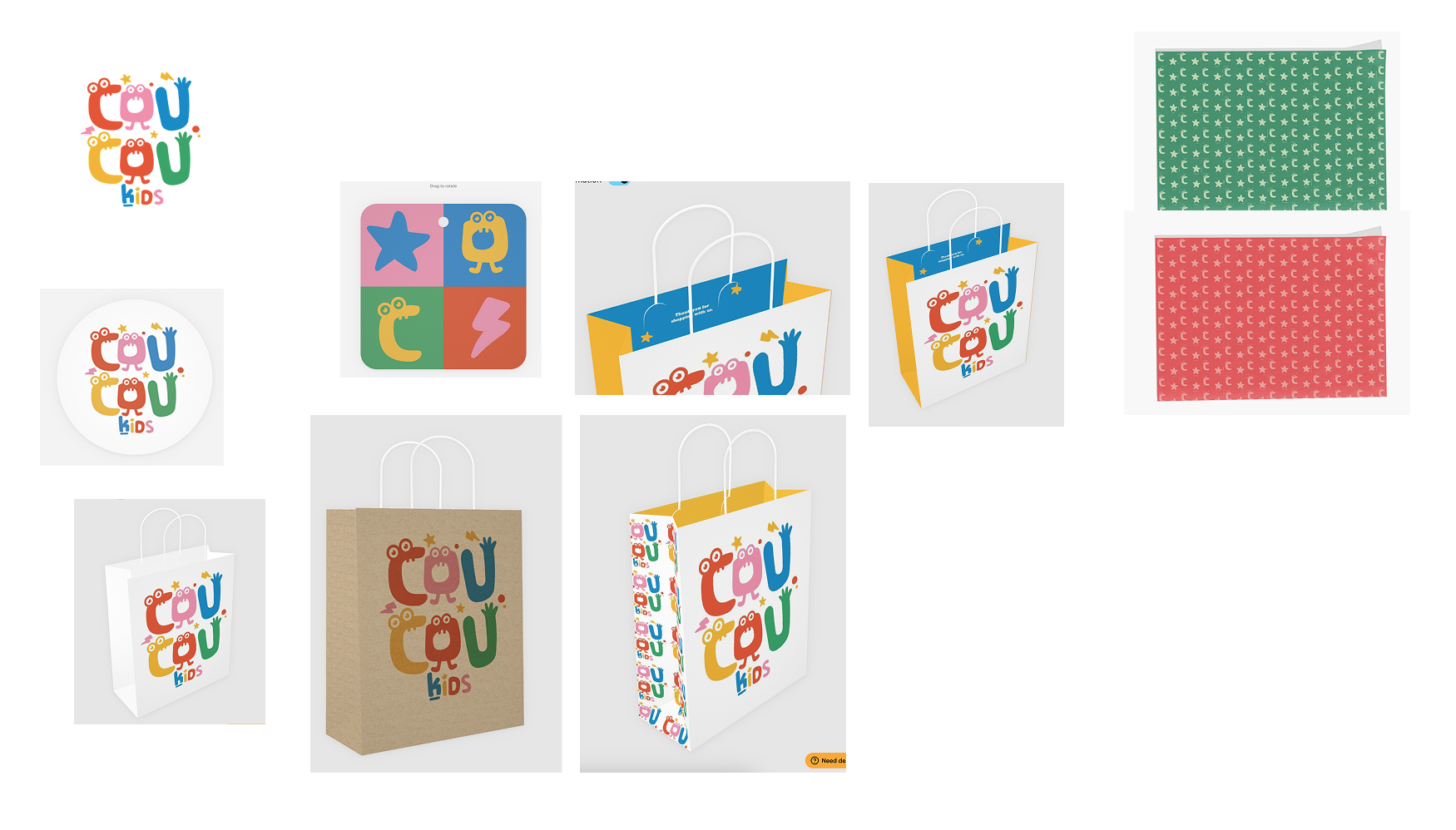
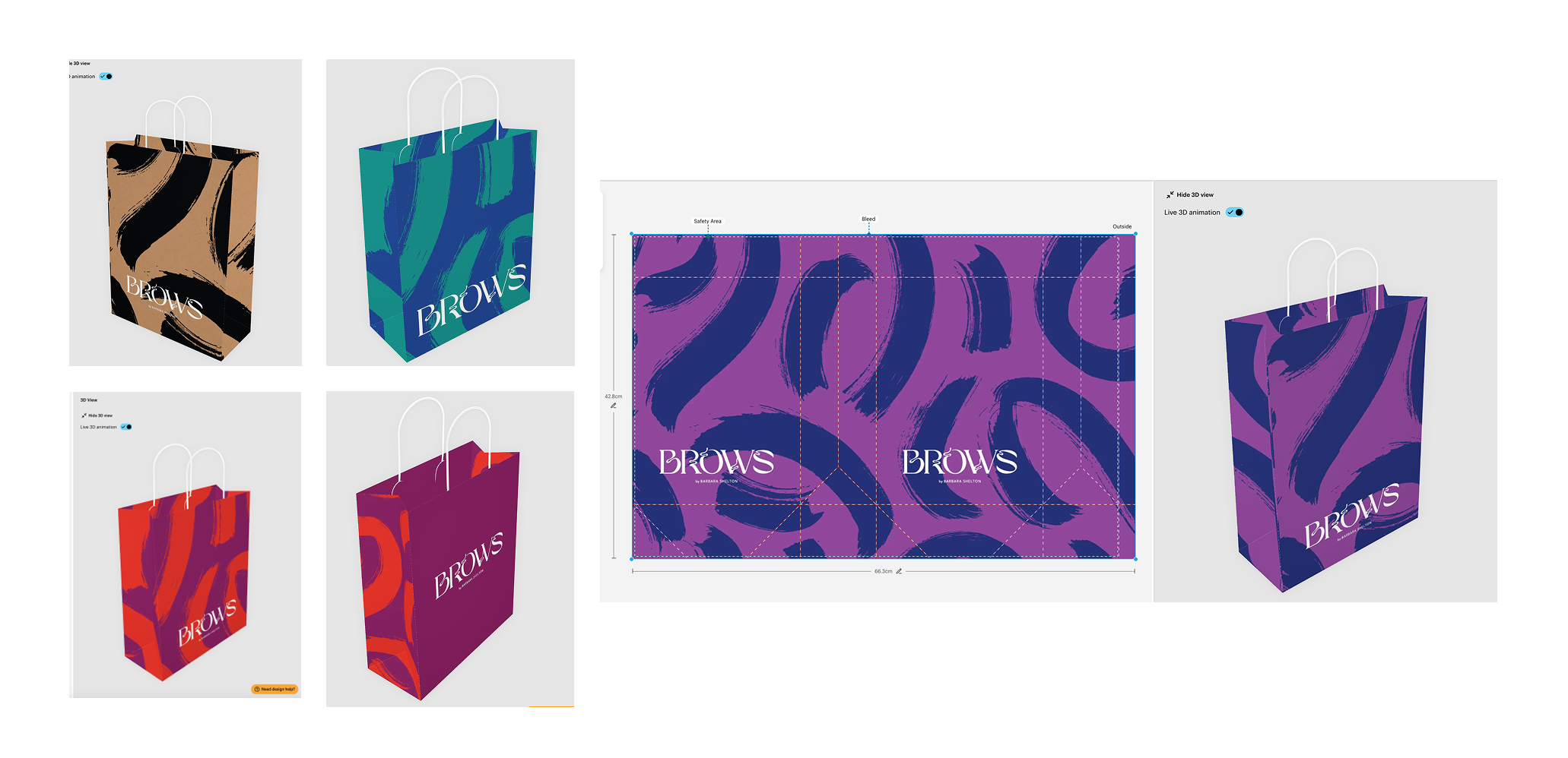
🎨 DESIGN SAMPLES CREATION
📷 PHOTO BRIEF
Final Experience & Impact
The project delivered 50+ high-quality images across category pages, PDPs, search, email, and social, creating a cohesive and inspiring visual experience. By making customization clearer and use cases more tangible, the new imagery strengthened product storytelling at every touchpoint. Alongside broader category improvements, this contributed to a period of standout growth, including +68% Net Bookings, +92% VGP, and +45% new customers.

NEW SITE EXPERIENCE
IMAGE TILES
BANNER