Category Page System
A scalable framework for e-commerce
Category pages play a key role in product discovery, but inconsistent interpretation of an existing navigation hierarchy created friction across both user experiences and internal workflows.
This project explored how category navigation was implemented across Vistaprint’s catalogue, with a focus on understanding system-level inconsistencies and how they affected structure, components, and navigation behaviour.
Working within the Navigation & Taxonomy team, I contributed to the discovery and analysis phase, focusing on aligning understanding of the existing system rather than defining a new one.
This work strengthened my ability to approach UX problems from a system perspective within complex e-commerce environments.
ROLE:
UX/UI Designer
CLIENT:
Vistaprint
TEAM:
Product Designer, Product Management, Copy, Product Lead, Engineers
TIMELINE:
2024-2025
System Context & Problem
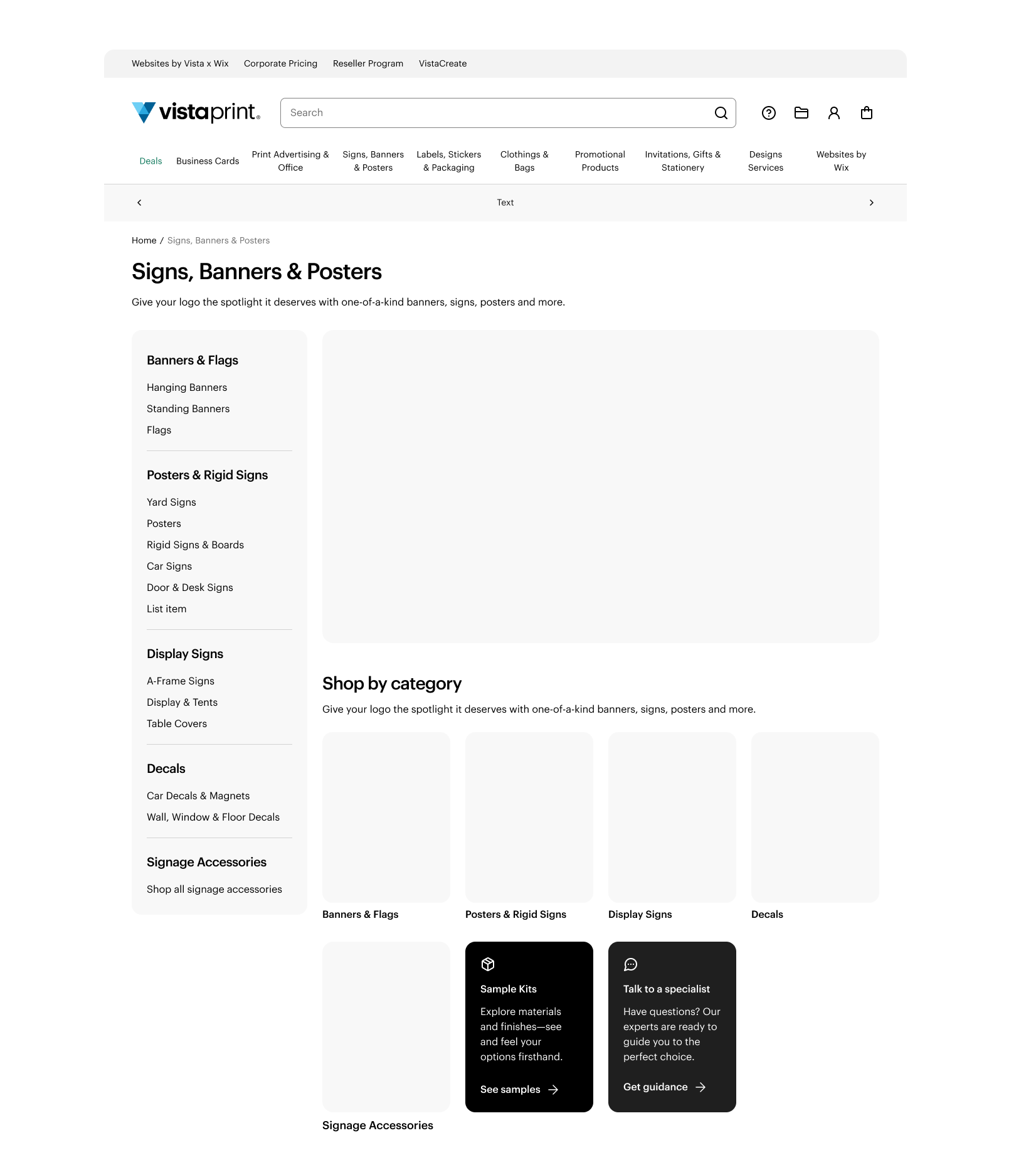
A three-level category hierarchy already existed within the product, but it was interpreted and implemented inconsistently across teams, resulting in fragmented navigation patterns and an unclear browsing experience. These inconsistencies in how the taxonomy was applied led to variations in category structure and hierarchy across the product, particularly in how L1, L2, and L3 levels were defined and surfaced.
Beyond structural issues, there were also inconsistencies in navigation behaviour, including how category paths were represented and how users moved between levels. Shared components such as CTAs and promotional modules were applied inconsistently, while manual implementation processes introduced additional variability. The lack of clear usage guidelines for category teams further amplified these issues, making the system harder to maintain and scale.
LEVEL 1
LEVEL 2
LEVEL 3
System Understanding
To understand how the existing navigation system was being interpreted across teams and experienced by users, we conducted cross-functional workshops and 8 customer interviews across key markets.
This phase helped surface how inconsistencies in taxonomy, navigation structure, and component usage were impacting both user decision-making and internal alignment across teams.
WORKSHOP IDEATION
Cross-functional workshop exploring inconsistencies in category interpretation across teams.
IN-DEPTH INTERVIEWS
User interviews conducted across key markets to understand how customers navigate complex category structures.across teams.
System Analysis
The existing category navigation system operated within a predefined three-level hierarchy (L1, L2, L3), but its implementation varied significantly across teams and surfaces. This created several system-level constraints that shaped the design direction:
Hierarchy Inconsistency
Component Fragmentation
Manual Process
Lack of Guidelines
This section consolidates system-level constraints and user needs into clear inputs for the navigation framework.
SYSTEM CONSTRAINTS (internal system issues)
USER NEEDS (external insights)
The discovery phase surfaced three core user needs that influence how users navigate and make decisions within the category experience: value, speed, and trusted support. Rather than standalone findings, these needs reflect key priorities that shape user expectations when browsing and selecting products.
“Online suppliers are used for convenience and 24/7 availability but lack the tactile feedback and flexibility of local providers”
🤝
Trusted Support
Users often rely on external or local providers when they need reassurance or guidance, particularly for more complex or tangible products.
System Implication
The navigation system needs to surface signals of guidance and support earlier in the browsing experience to reduce uncertainty in decision-making.
“I would go quality,
turnaround, price …”
⭐️
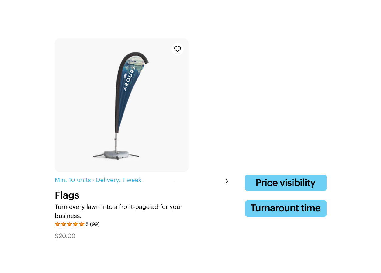
Value
Users evaluate products through a balance of cost, quality, and flexibility rather than a single dominant factor.
System Implication
Category structures should support quick comparison and help users understand trade-offs between key decision criteria.
“Better transparency in production timelines to reduce surprises during ordering”
🚀
Speed
Perceived and actual turnaround times strongly influence product selection and decision confidence.
System Implication
Operational information (e.g. delivery expectations) needs to be surfaced earlier in the navigation system, not only at checkout.
Blueprint for Future Navigation
Based on the system analysis and user needs, we explored a set of principles to guide a more consistent interpretation of the existing category navigation system across teams. The goal was not to redefine the system, but to explore how consistency could be improved across structure, components, and navigation behaviour.
HIERARCHY CONSISTENCY
We examined how the existing three-level taxonomy could be applied more consistently across category experiences to reduce fragmentation in structure and interpretation.
TRUSTED GUIDANCE IN CATEGORY EXPERIENCE
We explored how guidance and support elements could be more consistently integrated into category pages to help users navigate complex decisions with confidence.
DECISION SUPPORT IN NAVIGATION
We explored opportunities to surface key decision-making signals earlier in the browsing experience to support faster and more informed choices.
COMPONENT ALIGNMENT
We examined how inconsistent component usage and manual implementation could be reduced through clearer system-level guidance across teams. For example, linking category tiles to their corresponding hero content allows updates to propagate automatically, maintaining visual and contextual alignment across the system.