Fly UX
Rethinking Flight Booking
An end-to-end UX/UI project redesigning the flight booking experience — from research to prototype.
The goal: a booking flow built around confidence at every step, where the user always knows where they are, what they're paying, and what to do next.
Completing this project earned the Professional Certificate in UX Design from the UX Design Institute, validated by Glasgow Caledonian University.
ROLE:
UX/UI Designer
CLIENT:
Self-initiated · Course Project
TEAM:
Solo
TIMELINE:
2019-2020


Challenge
Booking a flight should be simple, but most airline websites make it overly complex. Prices fluctuate, key information is often hidden, the booking summary disappears on scroll, and by payment, users are left uncertain about their decisions. A routine task ends up feeling unnecessarily stressful.
Understanding the Problem
To understand where airline booking experiences were failing — and why — I ran four research activities before touching any design. This research was conducted in 2019–2020, so some pain points may have since been addressed; the value here is in the process and thinking, not as a current critique of any platform.
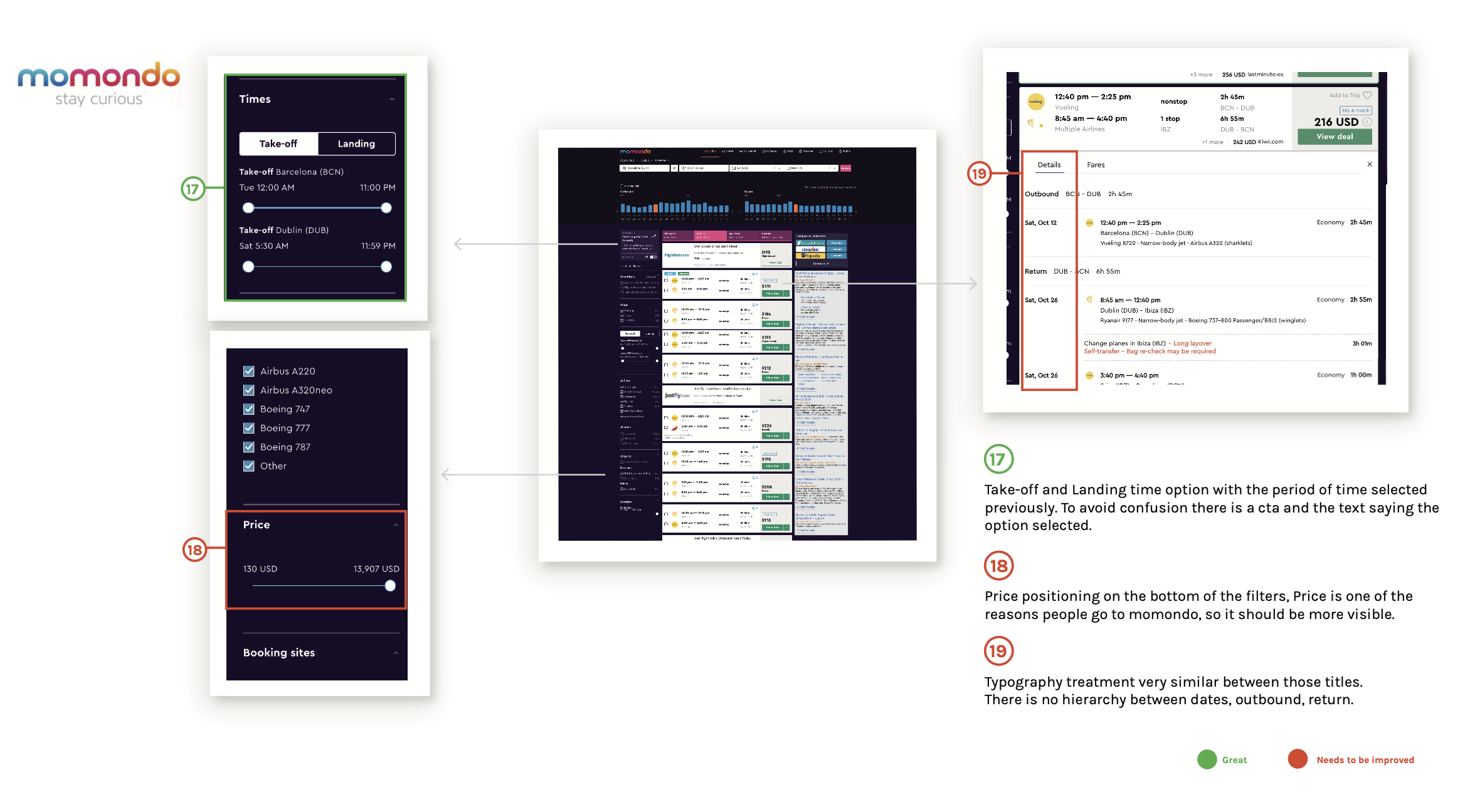
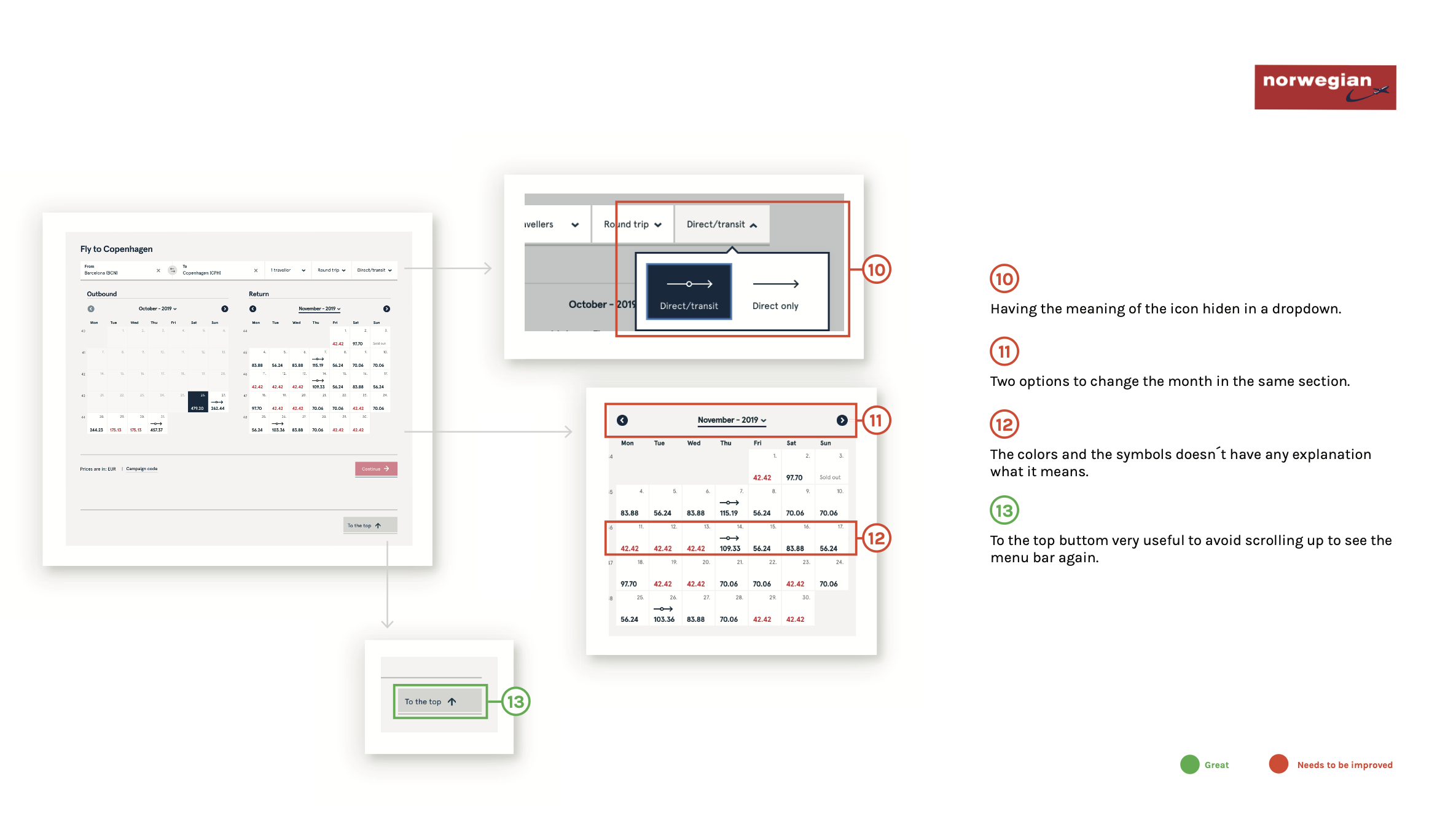
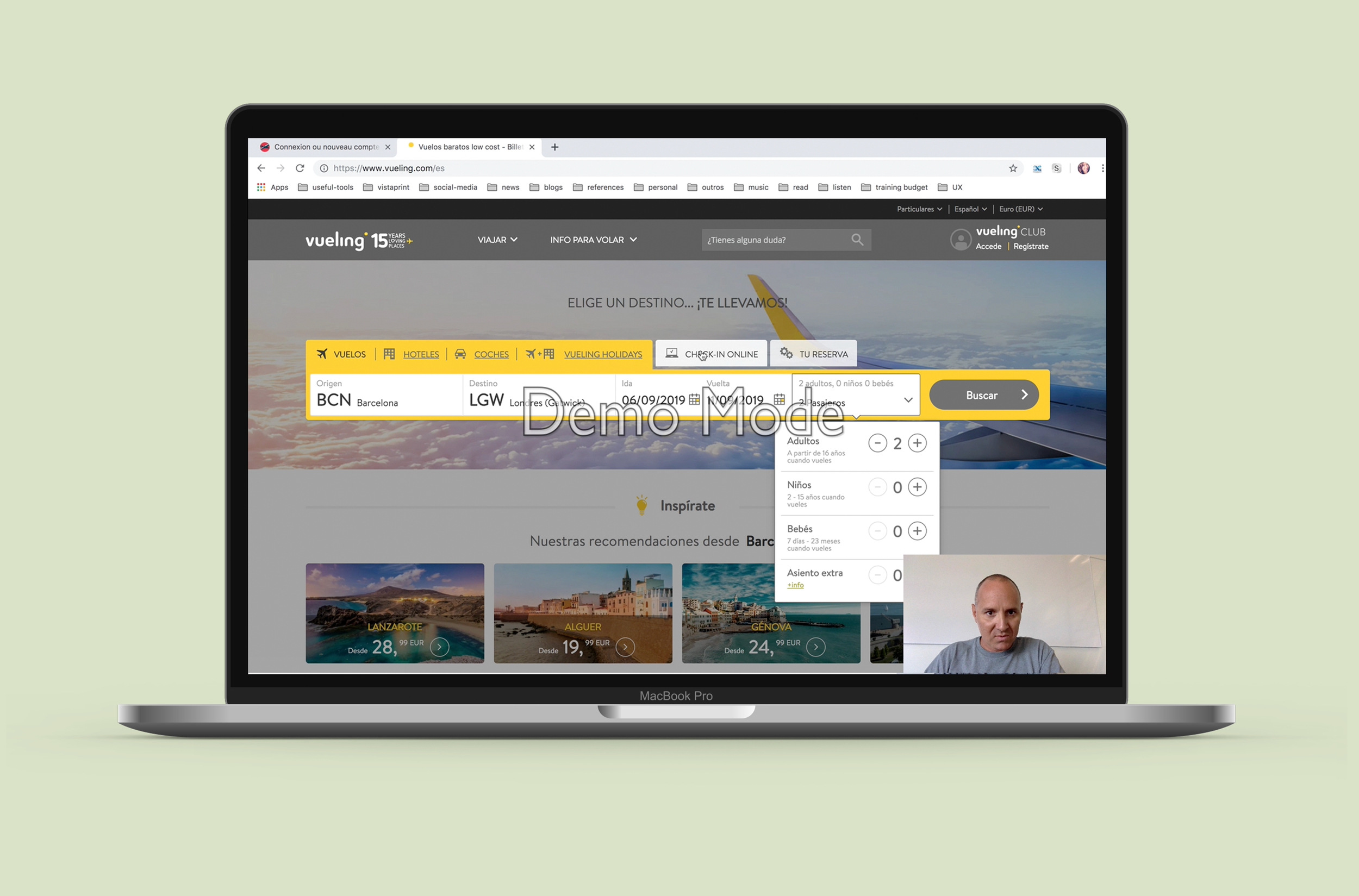
COMPETITIVE BENCHMARKING
Analysed four airlines and travel platforms (Momondo, Vueling, Norwegian, and Azul) across navigation, search, flight selection, pricing, and booking flow.
ONLINE SURVEY
I ran a survey with 28 respondents to understand real booking behaviour. The results validated several assumptions and surfaced a few important ones.
82% of people book flights on desktop.
92% were booking for vacation, meaning the emotional stakes are high and the experience needs to feel reassuring, not transactional.
71% used a comparison site before going to an airline website directly — meaning users arrive already knowing their destination, and just need a fast, frictionless path to booking.
USABILITY TESTING
I conducted usability tests on existing airline websites, observing real users as they attempted to complete a booking.
The most consistent pain points:
Users lost track of the total price as they moved through the funnel.
They struggled to compare flight options across dates.
They were repeatedly surprised by information that appeared too late — fees, fare inclusions, luggage rules — at a point in the process where backing out felt costly.
DEPTH INTERVIEW
A one-on-one depth interview allowed me to go beneath the surface — understanding not just what users did, but why. The conversation revealed that booking anxiety is real and consistent: people worry about whether they got the best price, whether they missed something important, and whether the process will go smoothly. Trust is fragile, and it's built or broken in small moments throughout the flow.
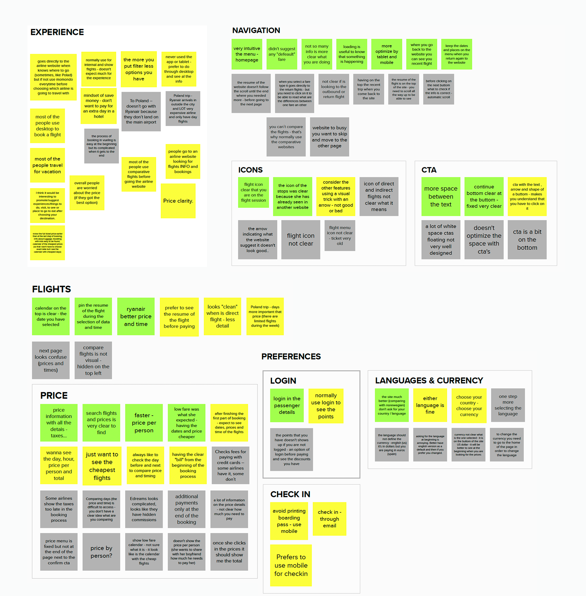
Finding the Patterns
With all the research gathered, I clustered findings by theme using an affinity diagram. Patterns emerged quickly across five areas: navigation, price, flights, special needs, and the overall booking experience.
The story they told was consistent — users were price-driven but poorly served, navigation was often unintuitive, and at every stage of the funnel, what people really wanted wasn't just functionality. They wanted reassurance.
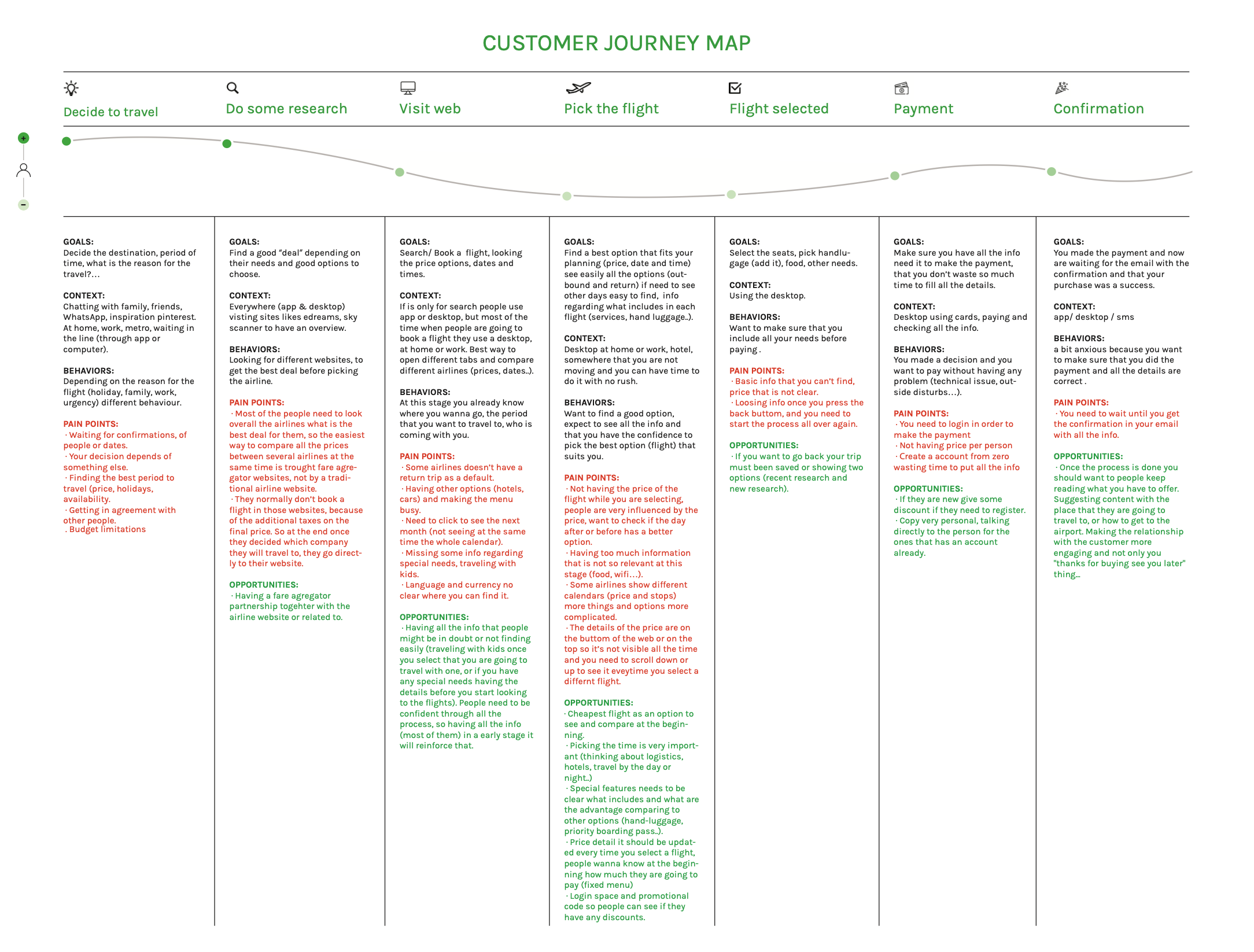
To see the full picture, I mapped the journey from the moment someone decides to travel all the way through to confirmation, capturing goals, behaviors, and pain points at every stage.
Key Insights
1.
Price confidence is everything.
Users want to know what they're paying at every step — visible, real time, and broken down clearly.
2.
Desktop is where bookings happen.
82% of users book on desktop, in a focused environment where they can take their time.
3.
Users arrive
informed.
They've already compared prices — they don't need to be sold to, they need a fast, clear path to booking.
4.
Contextual help reduces anxiety.
The right information needs to appear at the moment it's relevant, not buried in a help section.
5.
Never lose the user’s context.
A persistent booking summary throughout the funnel is essential for trust and reducing errors.
Design Process
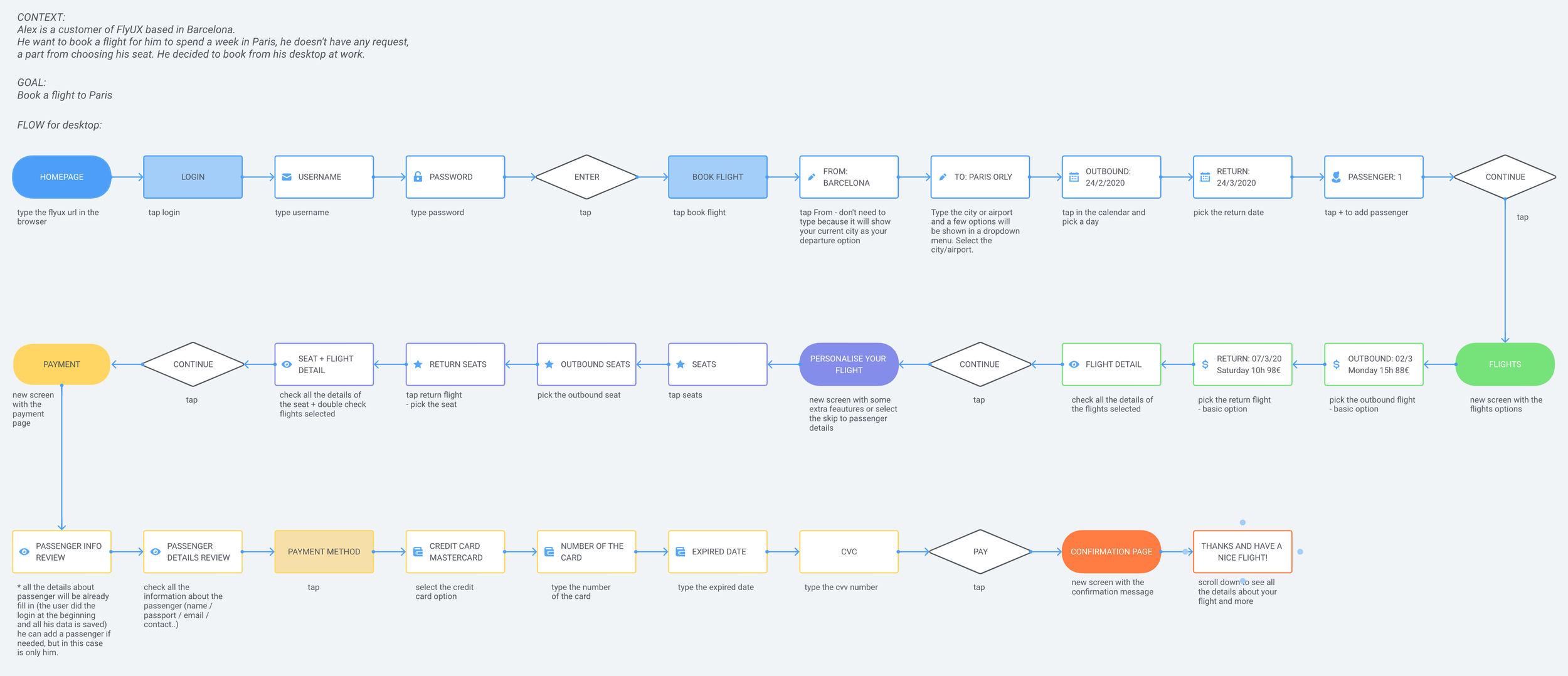
USER FLOW
Before sketching a single screen, I mapped the complete desktop flow for a logged-in user booking a return flight for three passengers — every step, every decision point, every edge case. Mapping the logic first forced decisions about sequence before any visual thinking began.
With the key insights defined, the design moved through three layers before touching Figma: user flow, navigation, and interaction design.
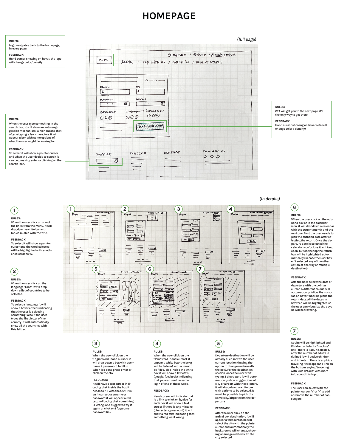
STRUCTURE FIRST
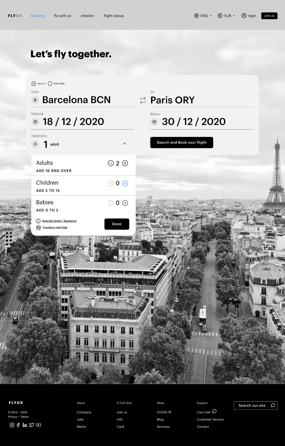
The first round defined the skeleton of every page: menus, step indicator, CTA placement, and the persistent flight summary sidebar. Key decision made here: the summary column stays fixed and never scrolls away.
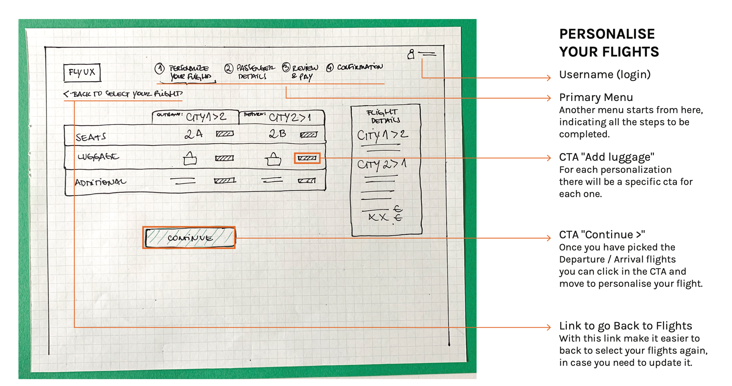
DESIGNING THE DETAILS
The second round mapped interaction rules, feedback states, and validation logic across all screens, so by wireframing, the core logic was already defined. Notable decisions included pre-filling the departure city from the user’s location, restricting children and infants until an adult is added, and disabling the Pay CTA until all fields are valid.
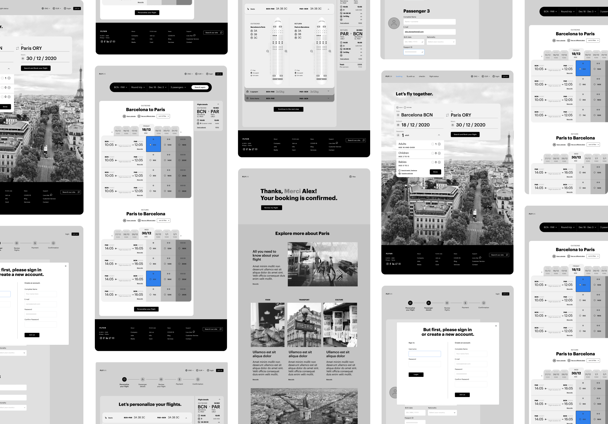
The Solution
The final wireframes cover the complete desktop booking flow from the homepage to the confirmation page. What follows are the key design decisions and the thinking behind them.
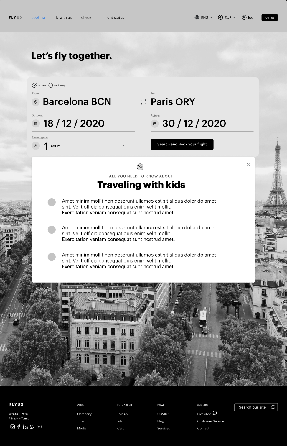
Contextual help at the right moment
When a child is added to the booking, a “Travelling with kids” link appears, surfacing a modal with all the information parents need before continuing, addressing concerns before the flight selection begins.
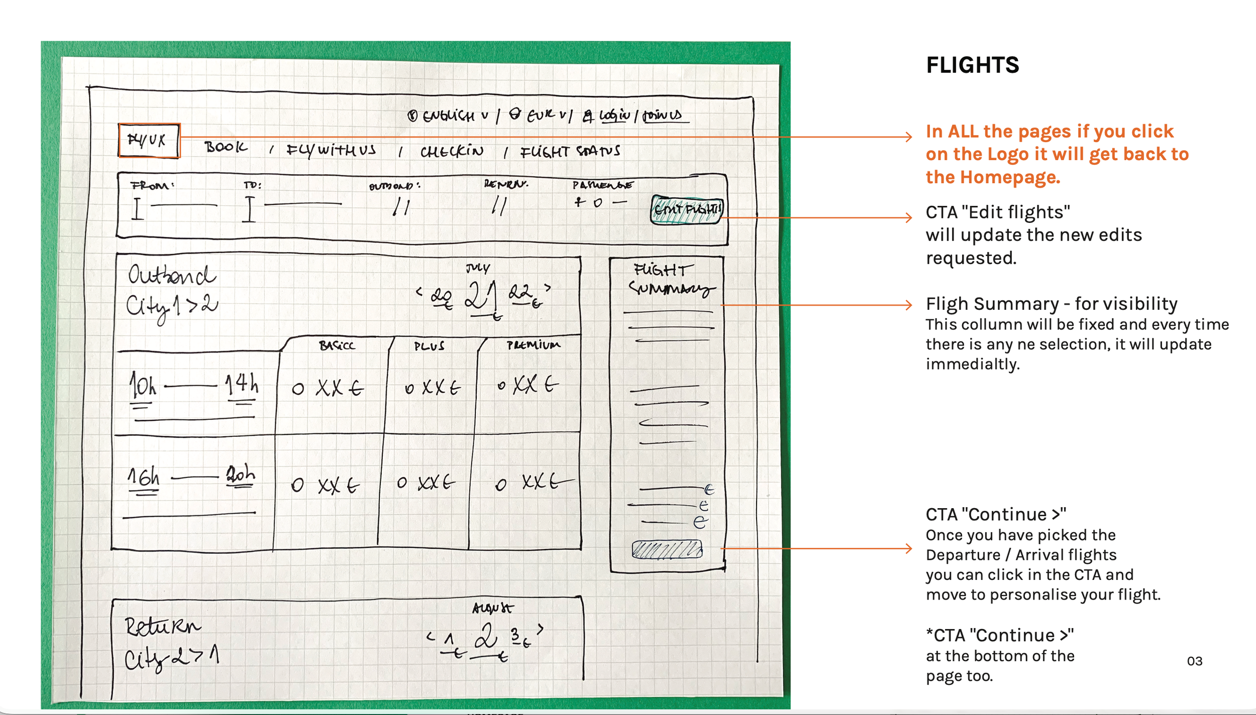
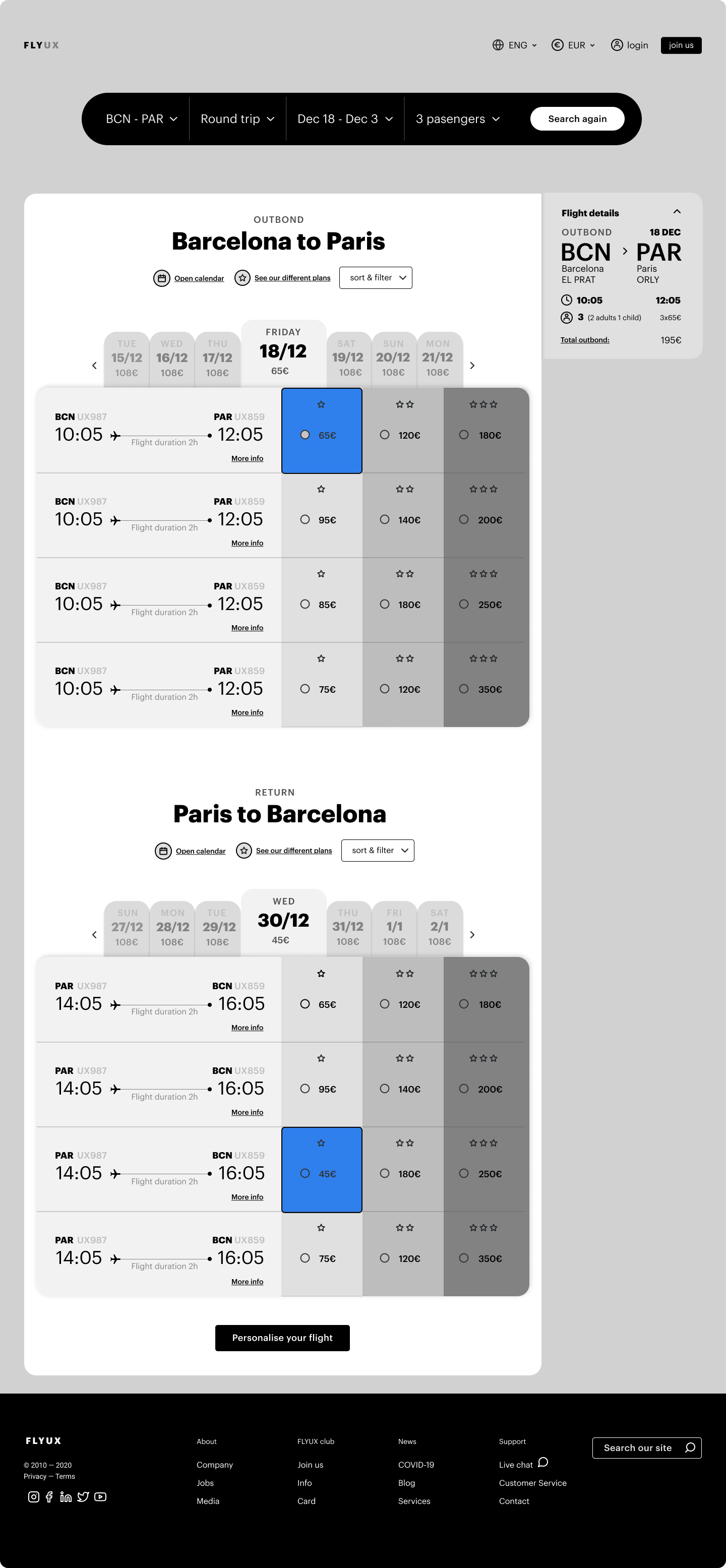
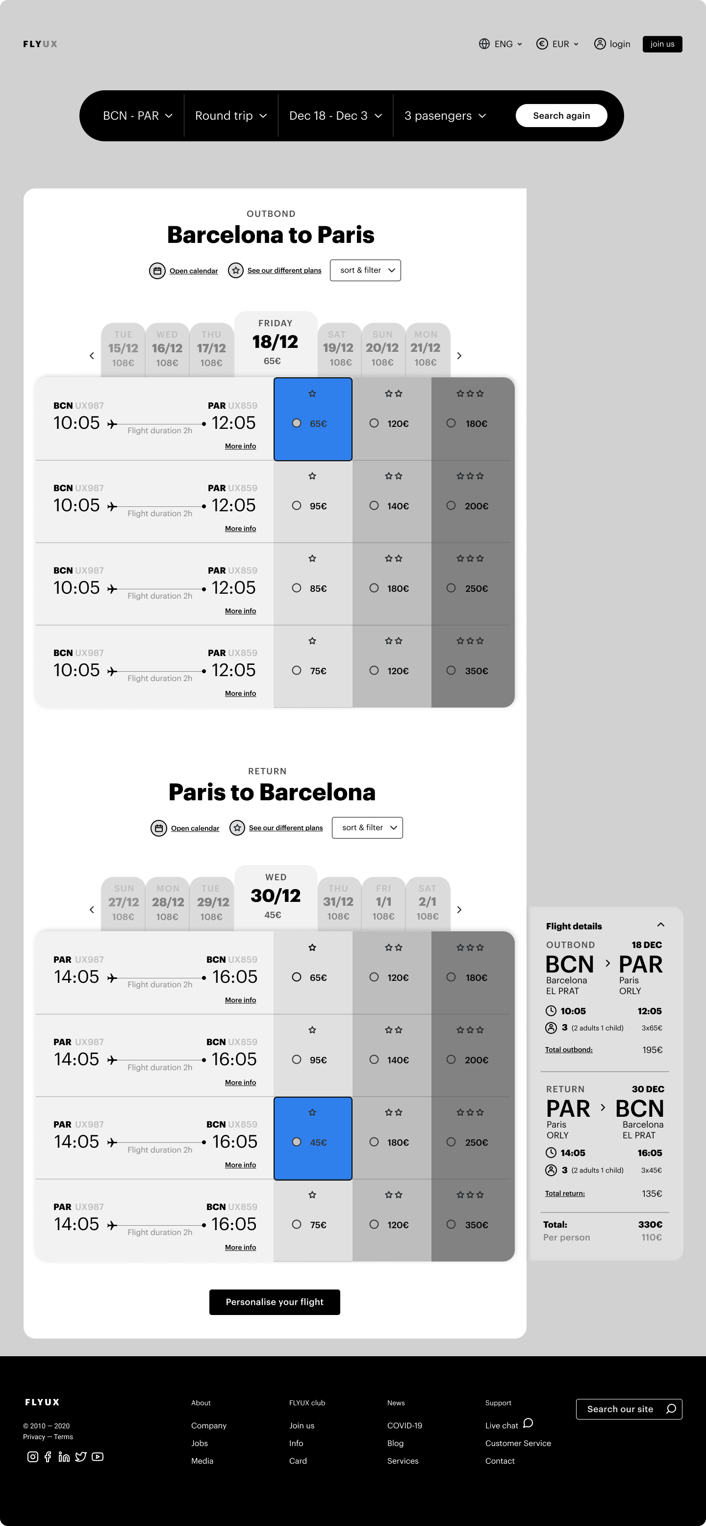
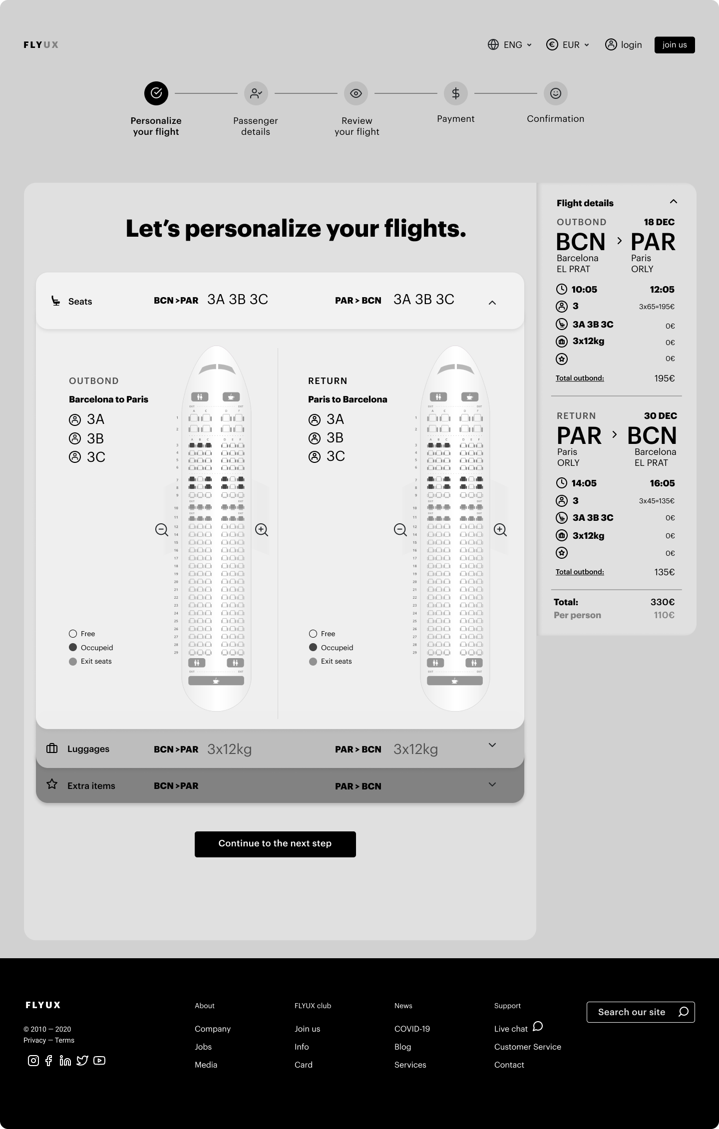
Price transparency throughout
Flight results show outbound and return on the same screen, with a date strip for price comparison across adjacent days. A persistent Flight Details sidebar updates in real time with every selection. The total is always visible.
A seat map that shows both flights at once
Outbound and return seat maps shown side by side. Select outbound first, return second — unselected side dimmed until ready. Less back-and-forth, clearer full picture.
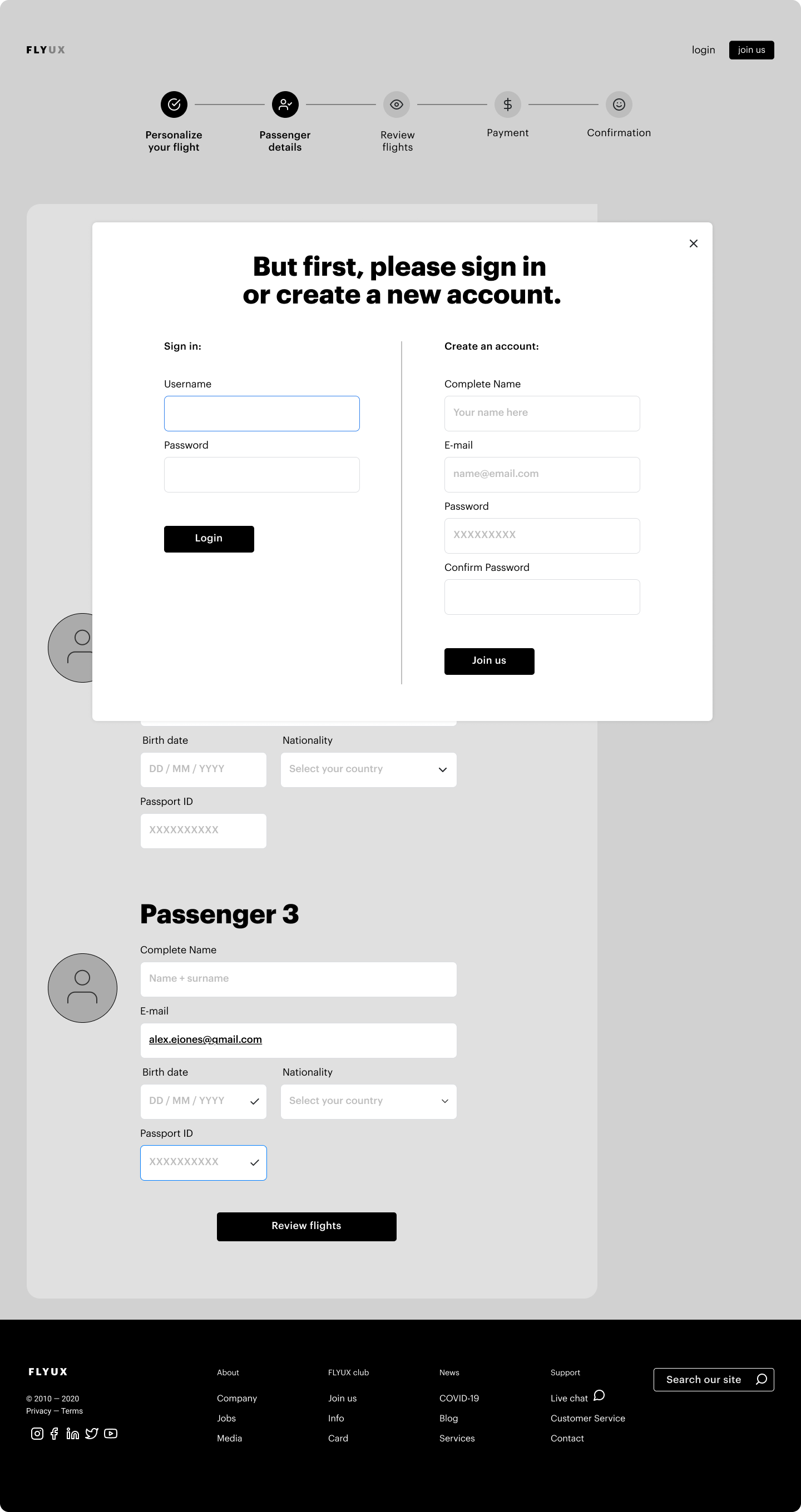
Login at the right moment,
not the first
Login modal appears between personalisation and passenger details — the natural moment when account data becomes useful. Side-by-side login and account creation, with a skip option. Never a gate.
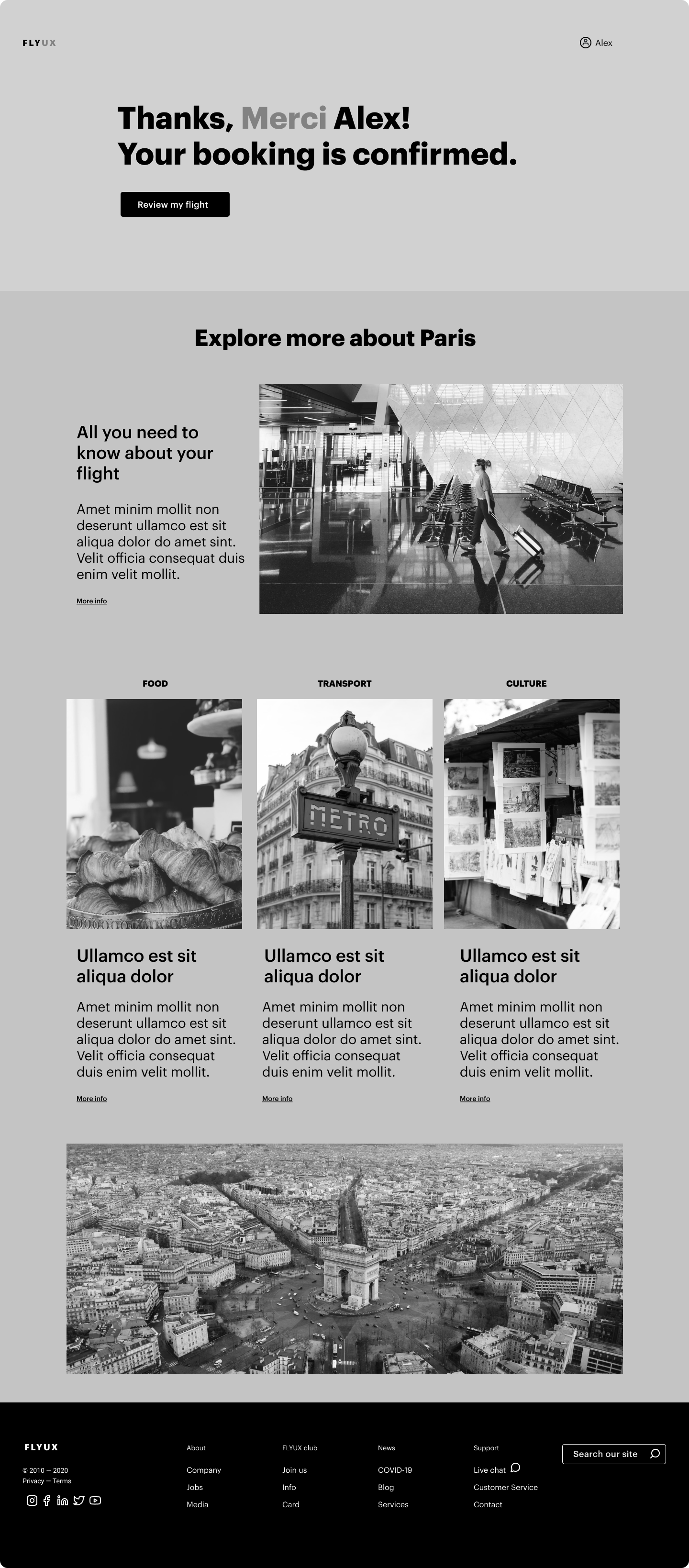
A confirmation page that goes further
Confirmation greets the user personally, confirms clearly, then offers destination content — food, transport, culture. The relationship doesn’t end at the transaction. It extends it.