Category Pages for
E-commerce
SITE EXPERIENCEAs Senior Designer on the Category Experience Europe team at Vistaprint, I worked at the intersection of UX, visual design, and cross-functional collaboration to craft and refine category pages across multiple levels and product pages. I also collaborated with production, photographers, 3D artists, and retouching specialists, to ensure visual content supported usability and consistency.
1/3
Paper Bags Revamp
USER JOURNEY > CATEGORY PAGE
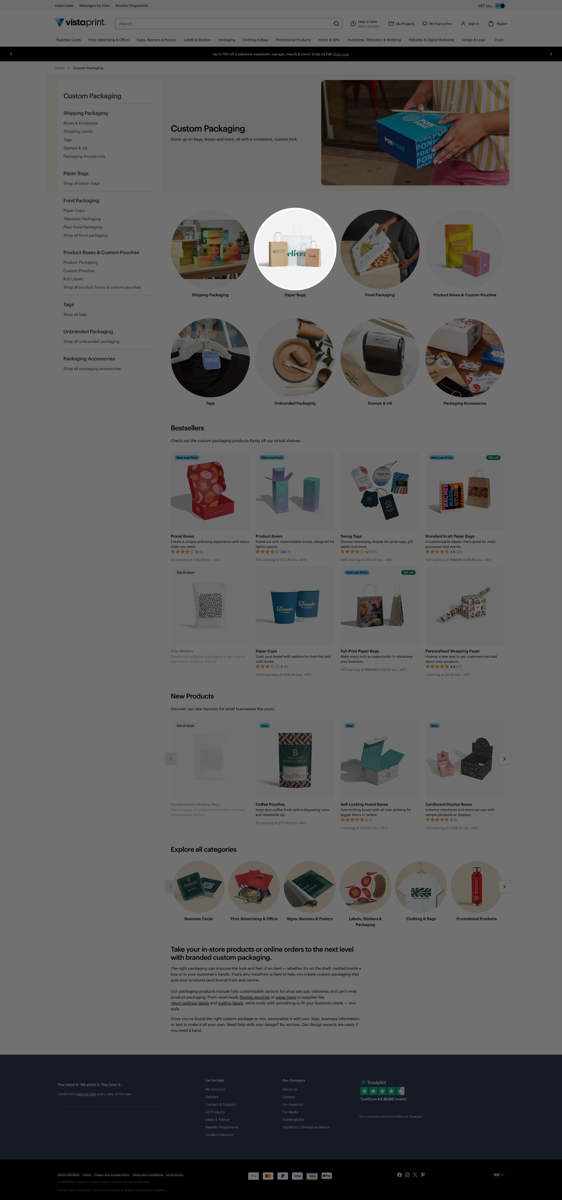
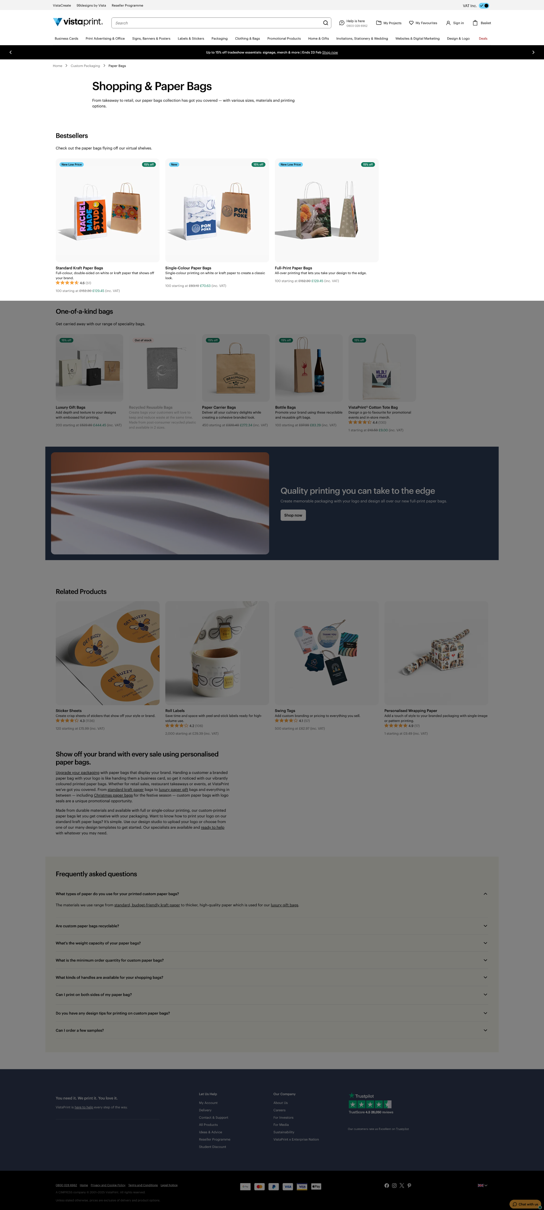
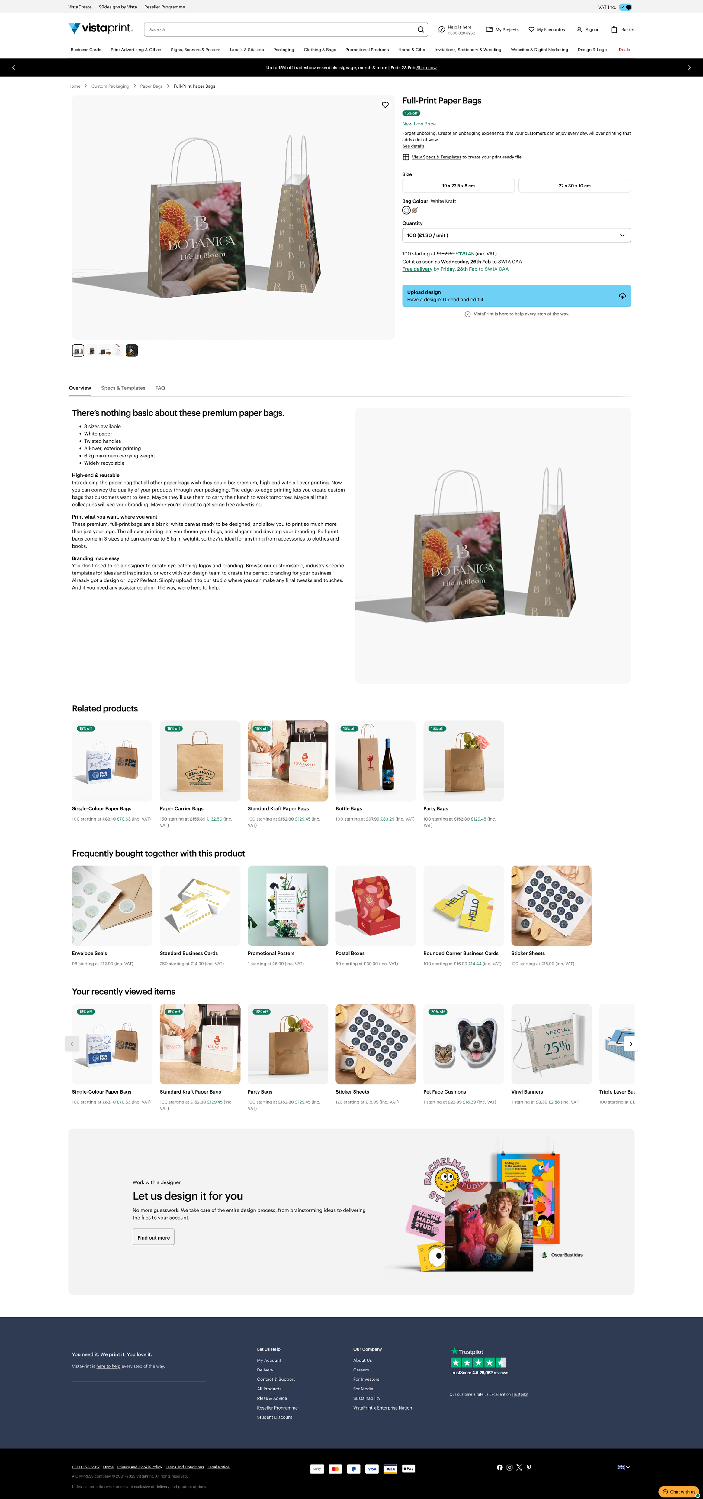
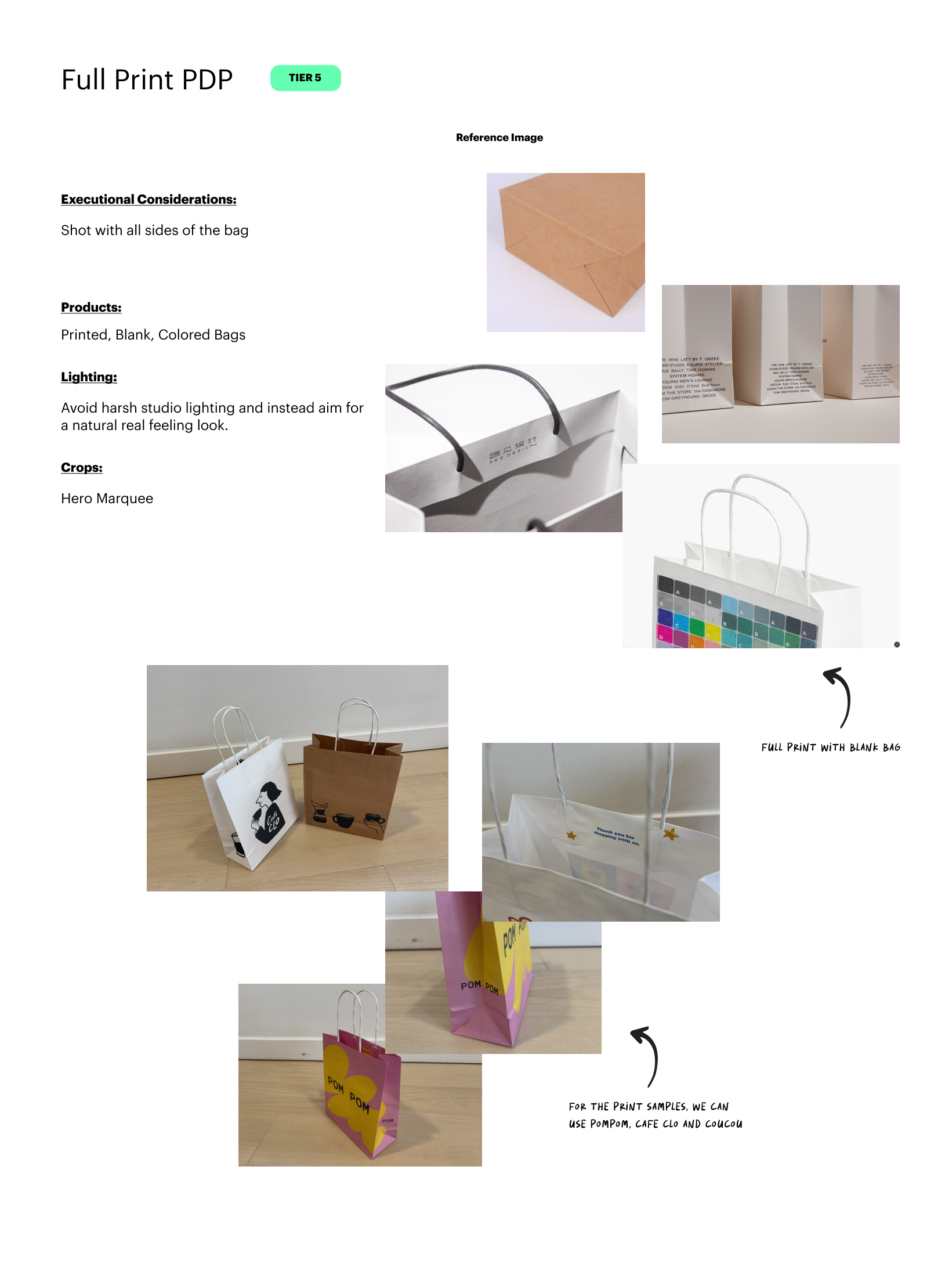
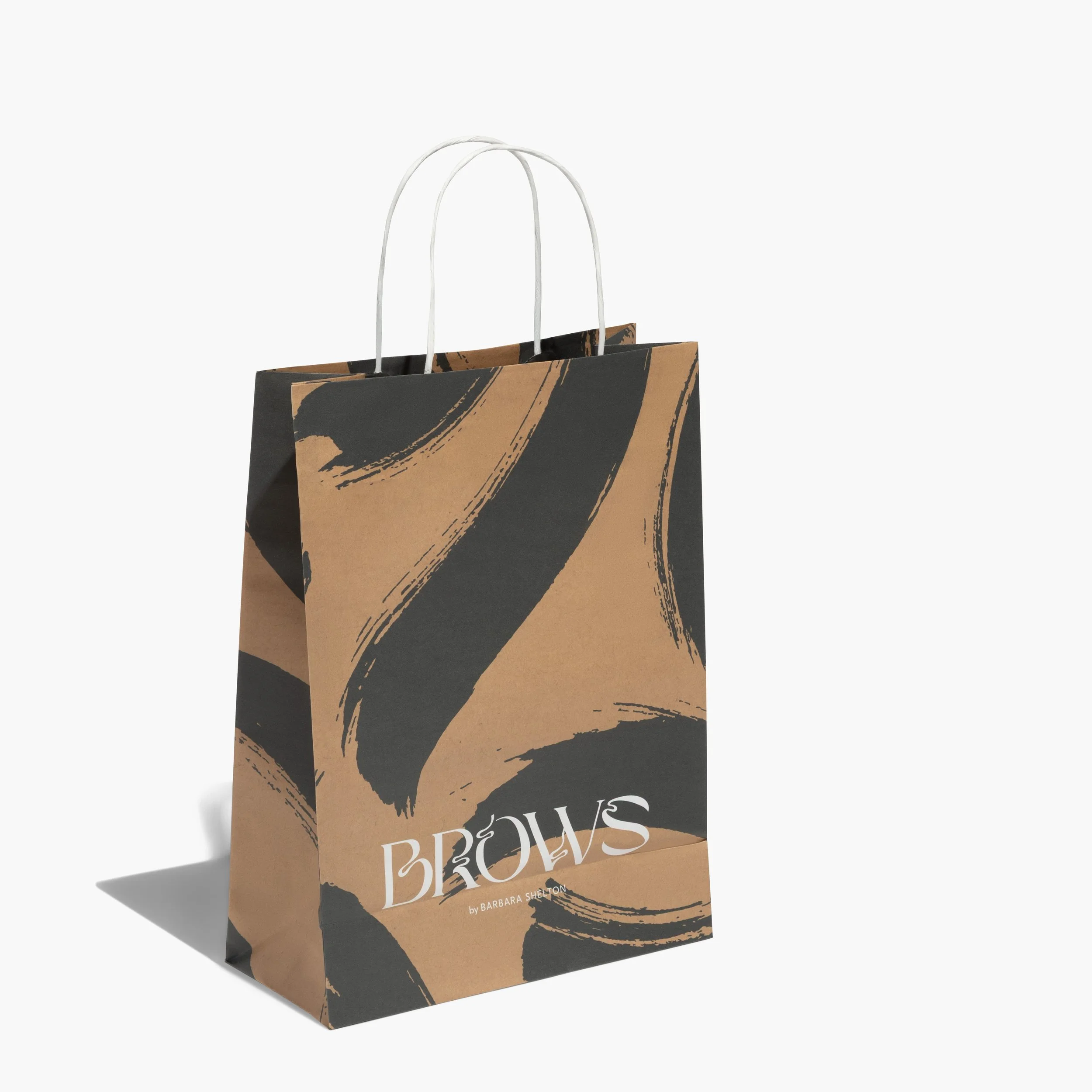
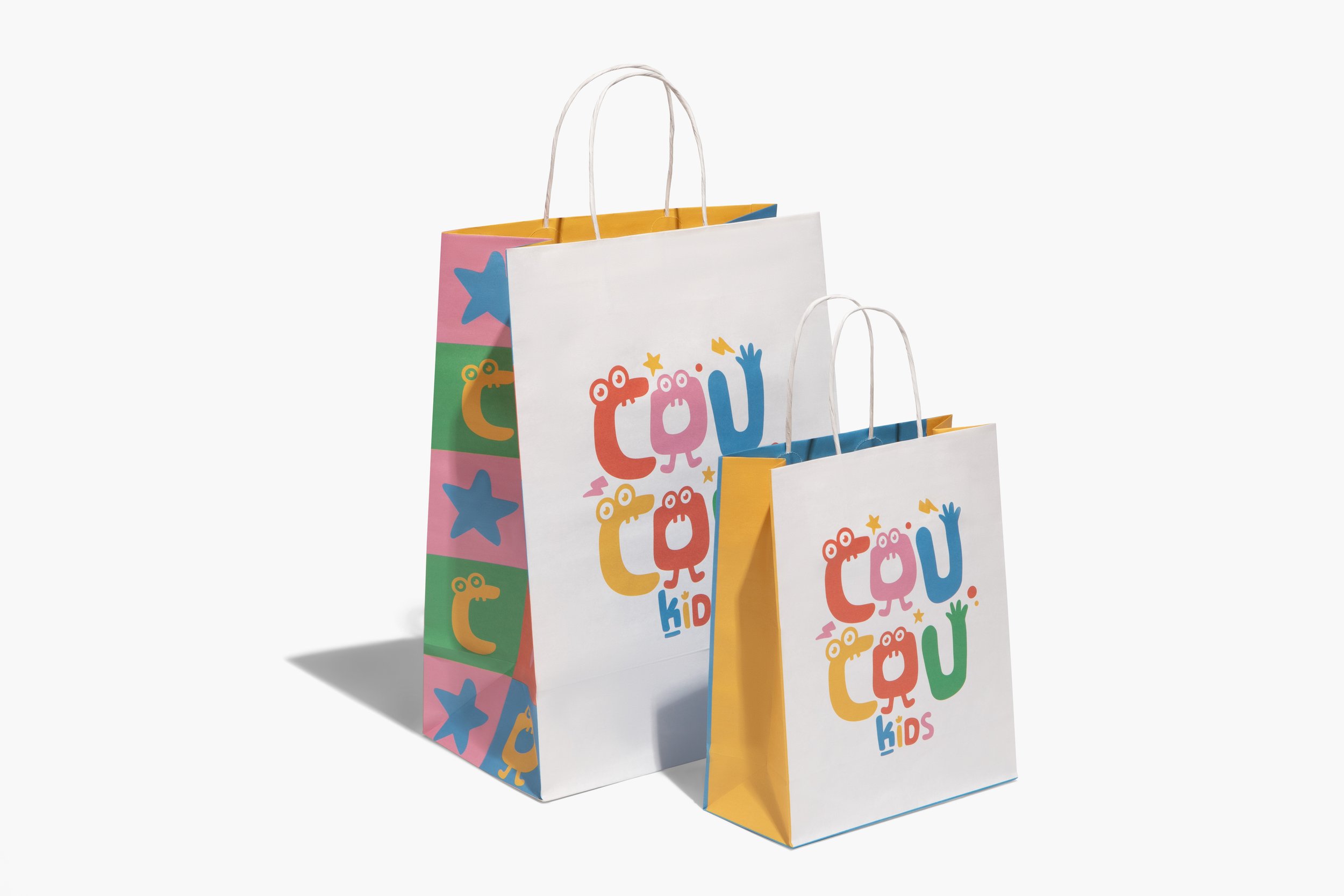
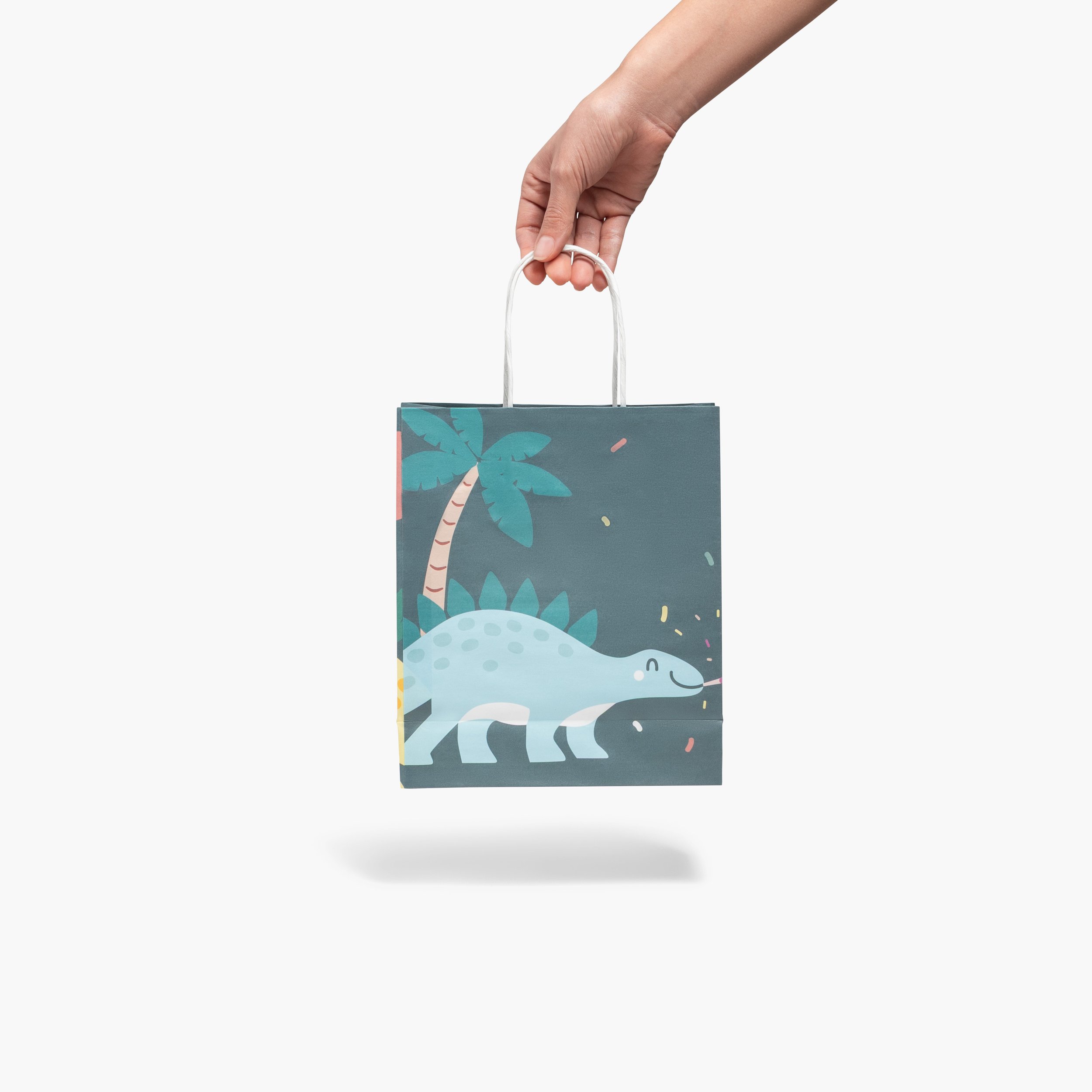
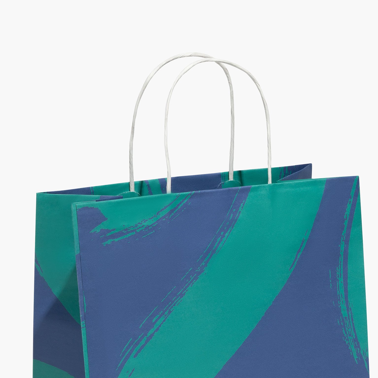
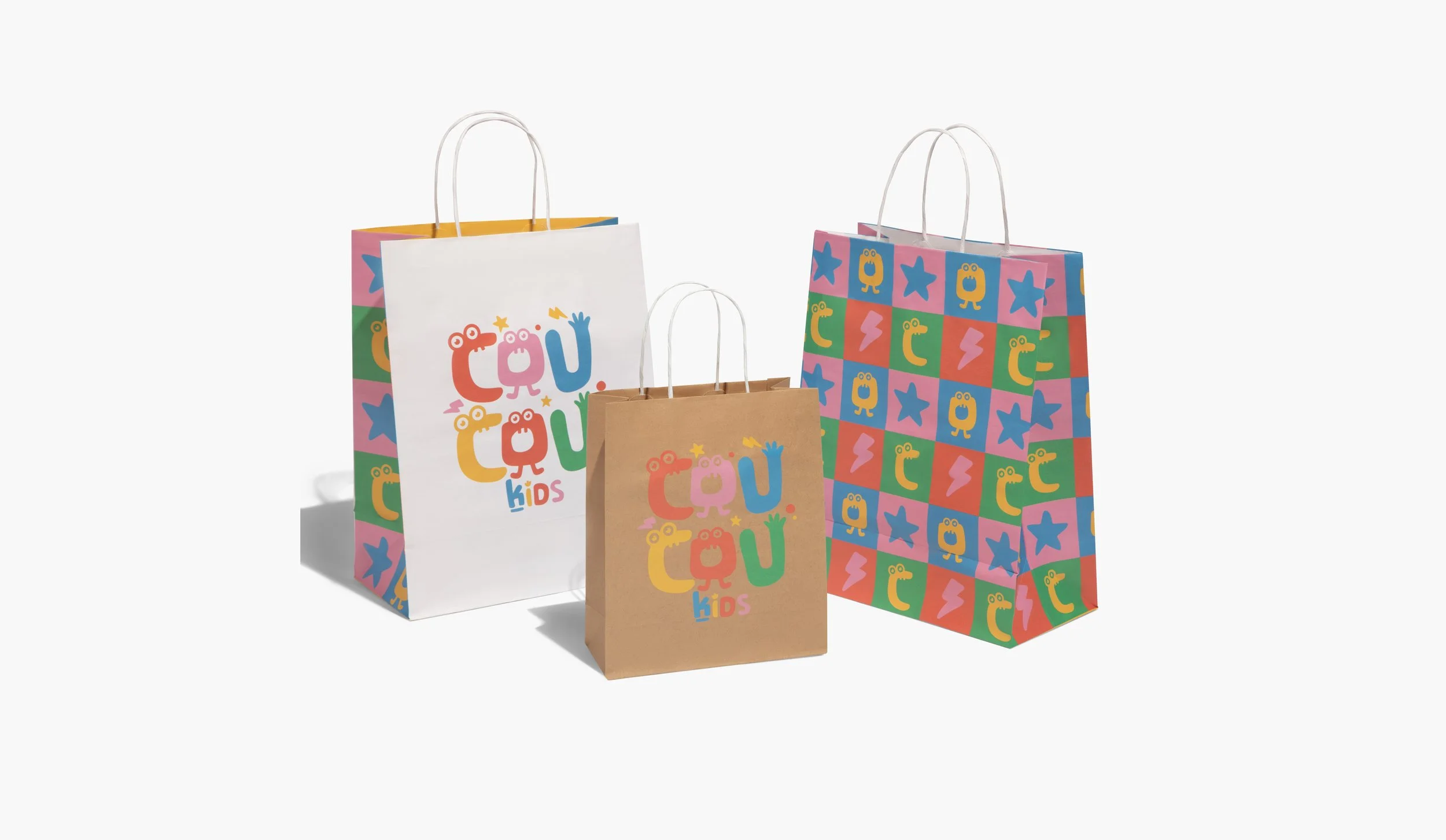
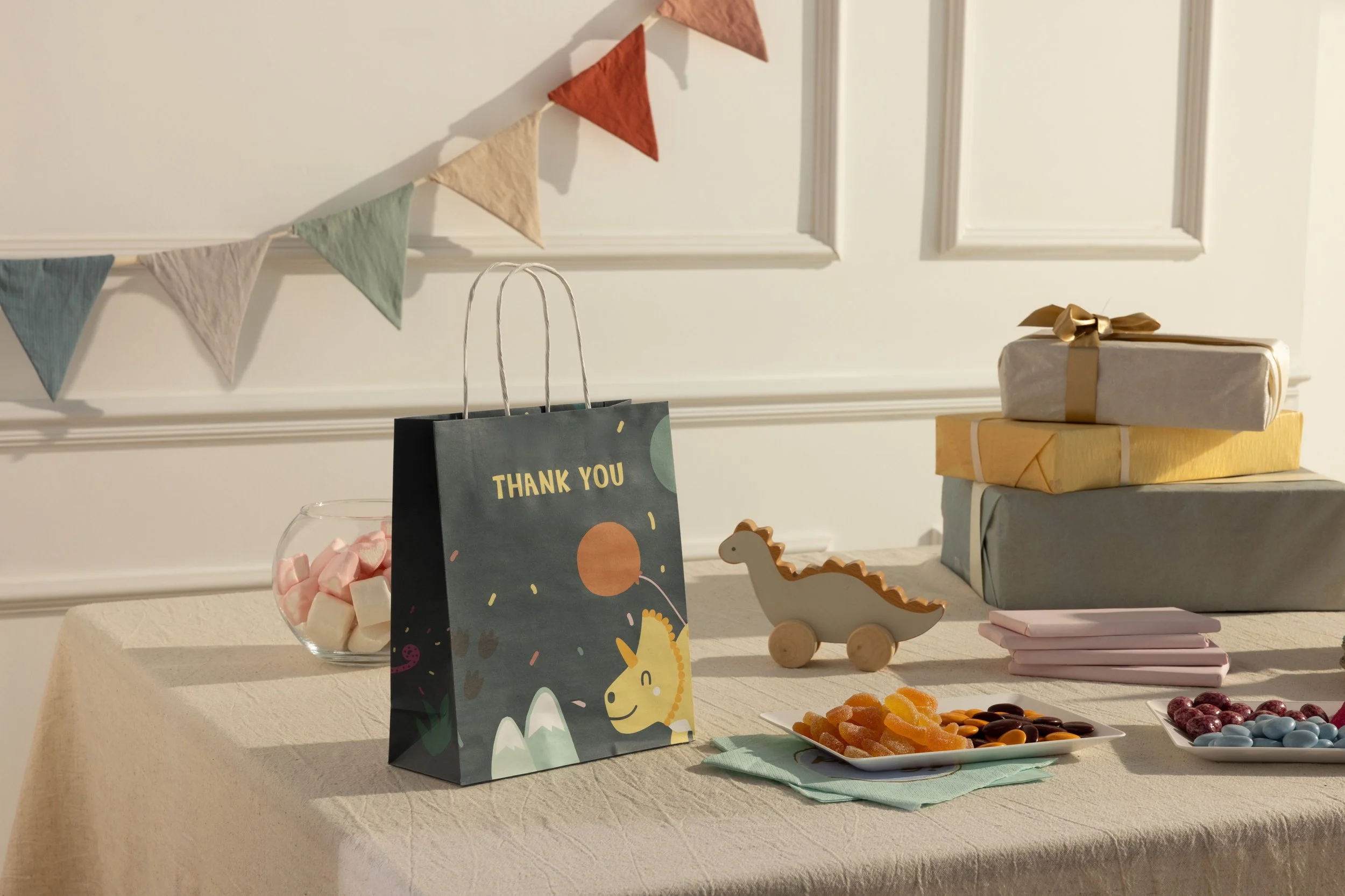
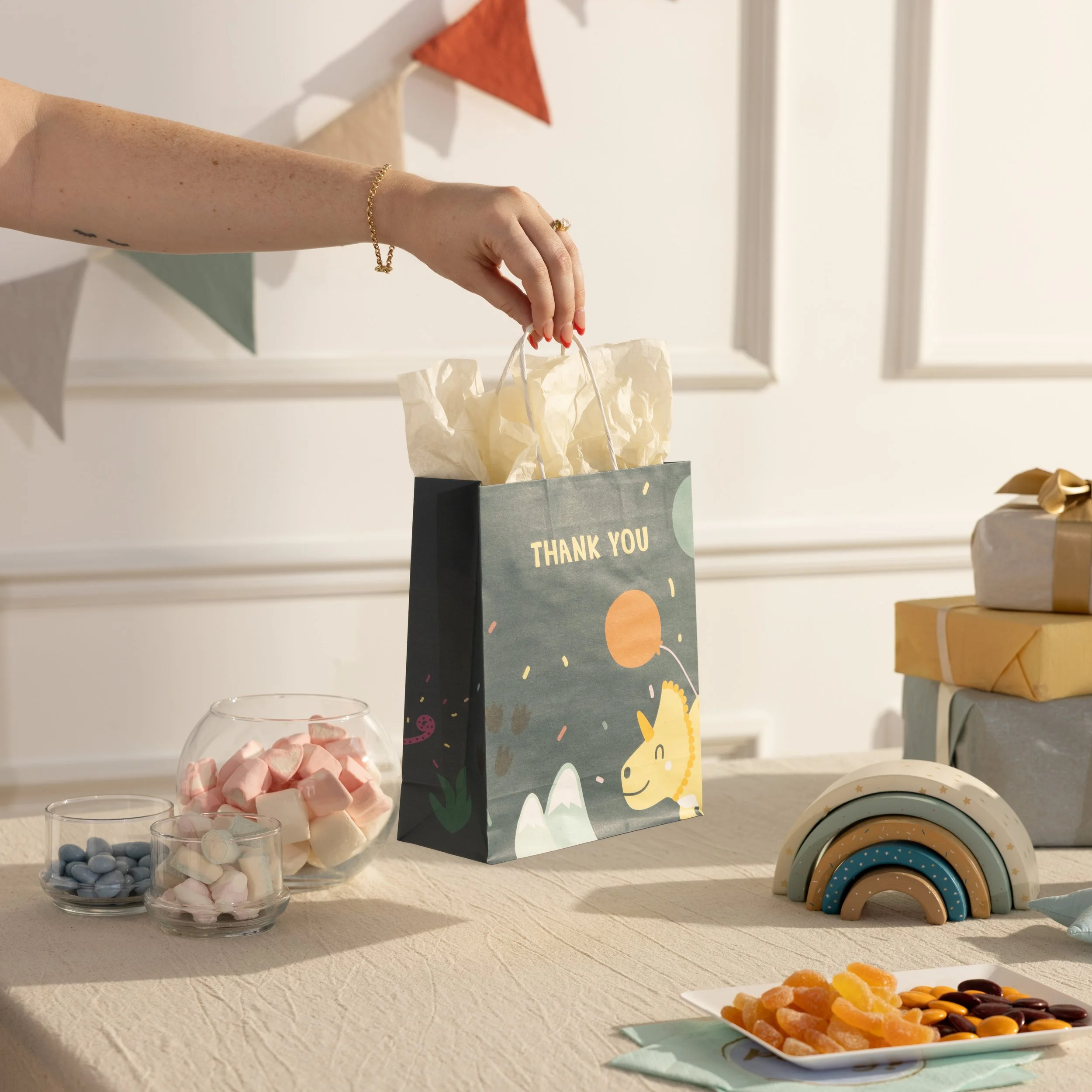
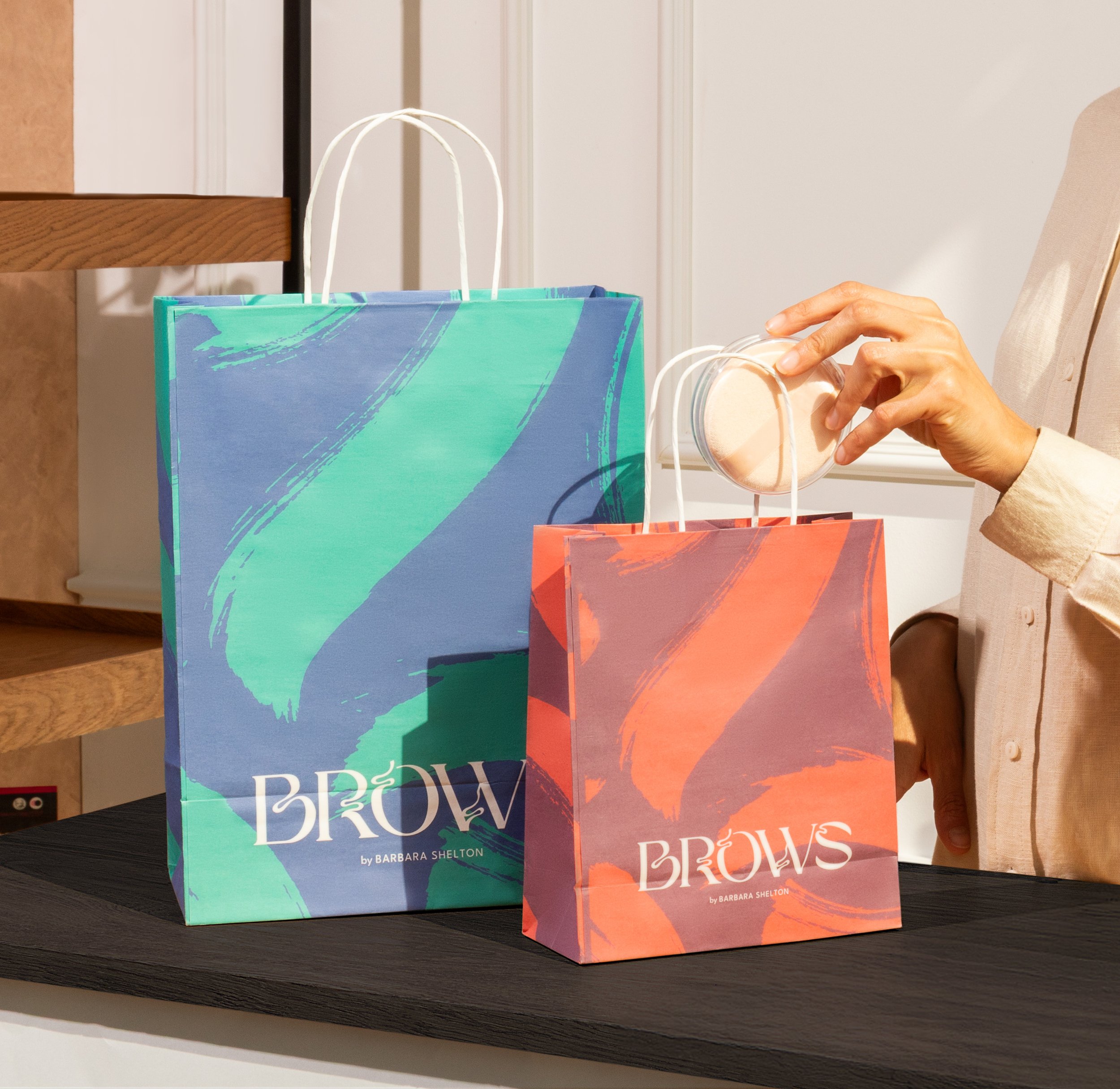
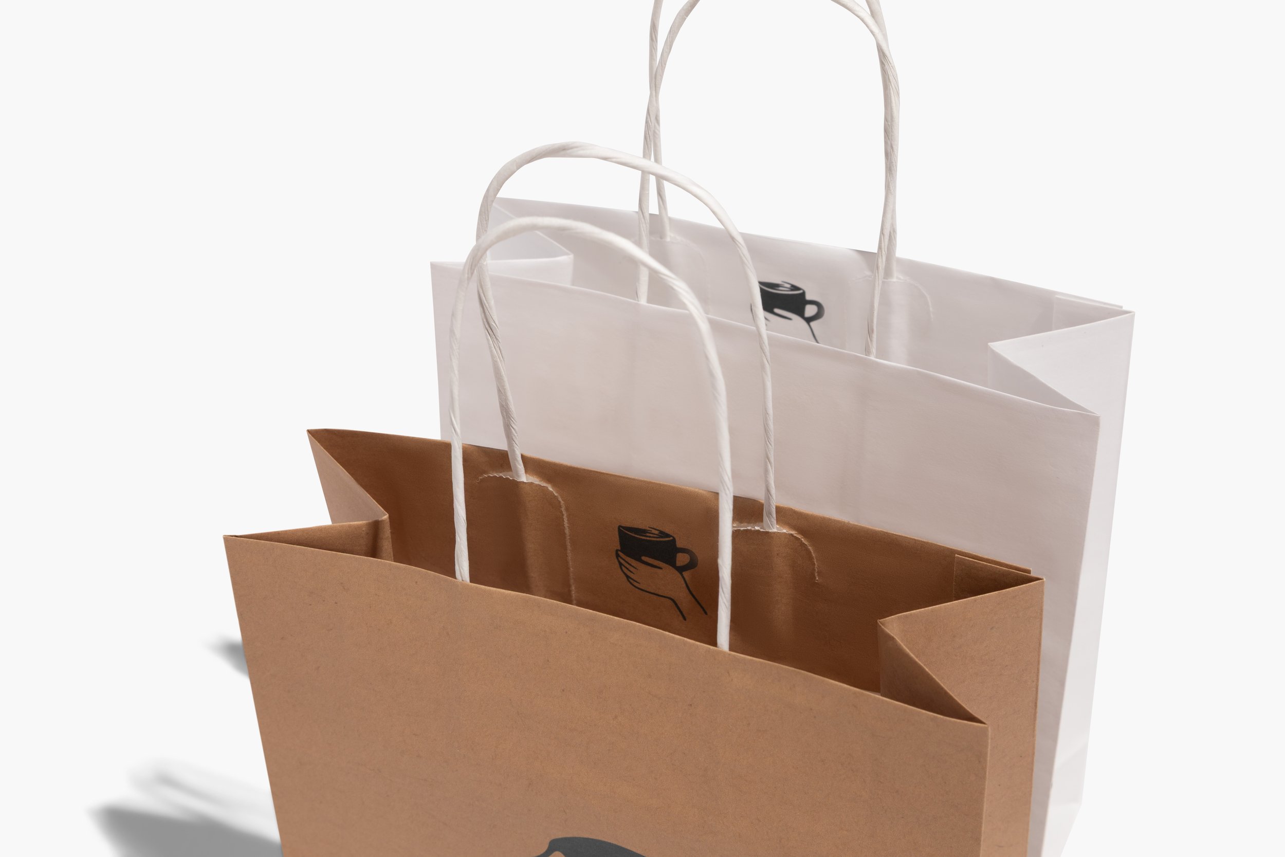
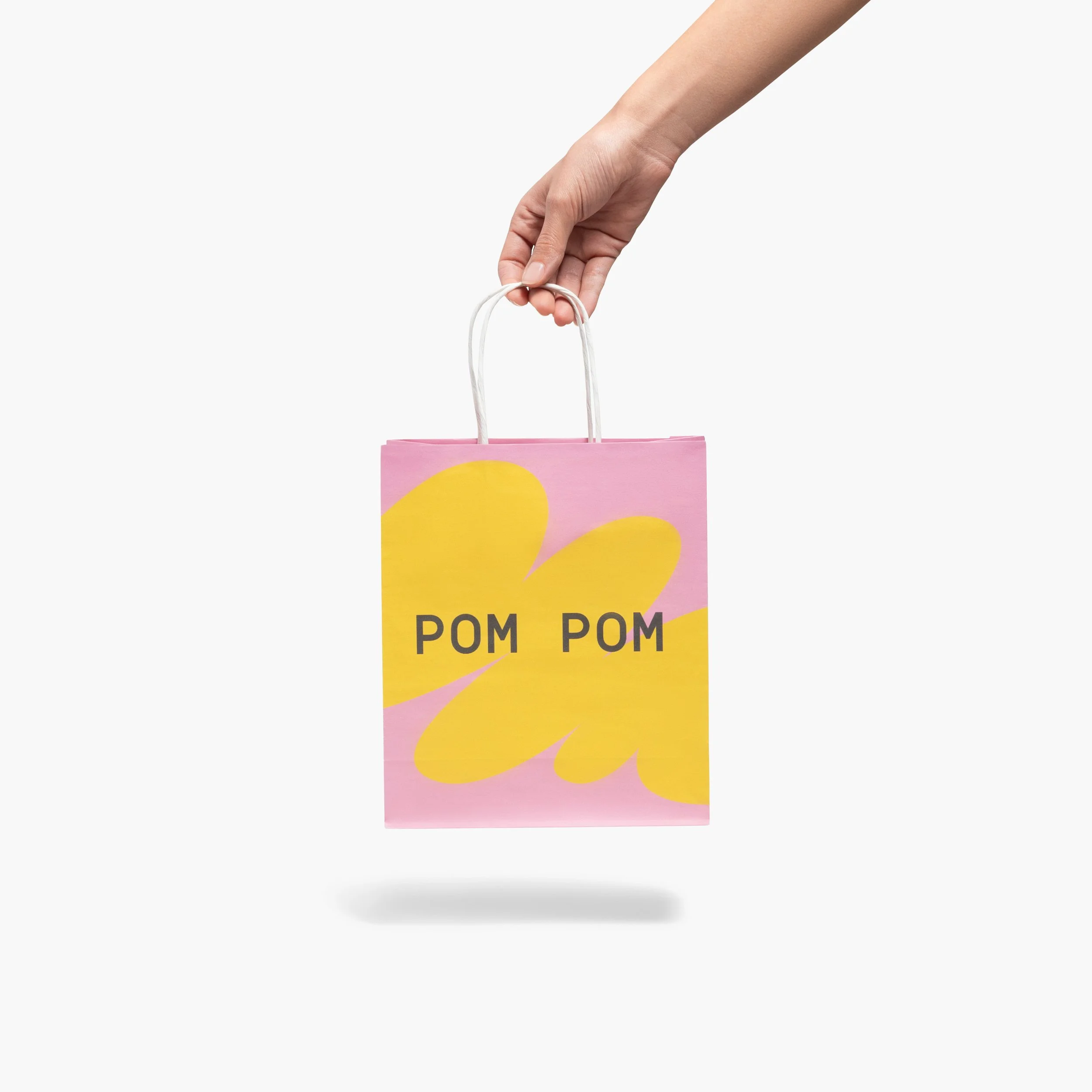
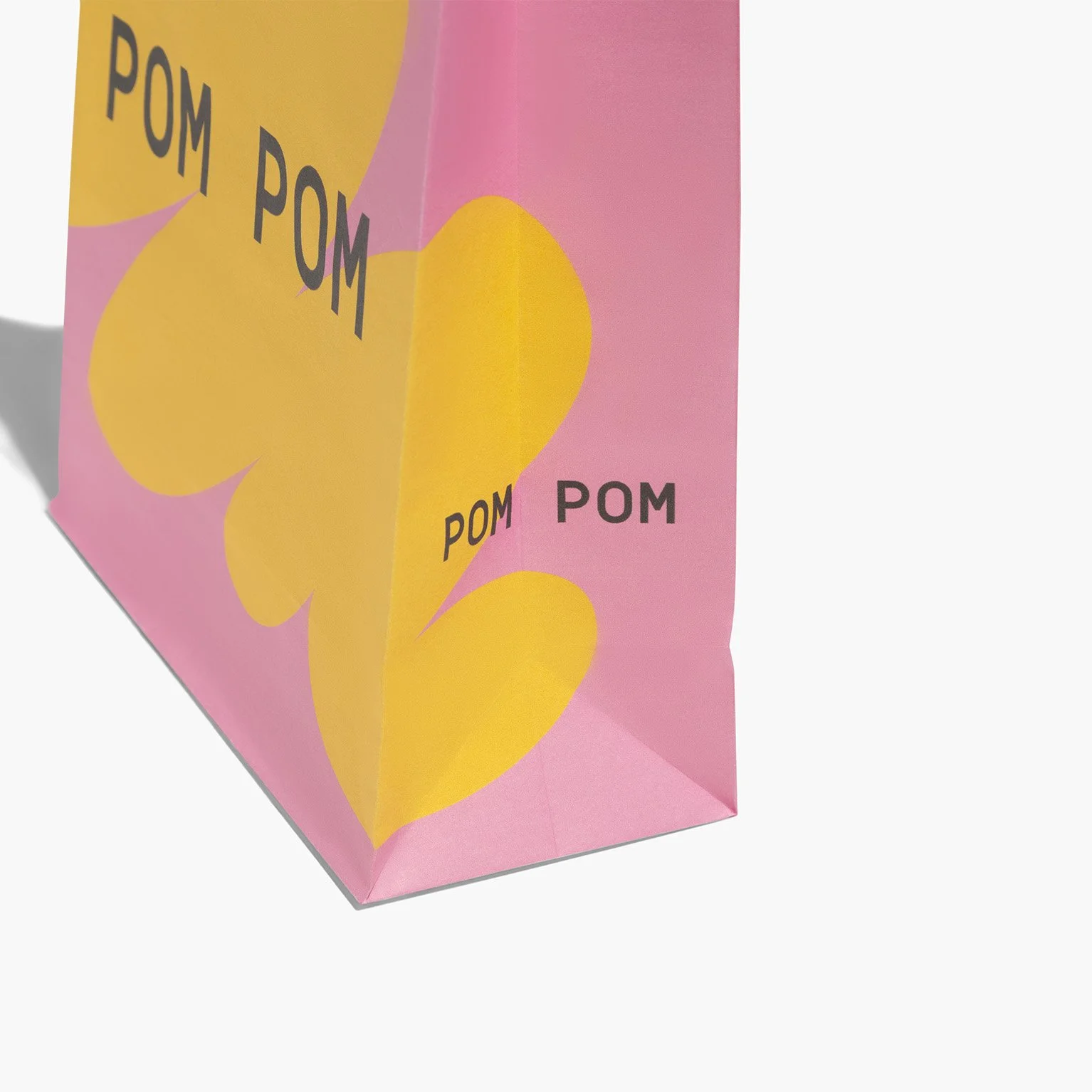
The Paper Bags subcategory represents one of the year’s biggest areas of growth for the company, offering a wide range of customizable print options.
The goal of this project was to refresh the Paper Bags subcategory inside the Packaging category, by introducing new imagery that highlights the full range of print options and use cases. From category to product pages, the redesign aimed to create a more inspiring and informative shopping experience.
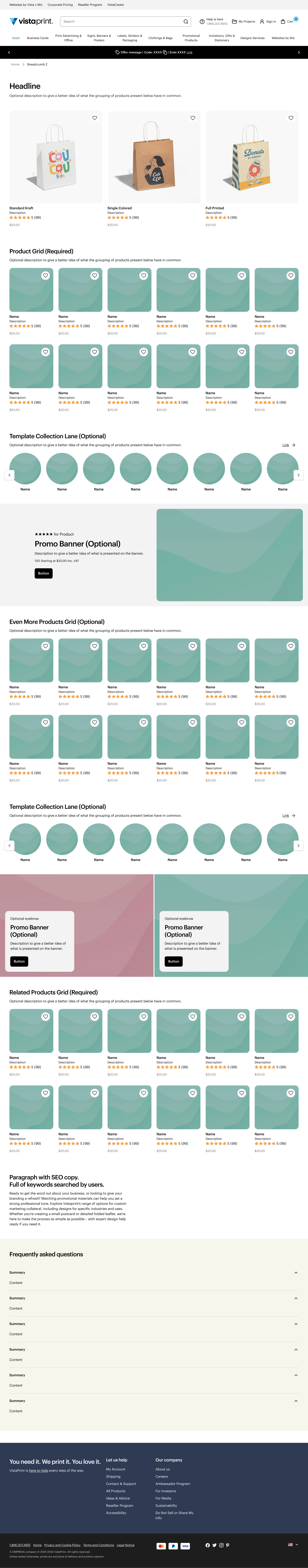
> SUBCATEGORY PAGE
> PRODUCT PAGE

CHALLENGE
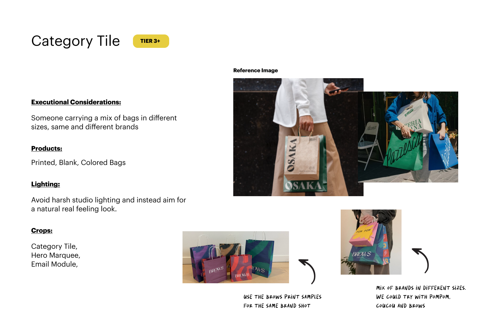
The main challenge of this project was the tight timeline and the lack of printed samples available in the warehouse in Tunis. Despite these constraints, we needed to produce a large volume of imagery, from lifestyle shots to studio and close-up photos, to showcase the full range of printing options and inspire customers with creative use cases.
OUTCOME
The project resulted in over 50 high-quality images covering all key angles and styles. Most importantly, we delivered the right visuals for each product page — improving consistency across the category and enhancing the overall user experience.
PROCESS
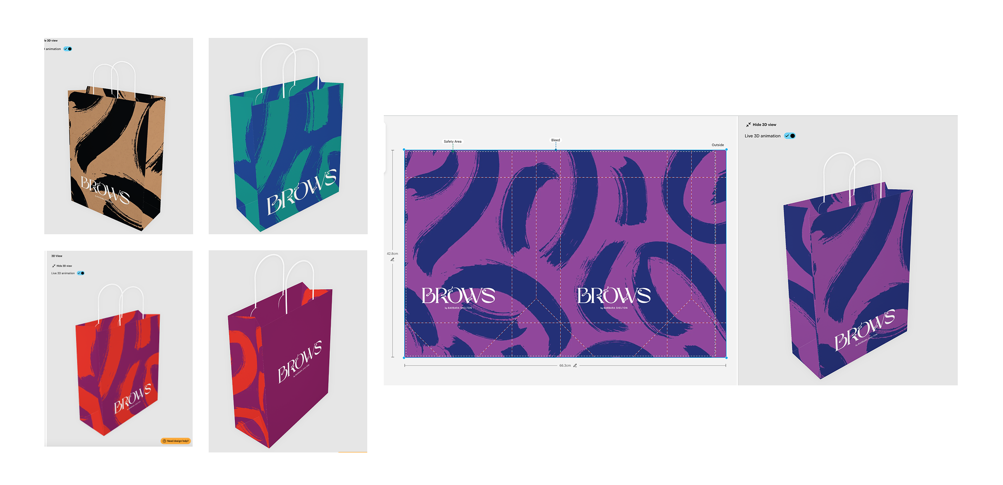
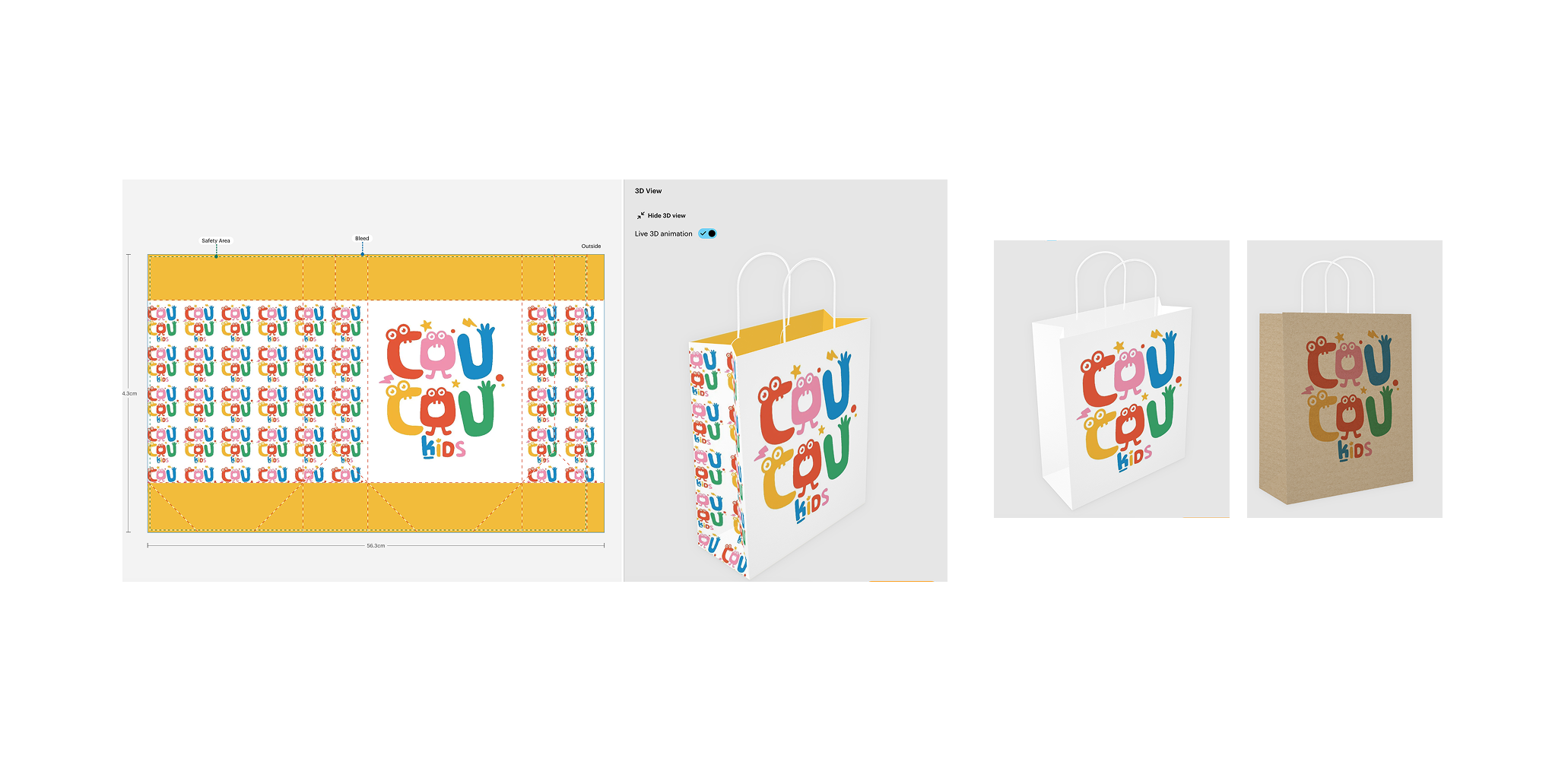
I began with preparing a detailed photo brief outlining all shot types — from lifestyle to close-ups — supported by visual references to guide the team. Once the direction was set, I created all the paper bag samples by adapting existing designs from our library, ensuring we captured a wide range of print variations building a rich and inspiring visual range for the shoot.

NEW EXPERIENCE
Client: Vistaprint
Year: 2025
Role: Art Director, working closely with the photography and retouching team. I also coordinated and managed the creative workflow, ensuring timely delivery while aligning cross-functional teams and stakeholders.
I learned the importance of clear, frequent communication, especially when directing remotely. Quick alignment and transparency made it possible to stay efficient and creative despite the tight timeline.
2/3
Collections Pages
USE CASE: BEAUTY & SPA ESSENTIALS
USE CASE: STARTING A NEW BUSINESS
PROCESS
To build each Collection Page, I started by identifying a brand that best represented the use case or industry focus. From there, I used the brand’s color palette as a visual thread to connect all the products and create a cohesive narrative.
The composition balanced studio and lifestyle photography to make the page visually engaging and easy to navigate, despite the wide variety of products included. This approach helped maintain visual harmony and ensured the collection felt curated, relevant, and aligned with the brand story.
The Collection Pages were conceived as a new type of shopping experience designed to highlight use-case specific collections of products.
Our goal was to enhance product discovery, drive conversion, and provide an intuitive, visually engaging shopping experience tailored to specific customer needs.
OUTCOME
Successfully delivered clear, use-case-focused experiences that reflect customer needs while showcasing the breadth of our products and materials. They introduced new products and highlighted our services, all within a single, cohesive page. By combining product discovery with our brand messaging, these pages reinforced our position as a design and marketing partner for small businesses, creating a strong, impactful experience that communicates both inspiration and practical solutions.
Client: Vistaprint
Year: 2024
Role: Senior Designer, working closely with Production and Retouching teams.
CHALLENGE
Each collection brought together items of different formats, styles, and quality, requiring a flexible design template that could adapt without compromising clarity or visual appeal.
Since these pages would be implemented in 11 different languages, the design needed to be globally consistent, avoiding localisation-specific elements while maintaining a strong, recognizable brand identity.
3/3
Category Pages
System
This project was part of the Navigation & Taxonomy team, which I had the opportunity to join during the discovery phase.
Category pages act as mid-funnel touchpoints that help customers find, learn about, and get inspired by products. They play a key role in turning broad interests into confident purchasing decisions—bridging the gap between initial discovery and final conversion.
Our goal was to define a seamless and intuitive browsing experience across all category pages, ensuring clarity, consistency, and ease of navigation throughout the user journey.
During this phase, I collaborated closely with the lead product designer to explore user needs, analyze current behaviors, and identify key opportunities for improvement within the browsing flow.
Even though the project was put on hold before moving into full design implementation, this experience was incredibly valuable in shaping my UX approach. I gained hands-on exposure to:
Facilitating and synthesising user research insights to inform design decisions.
Collaborating closely with a lead designer and cross-functional teams in a discovery context.
Understanding how taxonomy and navigation structures influence user journeys at different stages of the funnel.
DISCOVERY
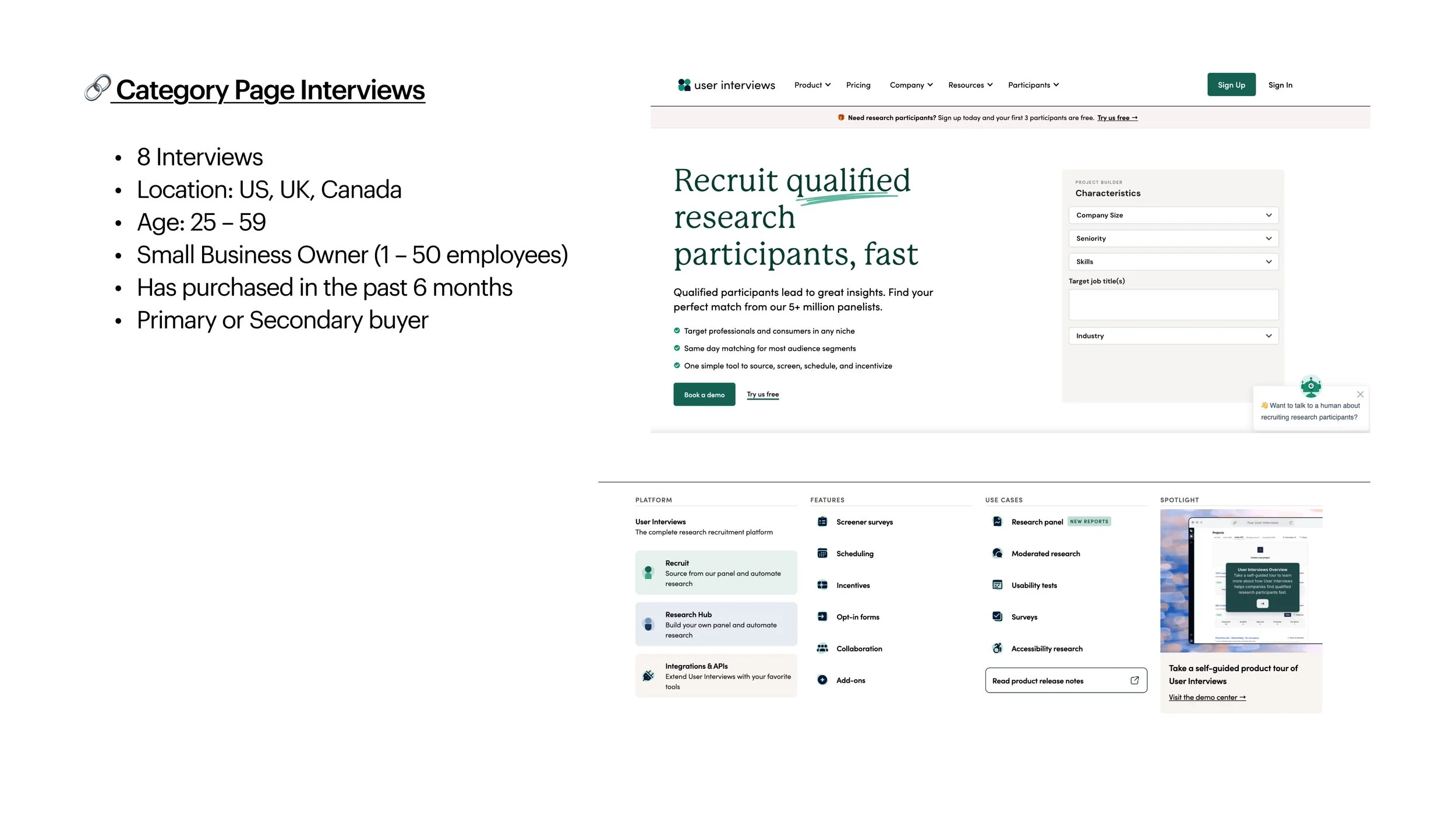
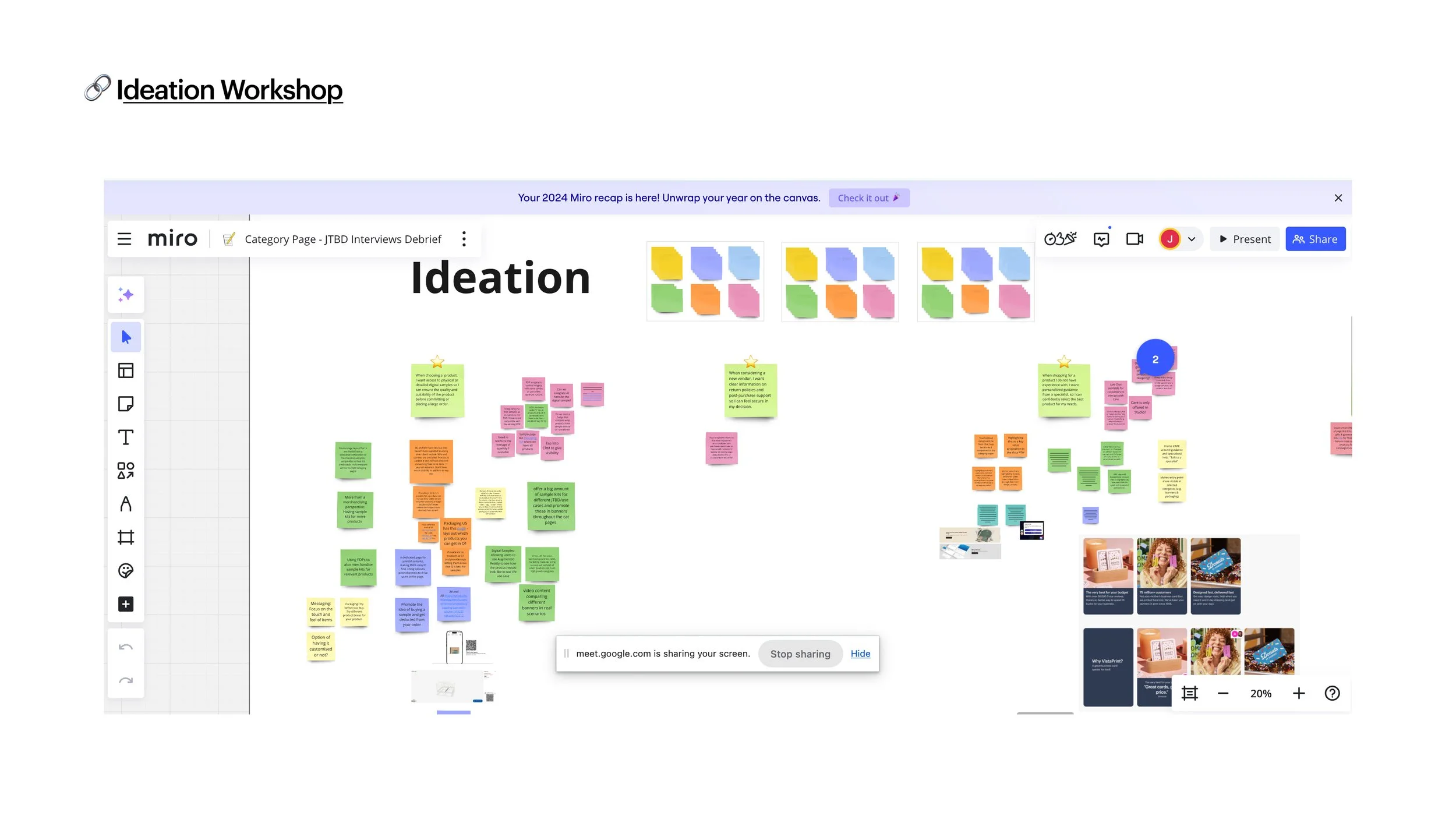
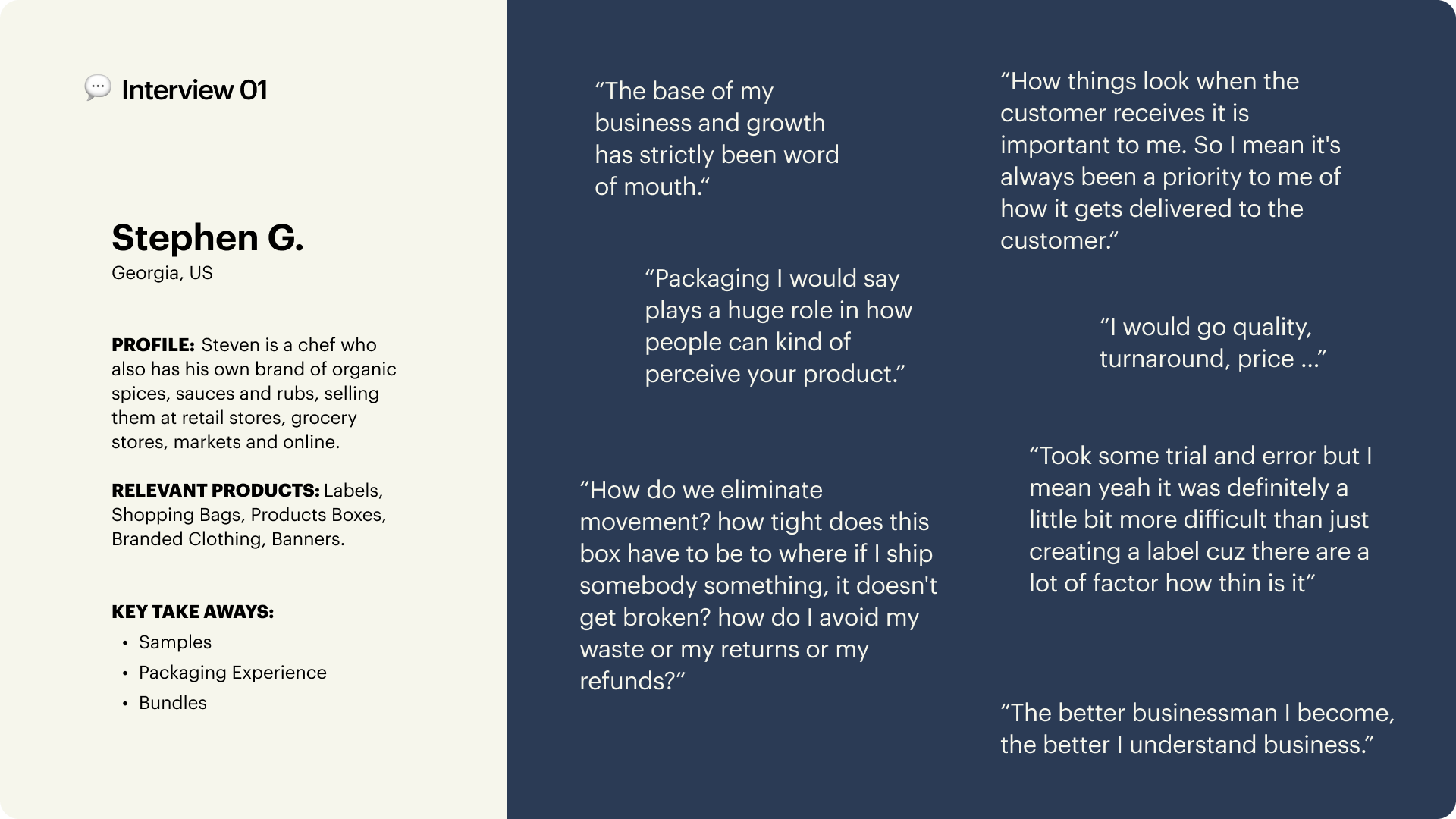
During the discovery phase, we conducted in-depth interviews with real customers to better understand their motivations, browsing habits, and pain points when navigating product categories.
In parallel, we held a series of cross-functional workshops with different teams (including content, product, operation, care and engineering) to gather diverse perspectives and uncover internal challenges affecting the browsing experience.
By synthesising our findings, we identified key statements captured the outcomes users truly desired and served as a foundation for the upcoming exploration phase.
Client: Vistaprint
Year: 2024/25
Role: UX Research & Discovery, Visual Designer
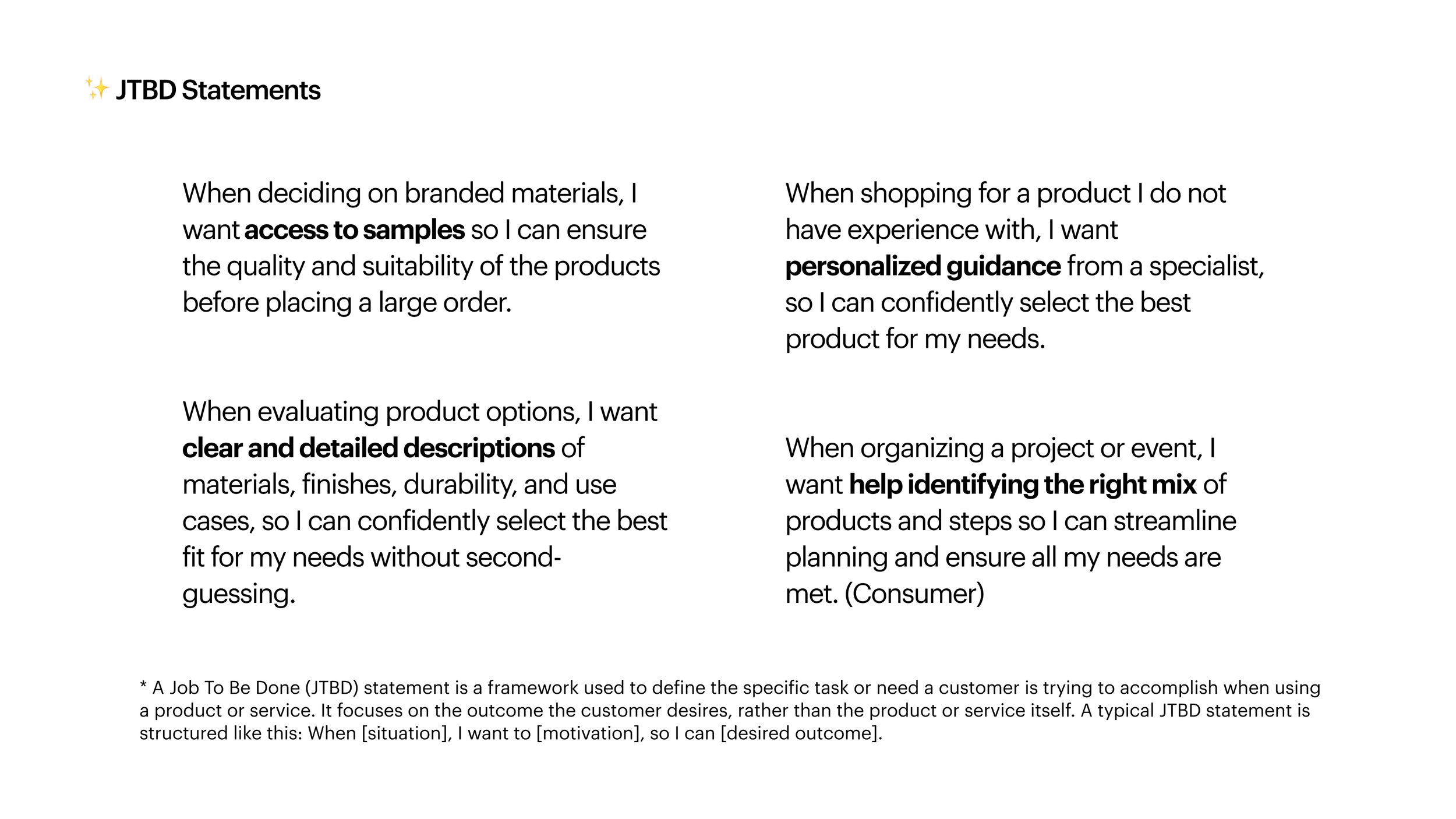
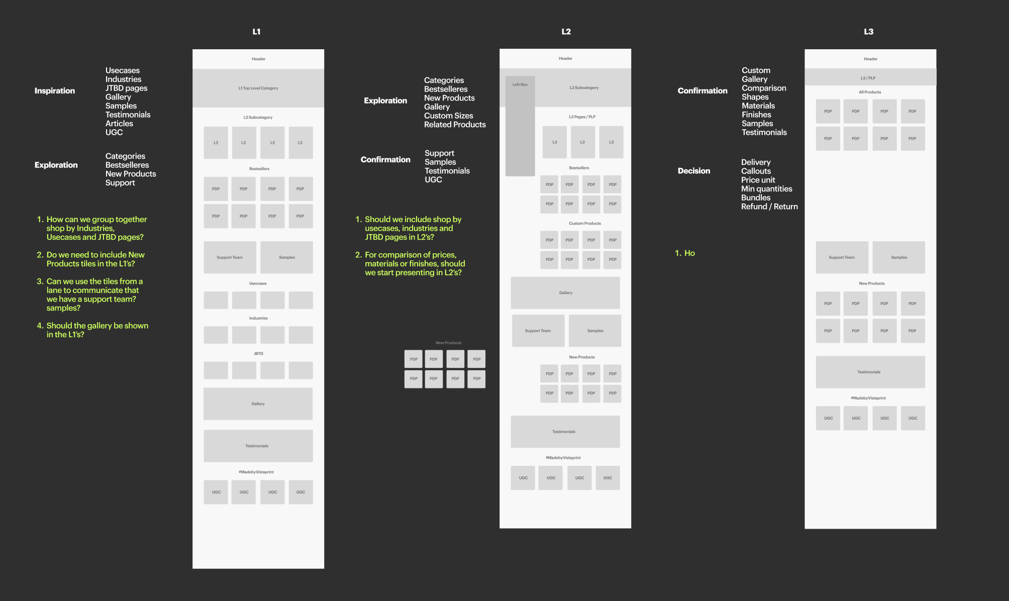
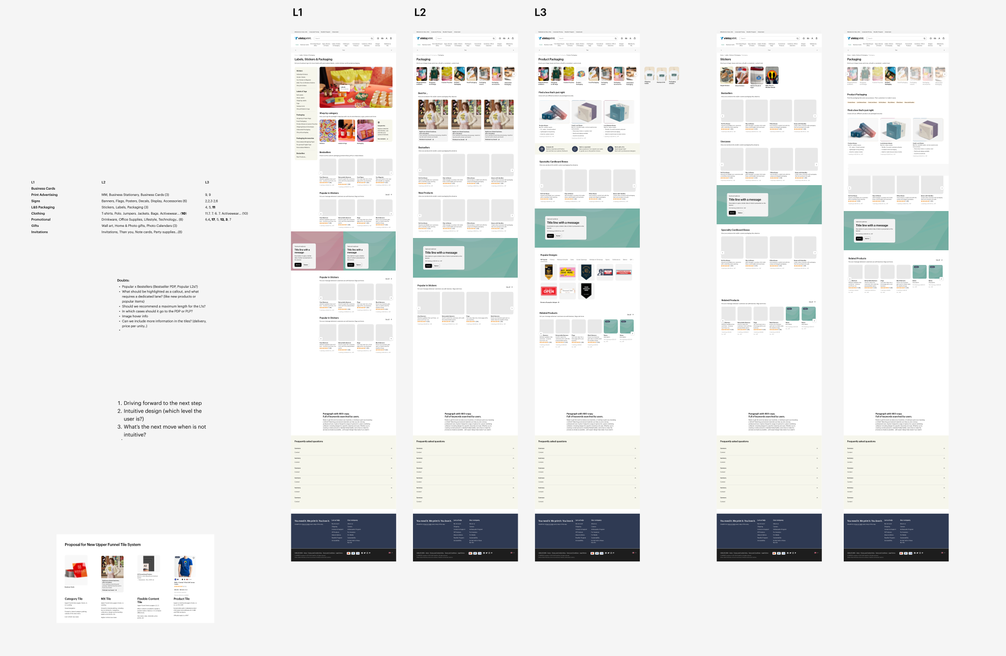
Before starting the design explorations, we revisited the three category levels and defined guiding principles for each, based on what we had learned from user feedback and analytics:
Level 1 (L1) – Inspiration & Exploration
Broad entry points meant to inspire and introduce the range of what Vistaprint offers.Level 2 (L2) – Exploration & Confirmation
Mid-level pages that help users refine their focus and compare related product groups.Level 3 (L3) – Confirmation & Decision
The most specific layer, where users validate details and prepare to take action or make a purchase.
This project reinforced my interest in UX/UI work and strengthened my skills in research, analysis, and user-centered problem framing, which I continue to apply in my design practice today.