Digital Product Experiences
UX/UI DESIGN (work in progress)These study-based projects were developed alongside my professional work, driven by curiosity and a desire to broaden my perspective. They provided tools and frameworks I now apply in my design approach.
1/2
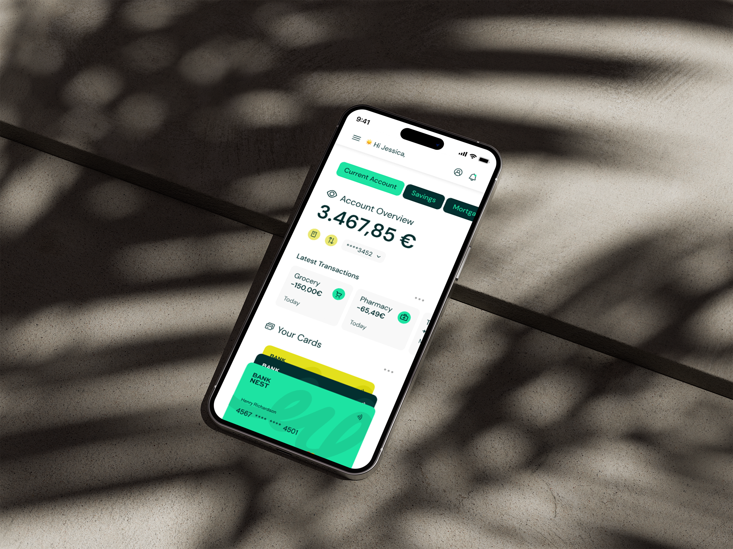
This project was part of a UI-focused course that I did last year. The brief was to design a financial app interface that feels clear, playful, and trustworthy, balancing a professional tone with approachable visual personality.
The goal of the project was to create a cohesive, responsive interface for desktop, tablet, and mobile. The deliverables included 9 screens in total, ensuring that key features and interactions were consistent, visually polished, and adaptable across devices.
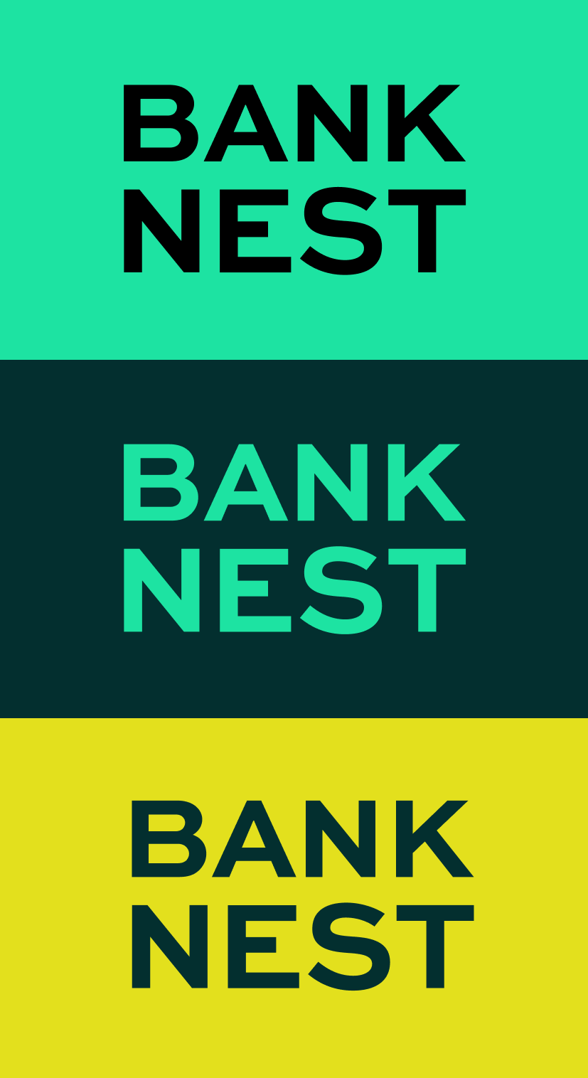
Bank Nest
Client: UX Design Institute
Year: 2025
Role: UI Designer
CHALLENGE
The main challenge was to balance the principles of transparency, trust, and playfulness. Giving users confidence in managing their money while maintaining a friendly and approachable tone.
Another key challenge was that this was a UI-focused project with no UX research or testing, so design decisions were guided by established patterns in financial and product interfaces, platform conventions, and common usability assumptions. Additionally, the interface needed to remain consistent and responsive across desktop, tablet, and mobile, ensuring a coherent experience on every device.
PROCESS
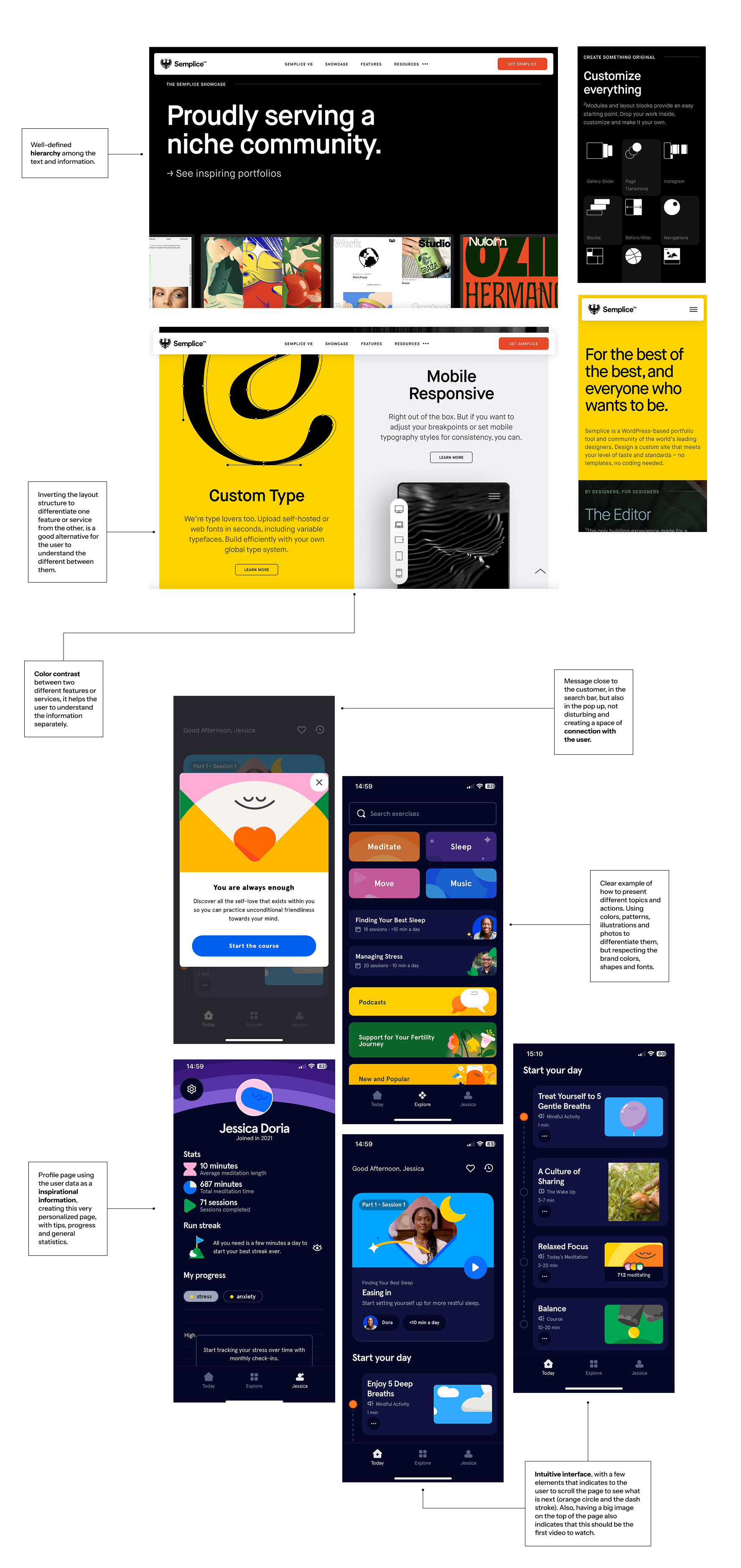
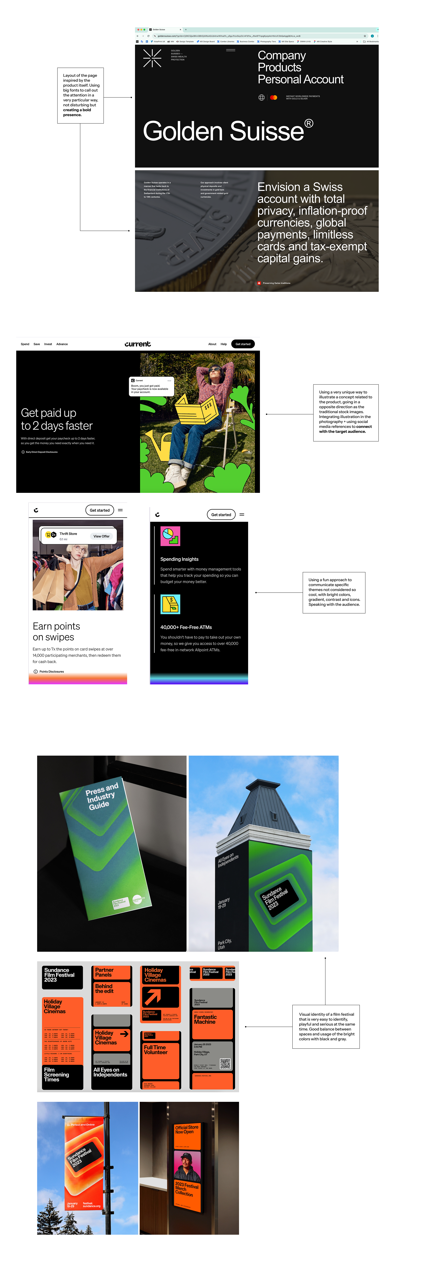
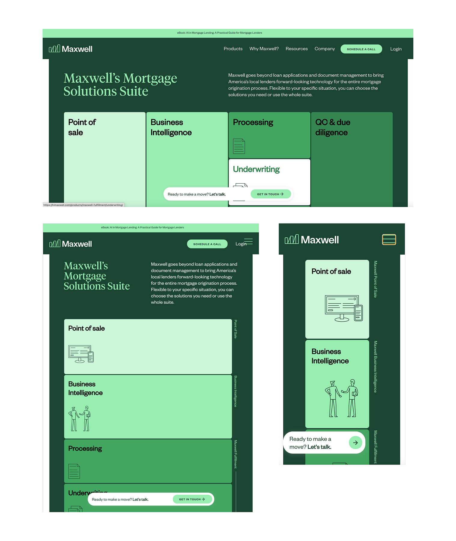
I started by collecting visual references that represented each of the core principles: Clarity, Trust, Playfulness, and Consistency. This step helped me understand how these qualities are commonly expressed in financial and product interfaces, and informed the visual strategy for the project.
Based on these references, I defined a set of design principles to guide all interface decisions:
CLARITY - Prioritize hierarchy, spacing, and typography to make key financial information easy to scan and understand.
PLAYFULNESS - Add a touch of personality with accent colors and soft visual details, keeping the interface friendly and approachable without losing credibility.
TRUSTWORTHY - Lean on neutral colors, familiar patterns, and consistent components to create an experience that feels reliable, professional, and confident.
RESPONSIVENESS - Design components, spacing, and layouts to work smoothly across desktop, tablet, and mobile, adjusting content priorities while keeping hierarchy clear and predictable.
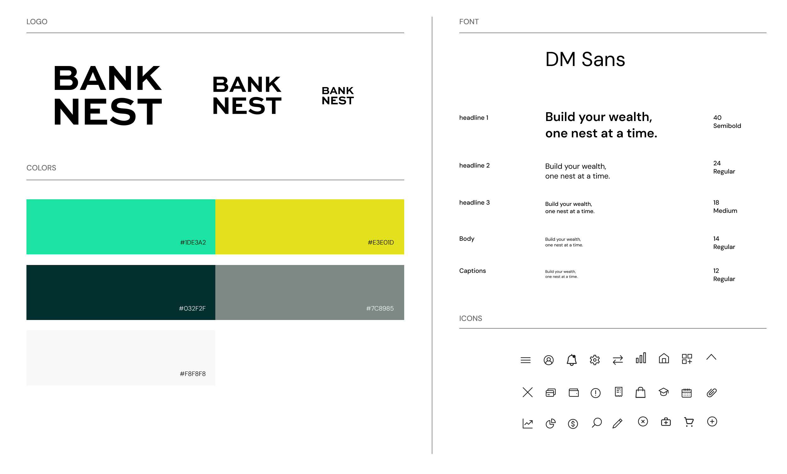
VISUAL DIRECTION & UI STRATEGY
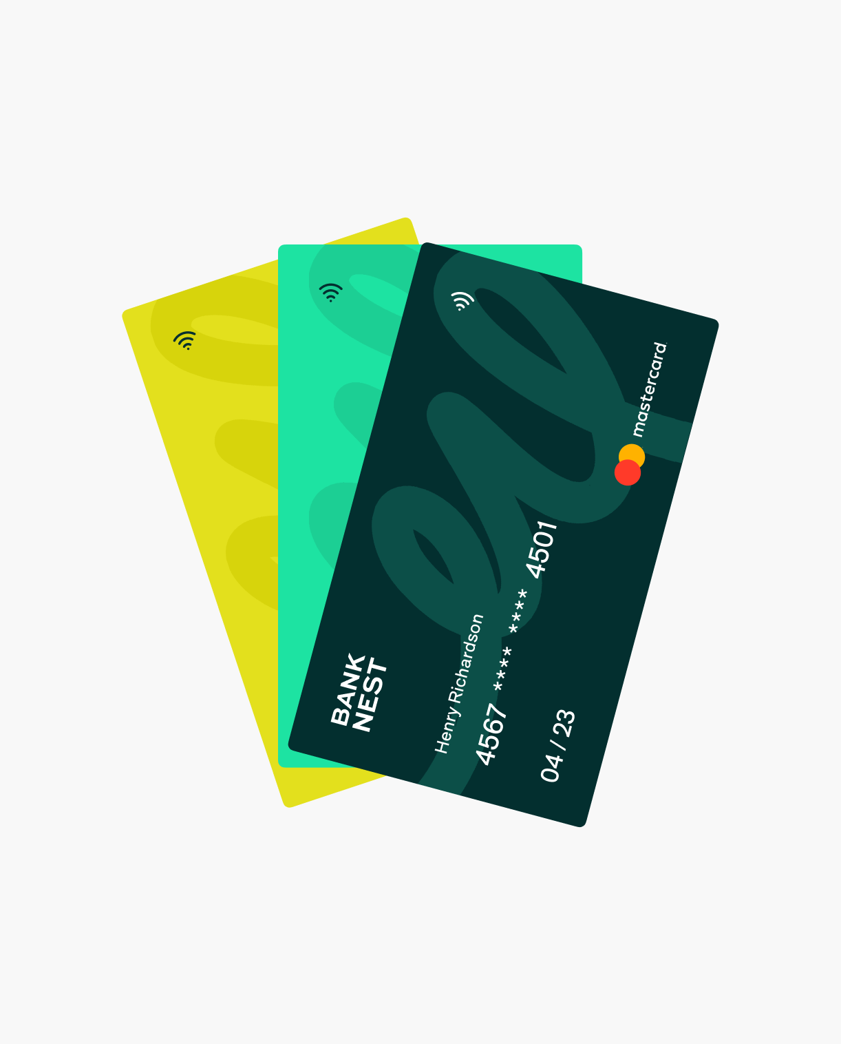
The visual direction was created to bring the design principles to life in a clear, trustworthy, and approachable interface for a financial product. The approach focuses on minimizing visual clutter while adding subtle personality through color, typography, and component styling.
