Elevating a packaging experience
PAPER BAGS REVAMP · VISTAPRINT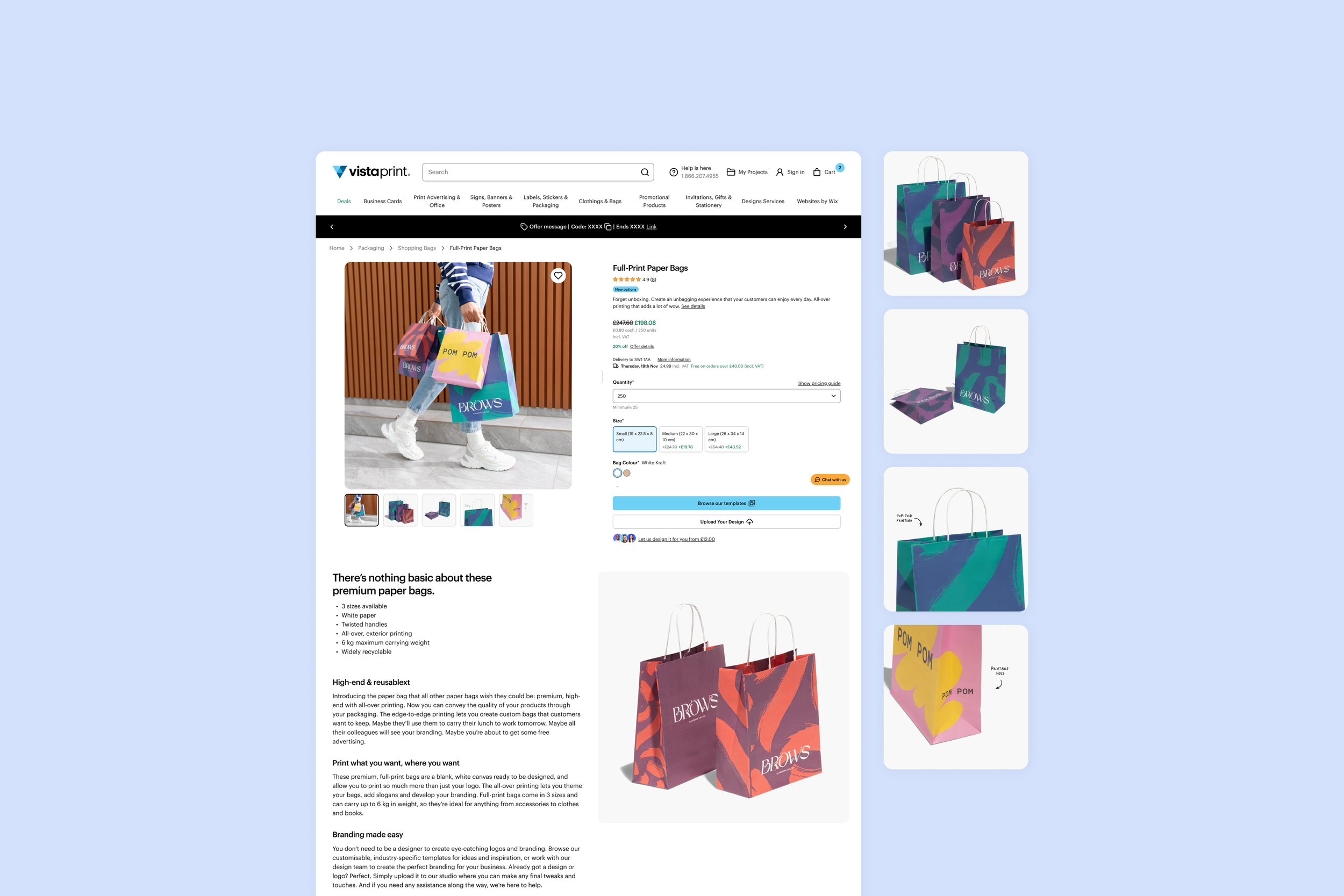
ROLE:
Senior UX/UI Designer and Art Director
TEAM:
Category Manager, Product Manager, Photographer, Retoucher, Production Artist, Operations
YEAR:
2025
Touchpoint Audit
Problem Framing
Prioritisation
Content Hierarchy
Shot Planning
Context
Paper bags were being relaunched at Vistaprint, but the site undersold the product: it didn't show its full print range or inspire customers with real uses.
-
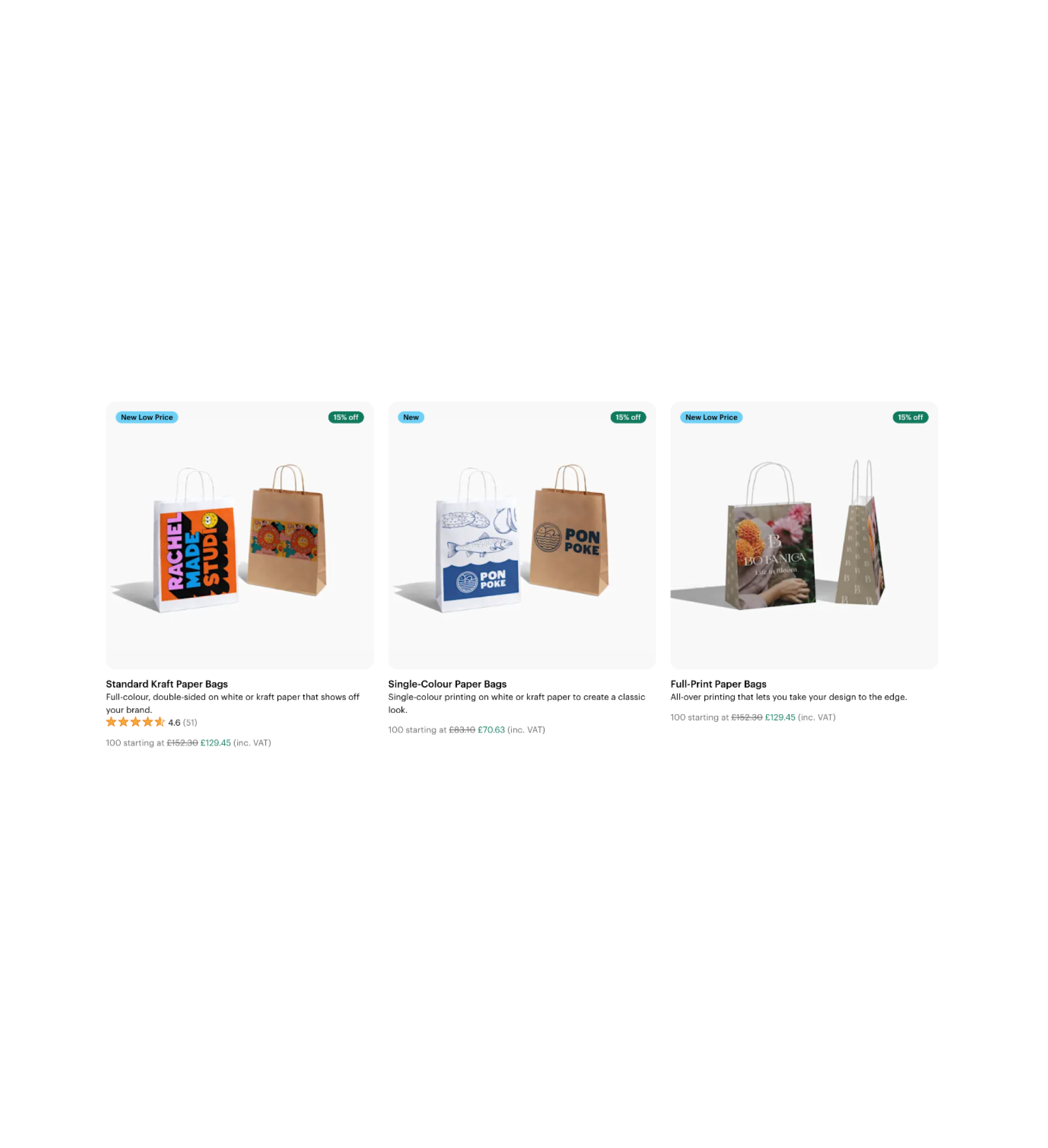
Customers struggled to understand the differences between print options. Existing imagery didn't adequately explain the product, leaving customers with limited visual information when making a purchase decision.
-
Lead designer on the visual revamp. I audited existing touchpoints, identified content gaps, prioritised imagery needs and proposed the content hierarchy. I also planned the photoshoot, proposed using real product samples and directed the shoot remotely through the brief, overseeing image placement across the customer journey.
-
We had a tight timeline and limited samples, but needed enough imagery to communicate every print option, size and use case. The launch was global, with no time for translations, so the visuals needed to work across all markets.
-
The new imagery went live across the website and email in spring 2025, as part of the wider Paper Bags relaunch.
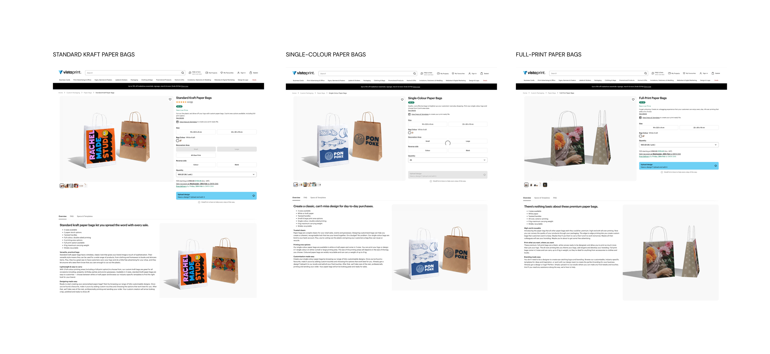
Before: the three core product pages, one for each print option.
Discovery
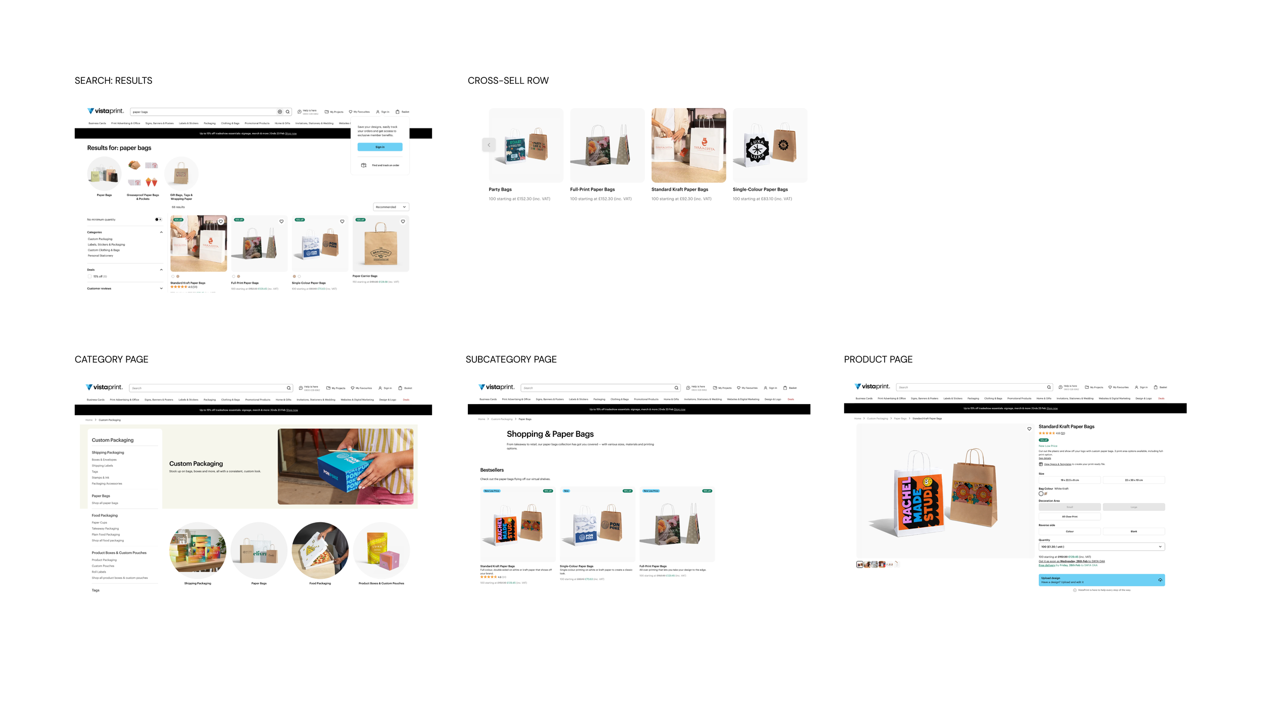
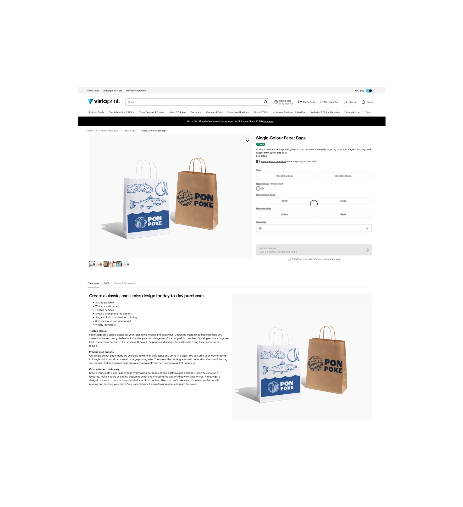
I started with the project brief and customer feedback, then audited every place paper bags appeared on the site.
Before: where paper bags appeared, from search to the product page.
FROM FINDINGS TO DESIGN DECISIONS
ACCURACY
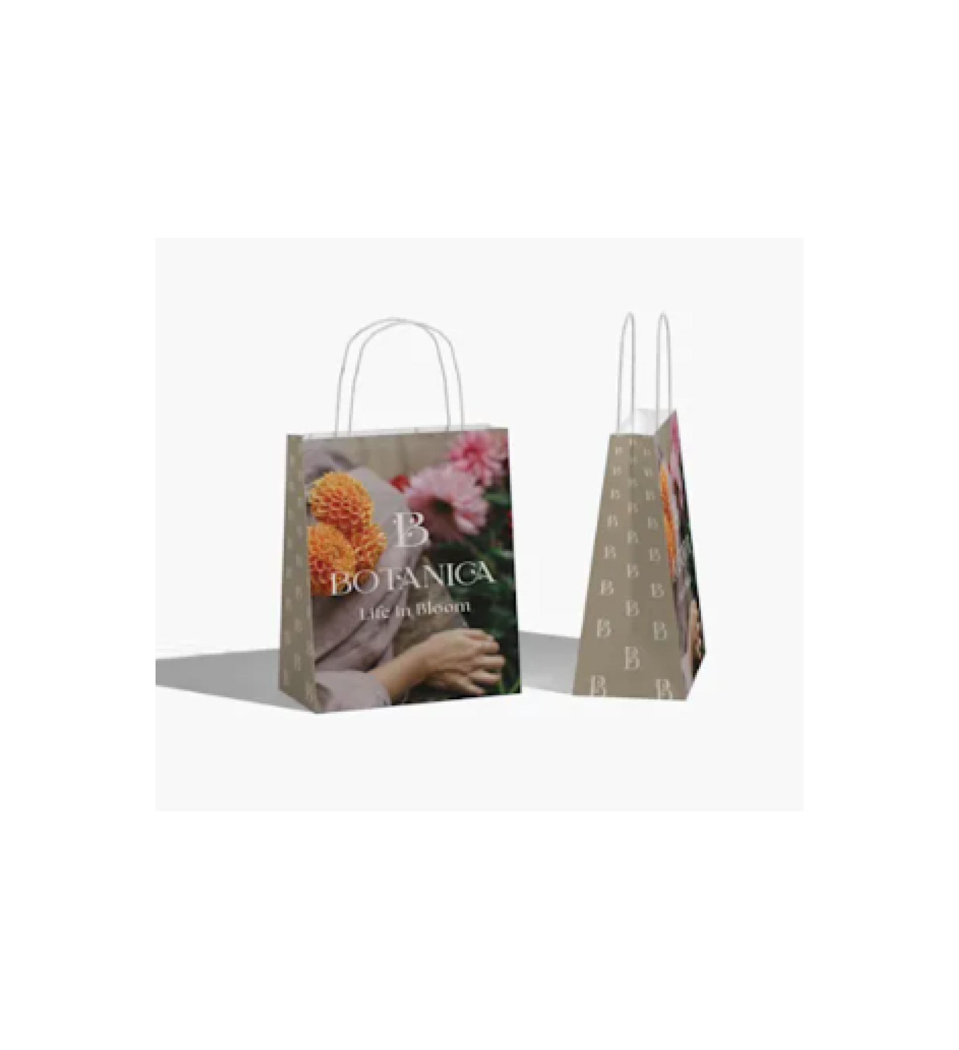
Existing 3D renders didn't accurately represent details such as handles and product scale.
Design decision:
Replace 3D renders with photography of real printed samples.
VARIETY
Existing studio imagery didn't communicate print options, size differences or the range of customer use cases.
Design decision:
Create dedicated close-ups of print features, photograph all three sizes together.
REPETITION
The same lifestyle images were reused across touchpoints, offering limited visual variety for different industries.
Design decision:
Develop a more varied image library and map assets to their intended touchpoints using Vistaprint's existing image-tier system.
Solution
With a tight deadline and no room for reshoots, every decision had to be made before the shoot. Three stages shaped the result, from planning to the page.
PLANNING THE IMAGE SET
Vistaprint already used an image tier system, which groups images by where they appear and what job they do. I wrote the photo brief around it, matching each finding to the images that could solve it:
Studio images (Tier 4) came first: real photos to replace the 3D renders, and the three sizes shown together.
Close-ups (Tier 5) showed the inside and all-over print.
Lifestyle images (Tier 3+) covered the industries in the brief.
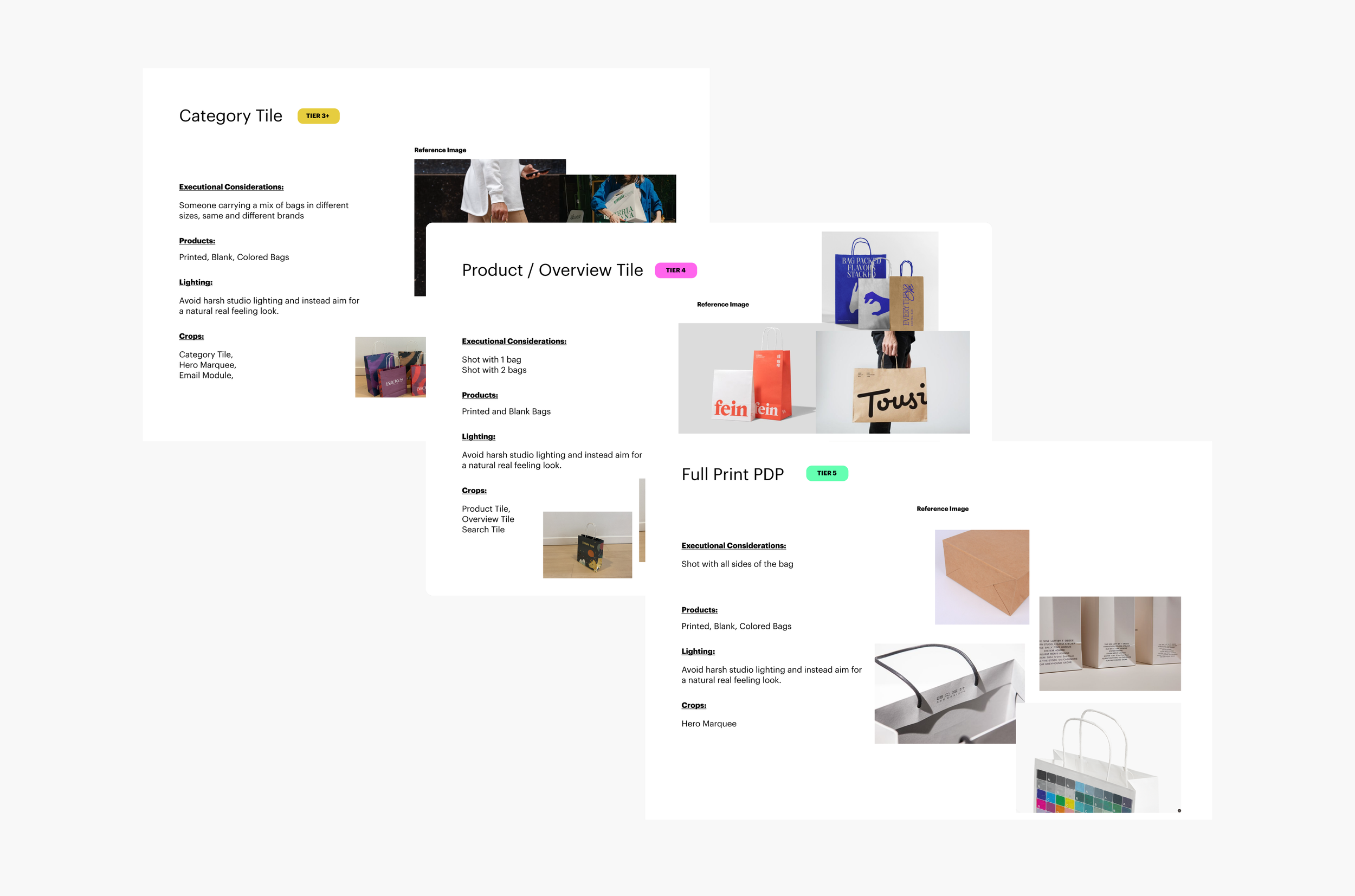
The photo brief: tier, products, lighting and crops for each setup.
REAL SAMPLES THAT WORK IN EVERY MARKET
I proposed printing real samples, the safest way to get accurate images with the tools we had at the time. I used brands that could work globally, with no need for translation.
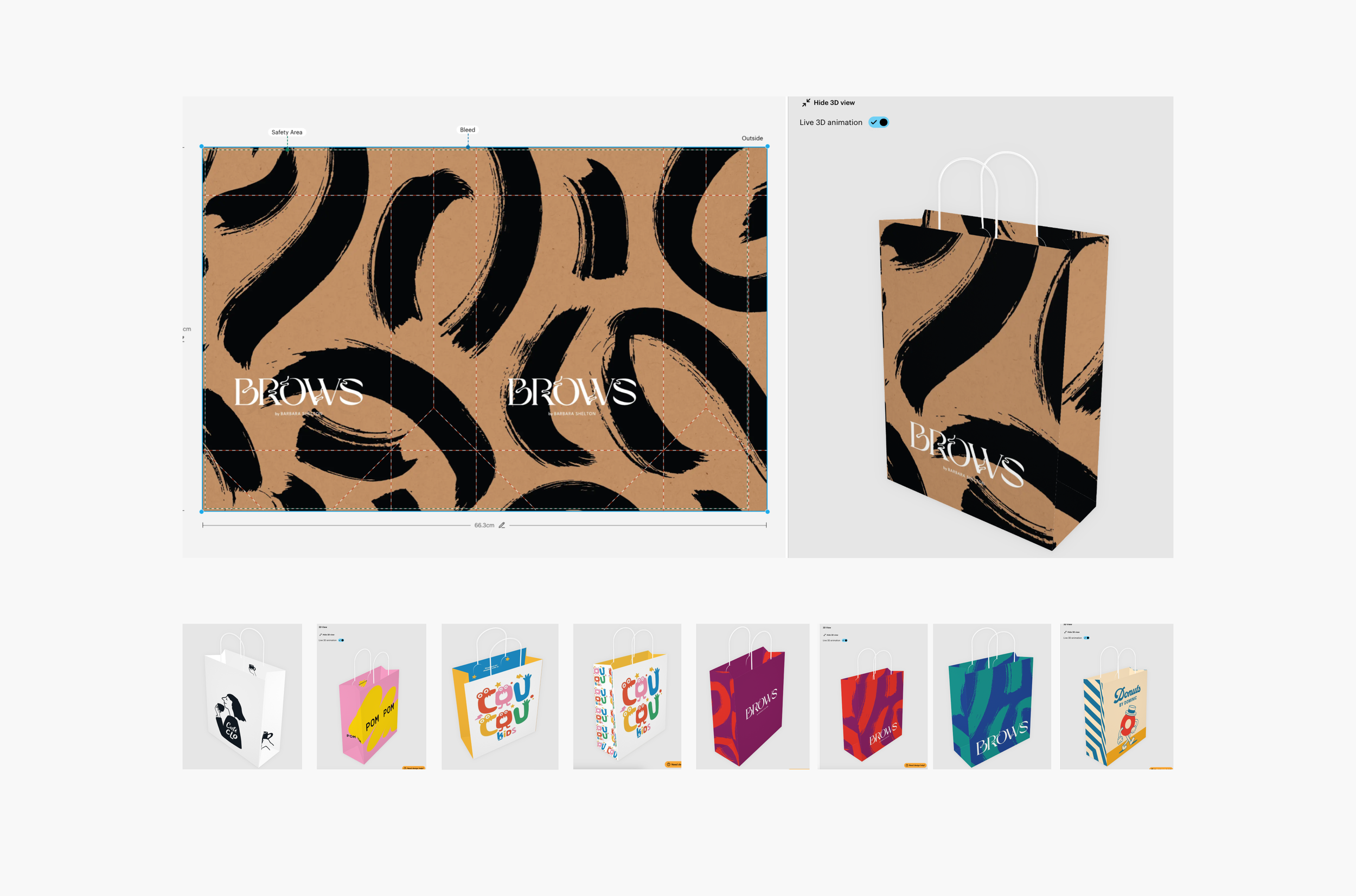
Sample designs using brands that work in every market.
PLACING IMAGES ACROSS THE JOURNEY
Based on an earlier A/B test we ran on a side project, where lifestyle won as the opening image, I proposed starting each gallery with lifestyle, then studio, then close-ups. I mapped the remaining images to each touchpoint, testing combinations in low and high-fidelity mockups before handover.
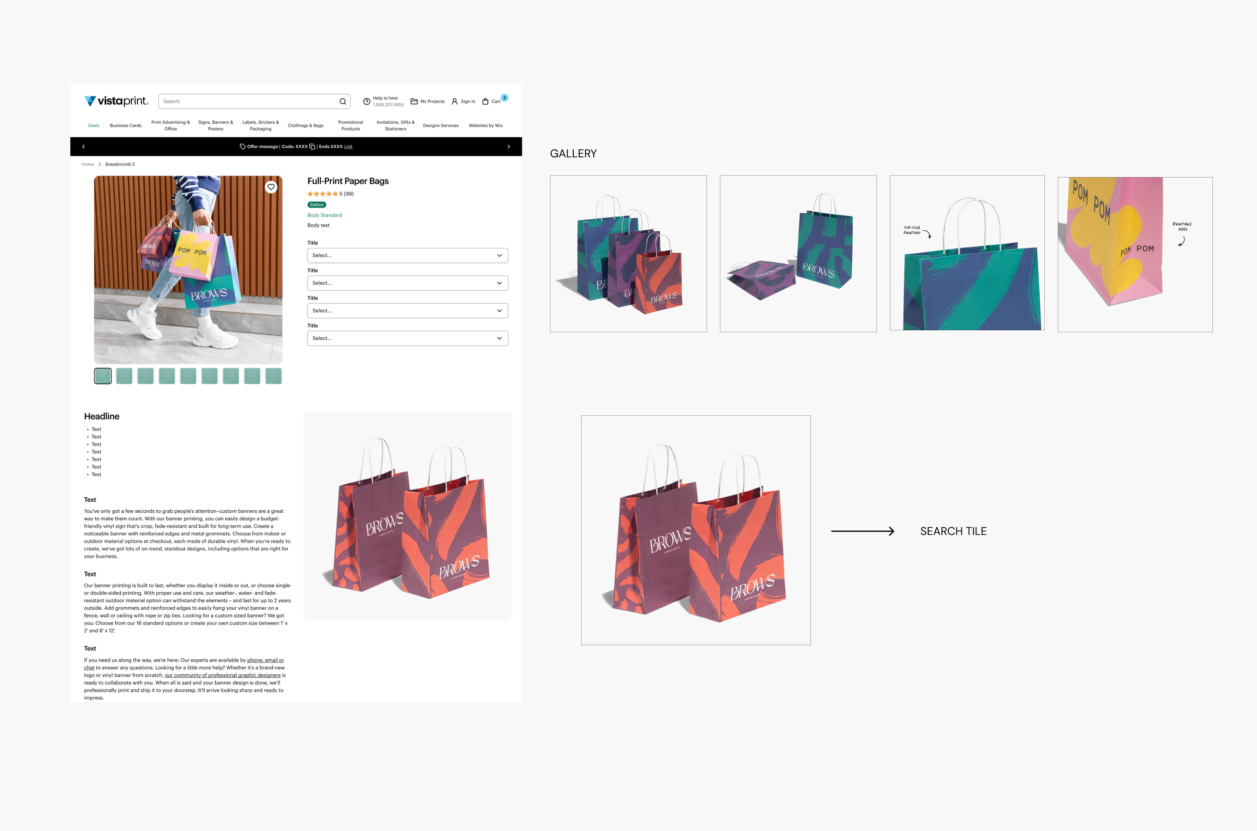
Mockup: the new Full-Print gallery, and where each image was used.
Outcome
The project delivered a library of 50+ high-resolution images, improving how product details, print options and sizes were communicated across website and email touchpoints.
The new imagery launched as part of the wider Paper Bags relaunch in spring 2025.
These results reflect the wider relaunch and its combined initiatives, not the imagery redesign alone.
+68%
Net bookings
+45%
New customers
Average product rating, up from 4.1
4.5 / 5
A new site experience.
New photos at every touchpoint, with galleries that show each print option, the inside print and the different sizes.
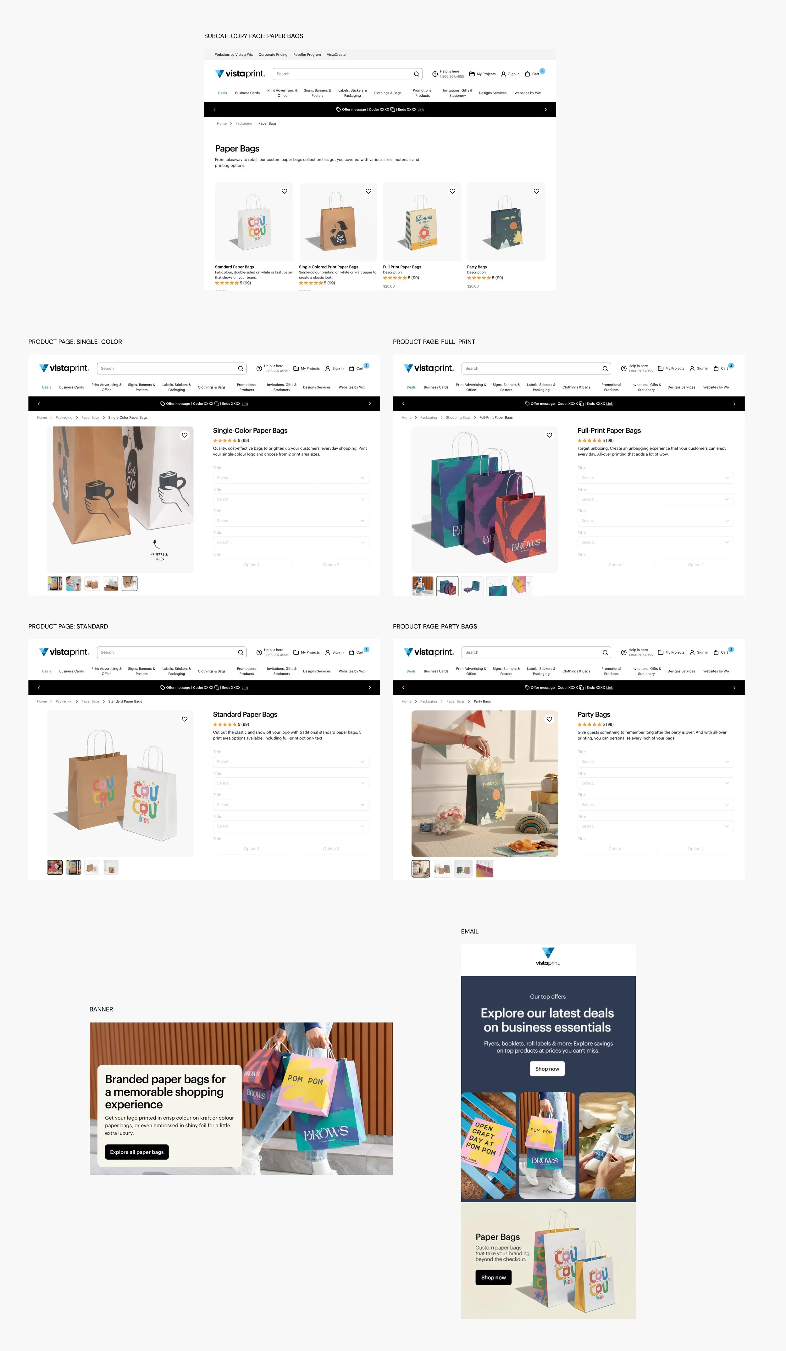
After: mockup of the subcategory page that went live in 2025, with new photos for all four products.
IF I PICKED IT UP AGAIN
I’d have shown products inside the bags. In customer interviews on a later project, I learned that people want to know what fits: how much a bag holds and how tall a product can be. I’d add images of each size with real products inside, and measure whether size-related questions and complaints go down.
WHAT I LEARNED
This project taught me how much good work depends on planning. With a tight deadline, limited samples and no chance for changes on the day, every trade-off had to be decided in the brief: real samples over post-production, global brands over translations, studio images first in the brief. Now I decide what matters most before I design anything.