Discovery & Insights
Category Page System
Category pages are key mid-funnel touchpoints, where customers discover, compare, and build confidence before purchasing. At Vistaprint, fragmented navigation patterns and structural inconsistencies were disrupting that experience for customers and internal teams alike.
The goal: bring coherence to the catalog through a framework flexible enough to scale, yet standardized enough to actually work.
My role: I collaborated with the Principal Product Designer on the Navigation & Taxonomy team across the discovery and research phase — work that deepened my approach to research, collaboration, and user-centred problem framing.
ROLE:
UX/UI Designer
CLIENT:
Vistaprint
TEAM:
Product Designer, Product Management, Copy, Product Lead, Engineers
TIMELINE:
2024-2025
Challenge
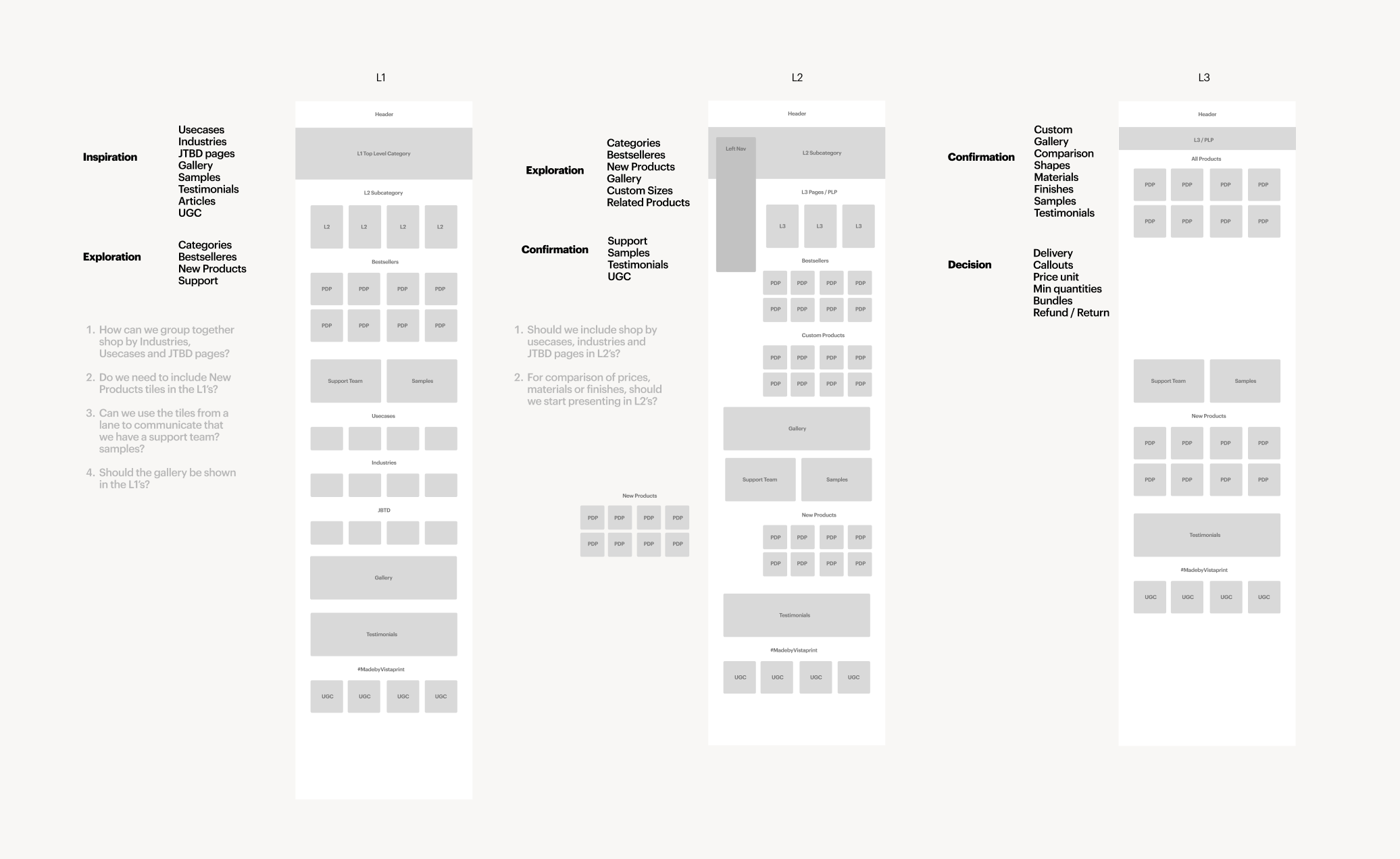
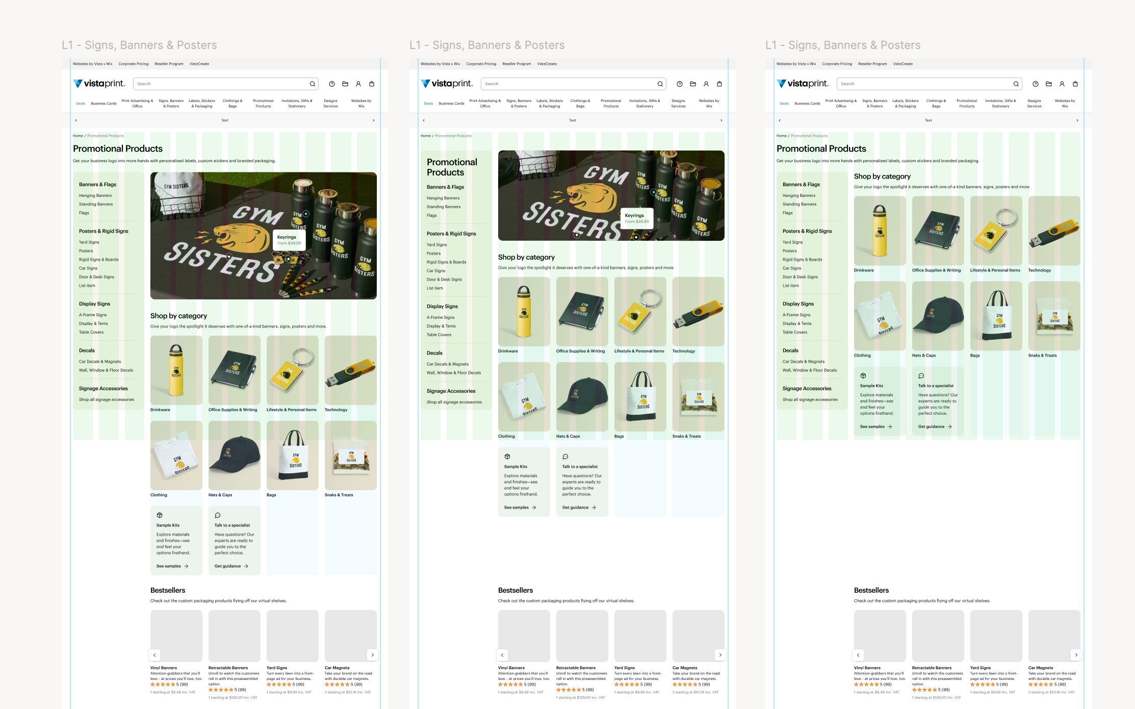
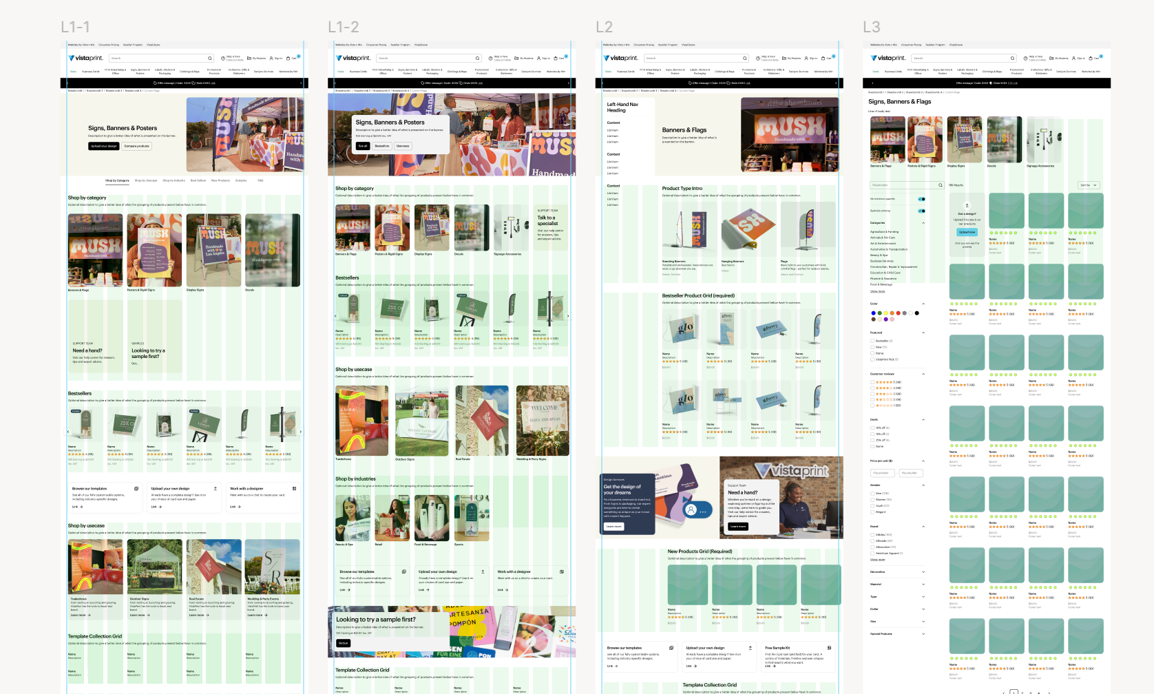
The category page experience was inconsistent, for customers trying to find what they needed, and for the teams working to keep everything running. Navigation patterns varied across the site, making discovery feel unpredictable, and maintaining pages manually just wasn't sustainable at Vistaprint's scale. Things got more complex when a structural update introduced a three-tier hierarchy — a top-level category (e.g. Signs & Posters), a subcategory (e.g. Banners), and a tertiary level (e.g. Hanging Banners) — before landing on a product page. The intent was right, but the execution left gaps. Inconsistencies across all three levels created friction for users navigating the site and made life harder for the teams behind it.
LEVEL 1
LEVEL 2
LEVEL 3
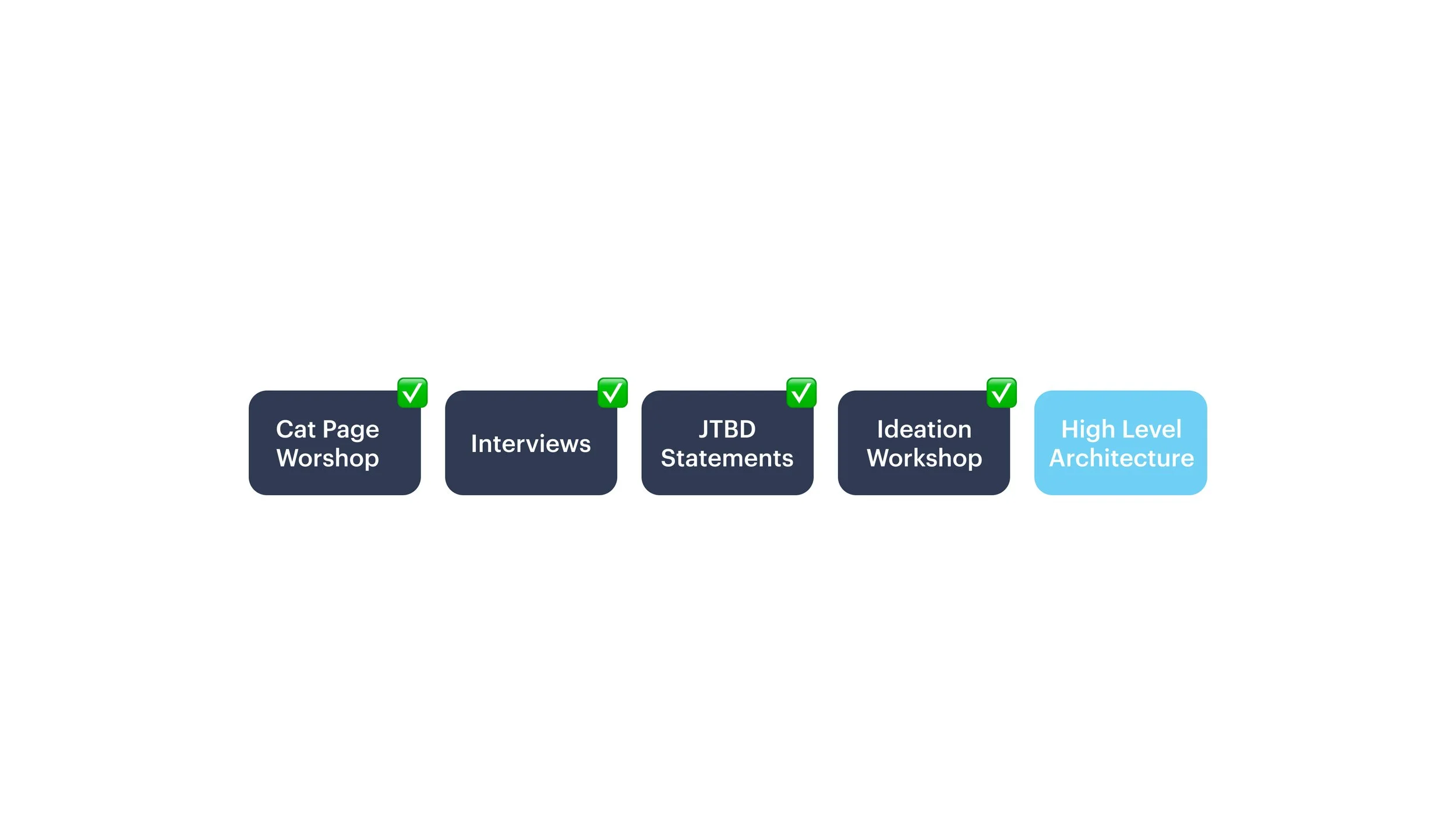
Research & Discovery
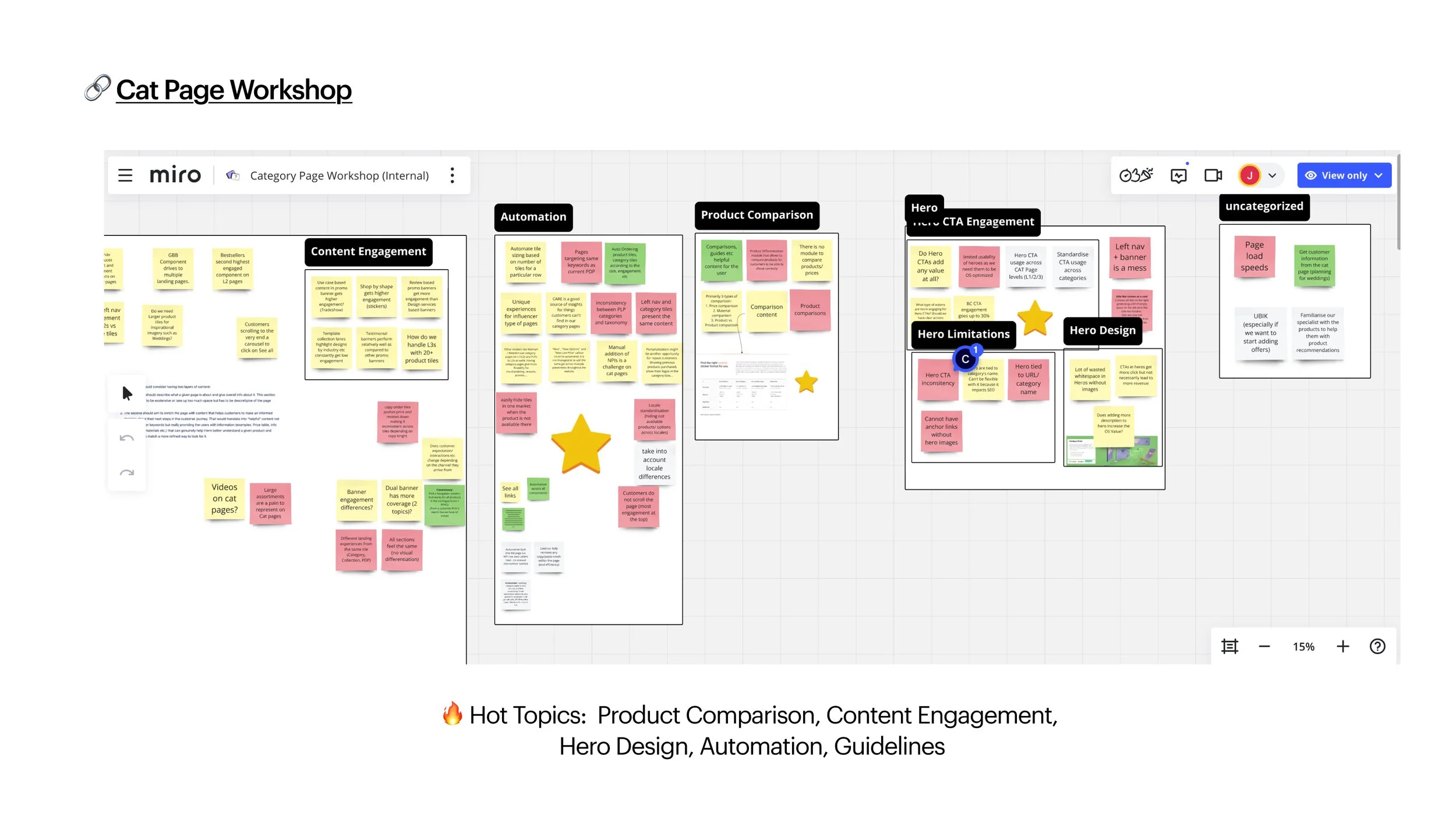
During this phase, we held a series of cross-functional workshops with different teams (including content, product, operation, care and engineering) to gather diverse perspectives and uncover internal challenges affecting the browsing experience. By synthesising our findings, we identified key statements captured the outcomes users truly desired and served as a foundation for the upcoming exploration phase.
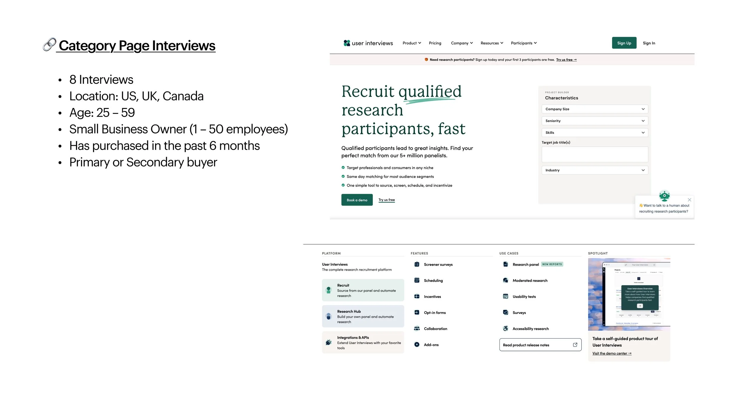
In parallel, we conducted 8 in-depth interviews with real customers from US, UK and Canada, to better understand their motivations, browsing habits, and pain points when navigating product categories.
“I prefer local suppliers for hands-on, personalized interactions, especially for wearable items”
“Better transparency in production timelines to reduce surprises during ordering”
“I would go quality, turnaround, price …”
What We Heard
“Online suppliers are used for convenience and 24/7 availability but lack the tactile feedback and flexibility of local providers”
“I’m Fostering a sense of belonging and exclusivity through branded items that clients take home”
“How things look when the customer receives it is important to me. So I mean it's always been a priority to me of how it gets delivered to the customer.“
Insights
The discovery phase revealed three core user needs: value, speed, and trusted support. Users are looking for affordable solutions, quick service, and expert guidance to help them make informed decisions with confidence. Addressing these needs presents a clear opportunity to strengthen appeal within the local-first market, build loyalty, and encourage repeat purchases.
The following insights highlight the key findings from user research, along with the opportunities each one presents.
Local vendors are often preferred when guidance
is needed.
Position CARE as specialized help, and offer guidance on choosing the right products for their needs, especially for complex items like packaging.
Online providers are associated with longer turnaround times.
Present transparent production timelines, shipping time and costs, and unit price estimates upfront to minimize surprises.
Material Transparency
and Validation
Promote and create sample kits to reduce uncertainty and trial-and-error costs. Improve clarity of material options with comparisons of features like size, thickness, or durability.
Balancing Cost, Quality, and Flexibility
Provide tools for delivery and bulk order pricing estimations directly in the product selection phase.
Blueprint for Future Navigation
We explored different ways to organize and navigate the category pages, focusing on solving user pain points while creating a more consistent and scalable experience. Even though the project was paused before full implementation, these explorations gave the team a clear direction, aligned cross-functional partners, and laid the groundwork for future improvements.
This experience also strengthened my skills in synthesizing research, collaborating across teams, and framing problems from the user’s perspective — lessons I continue to carry into every design project.