Bank Nest
Creating A Responsive Banking Experience
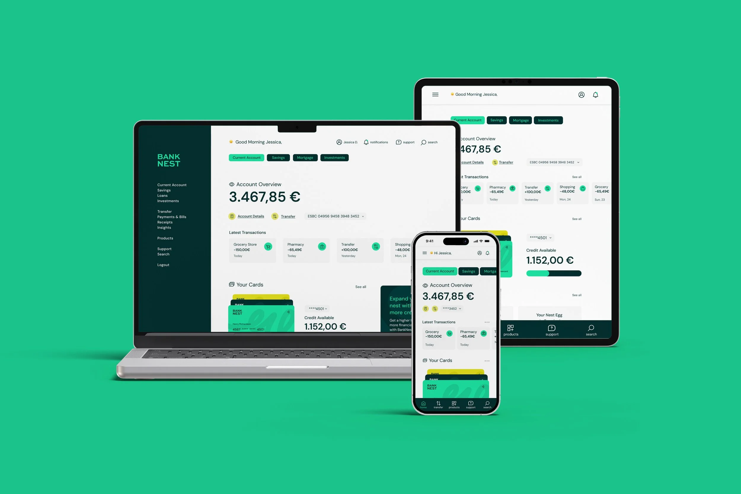
Bank Nest was a UI-focused course project to design a fictional banking app interface that feels clear, playful, and trustworthy, balancing professionalism with an approachable visual style. The deliverable was a cohesive, responsive interface across desktop, tablet, and mobile, consisting of 9 screens with consistent and polished interactions across all devices.
Completing this project earned the Professional Certificate in UI Design from the UX Design Institute, validated by Glasgow Caledonian University.
ROLE:
UI Designer
CLIENT:
Self-initiated · Course Project
TEAM:
Solo
TIMELINE:
2025

Challenge
The main challenge was balancing transparency, trust, and playfulness while keeping the interface approachable and confidence-inspiring. Without UX research or testing, decisions relied on financial UI patterns, platform conventions, and usability principles, ensuring consistency across desktop, tablet, and mobile.
Process
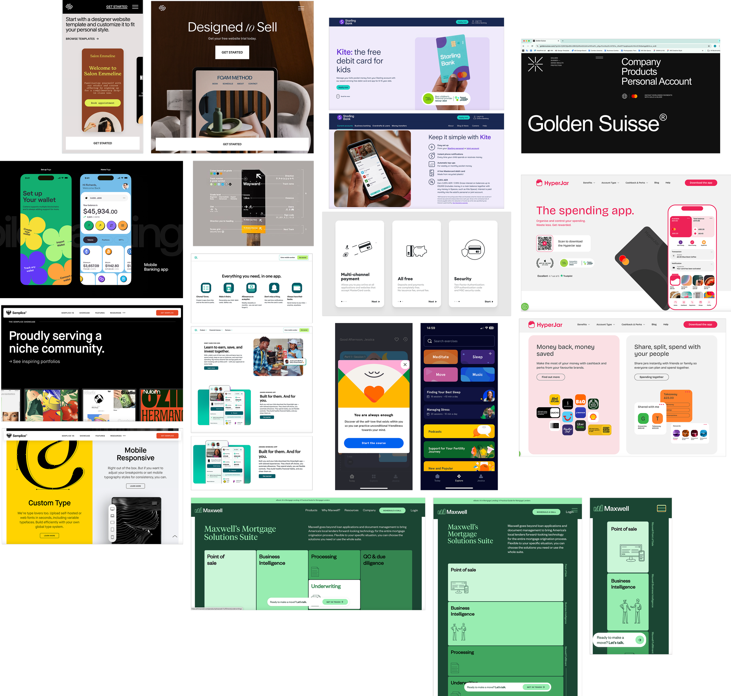
I started by gathering visual references representing the brand values of clarity, trust, playfulness, and responsiveness. This helped me understand how these qualities appear in financial and product interfaces and shaped the overall visual strategy, which then guided every design decision.
Brand Identity
Before exploring the visual language, I defined a brand identity centered on approachability and safety: Bank Nest, inspired by the idea of a nest as a metaphor for growing and protecting savings.


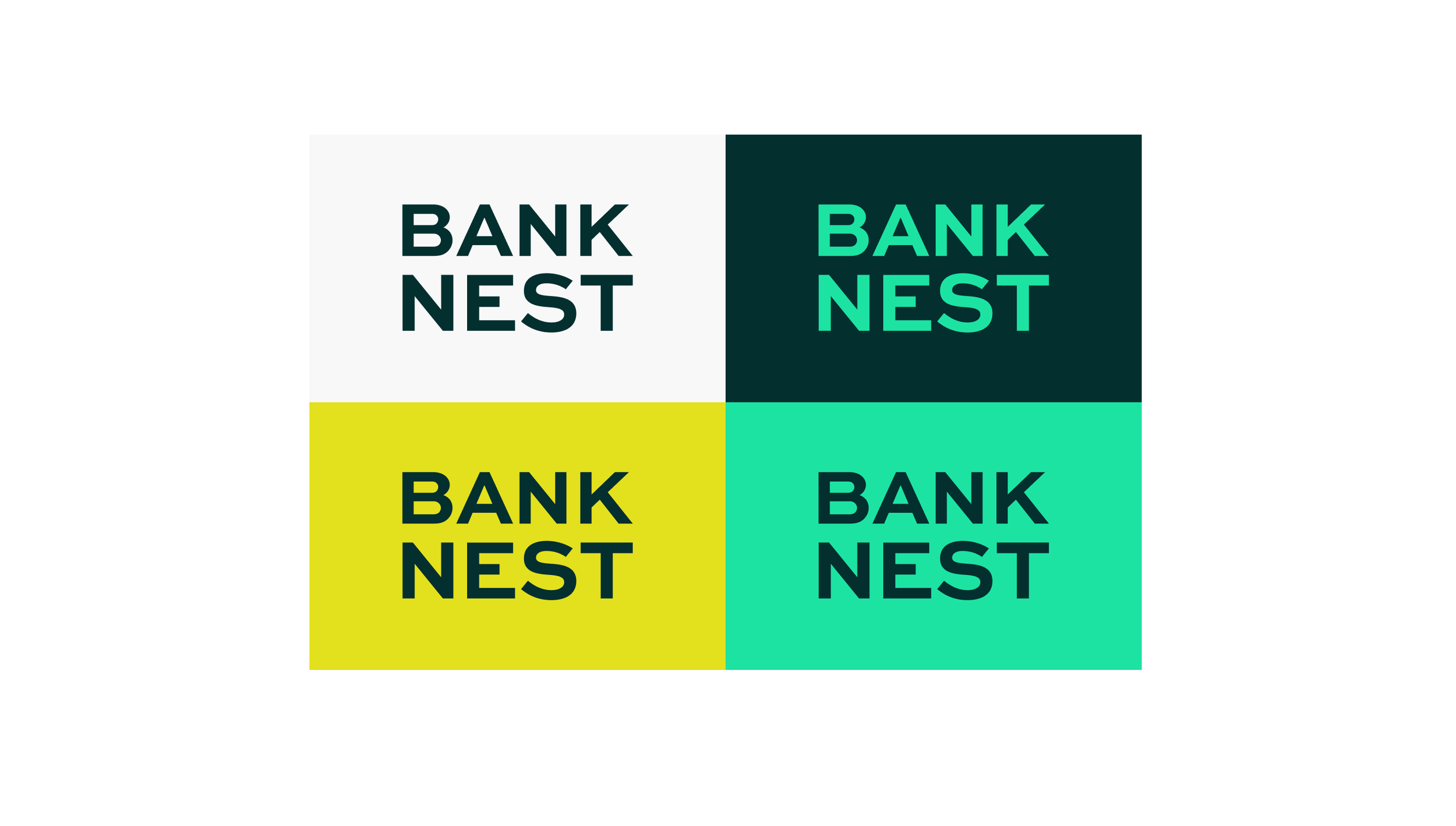
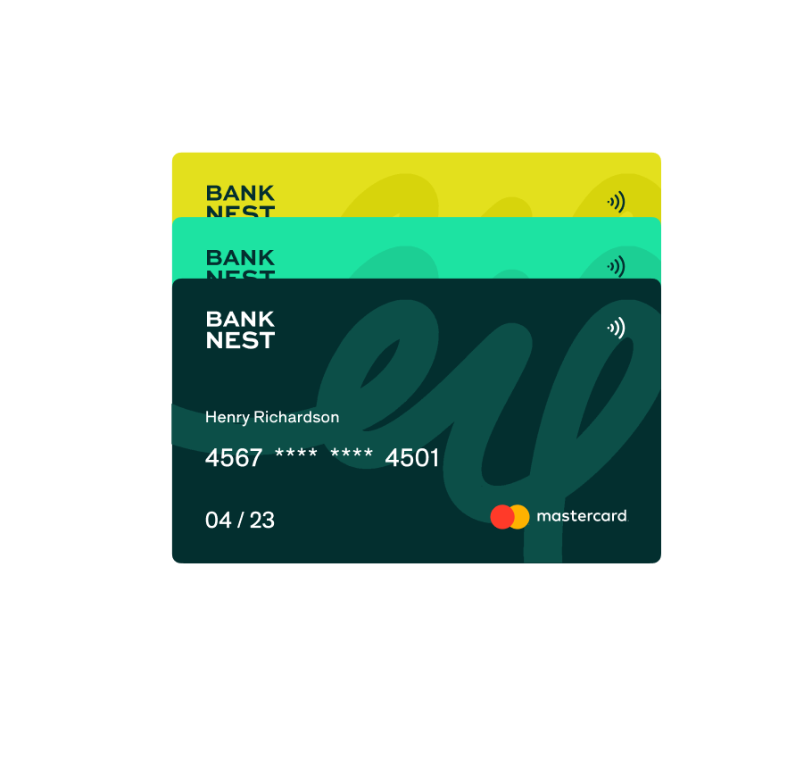
The logo uses a geometric sans-serif in all caps for clarity and confidence, supported by a palette of forest and mint greens for trust, and electric yellow for a playful accent. Organic, flowing line work reinforces the nest-building metaphor throughout the identity.
Design System
Once the brand was defined, the next step was to create a design system that would guide the interface design.
COLORS
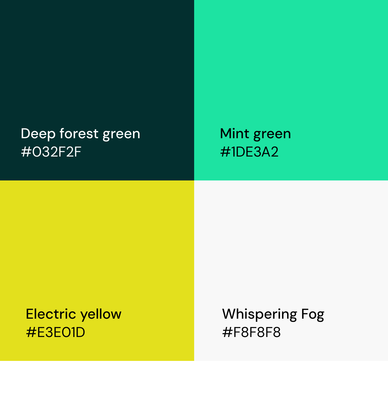
The Bank Nest palette pairs deep forest green with fresh mint green to convey trust and approachability, with strong contrast for accessibility. A bright yellow accent adds energy and playfulness, while Whispering Fog, a light grey, ensures clarity and visual breathing space.
TYPOGRAHY
I chose the DM Sans typeface for Bank Nest to bring a modern, neutral tone to the interface. Its open letterforms improve readability, and its versatility across headings, body text, and UI elements helps maintain clarity and consistency throughout.

ICONOGRAPHY
The icons were selected for their clean and clear style, helping create a simple, intuitive, and easy-to-navigate interface.

COMPONENTS
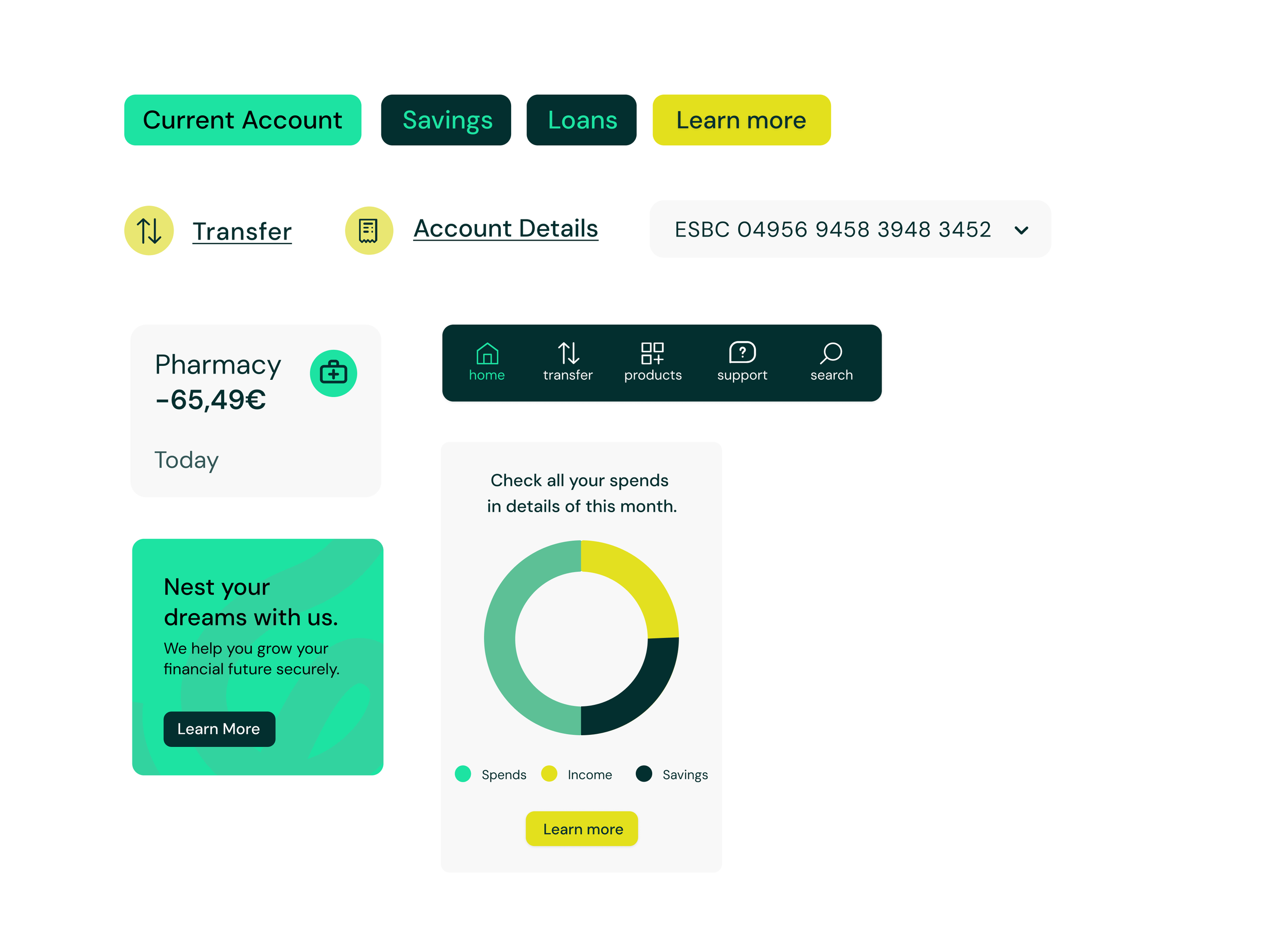
These colors, icons, and fonts are more than just design choices—they’re the pieces that give the interface its personality and clarity. Looking at them together shows how they work as a team before we dive into the full screens.
Final Screens
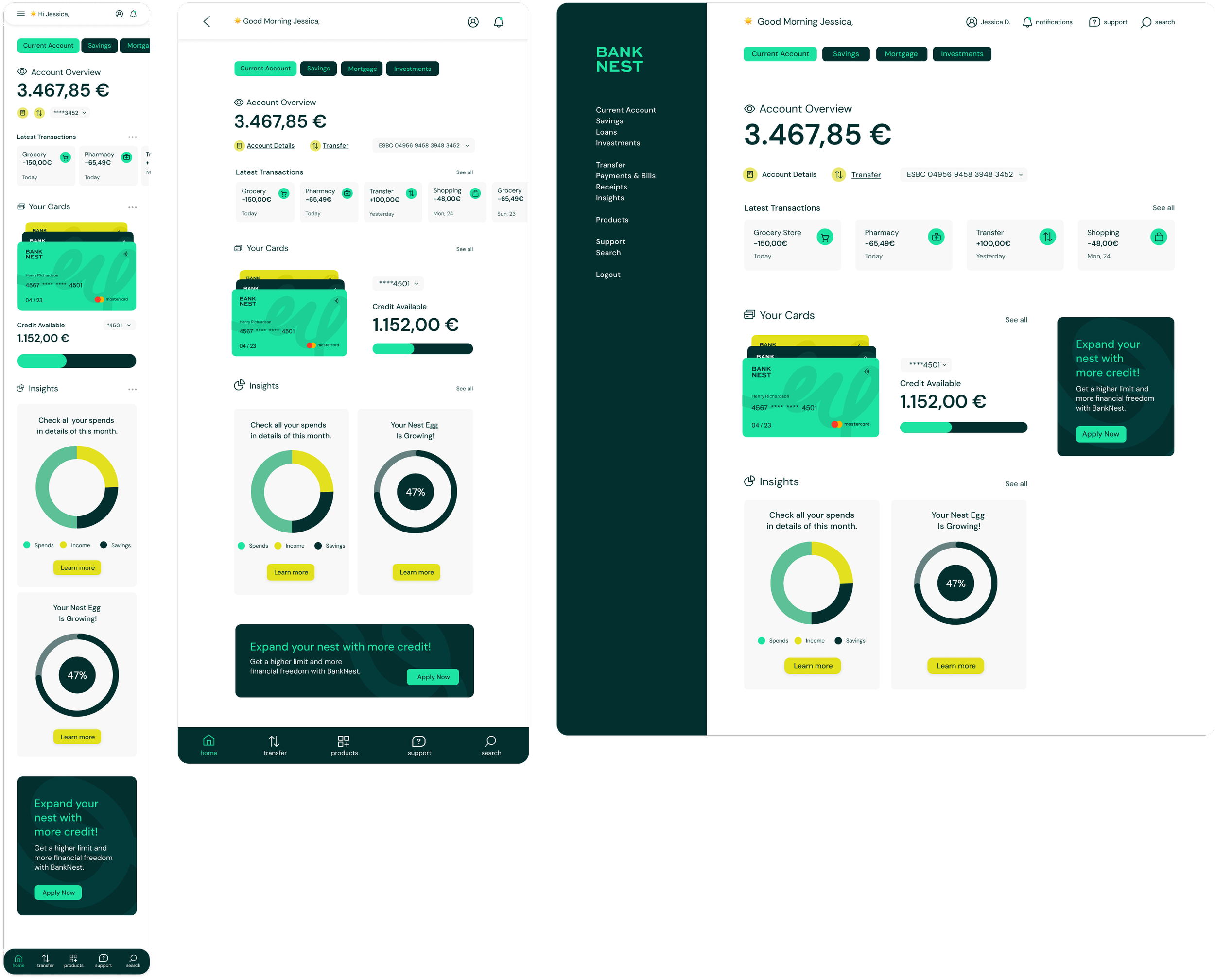
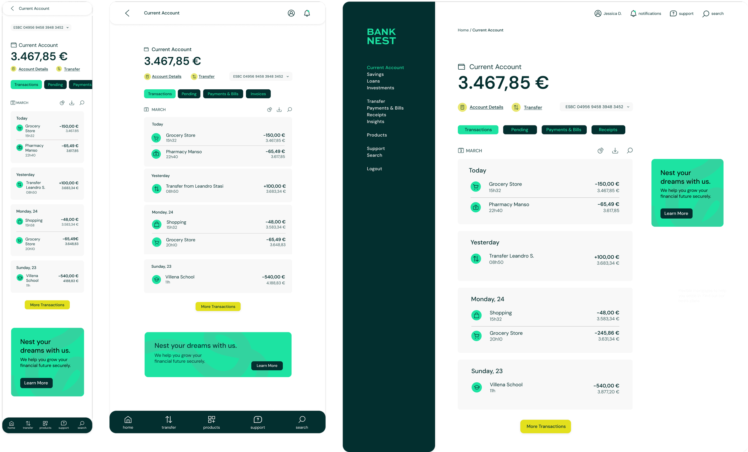
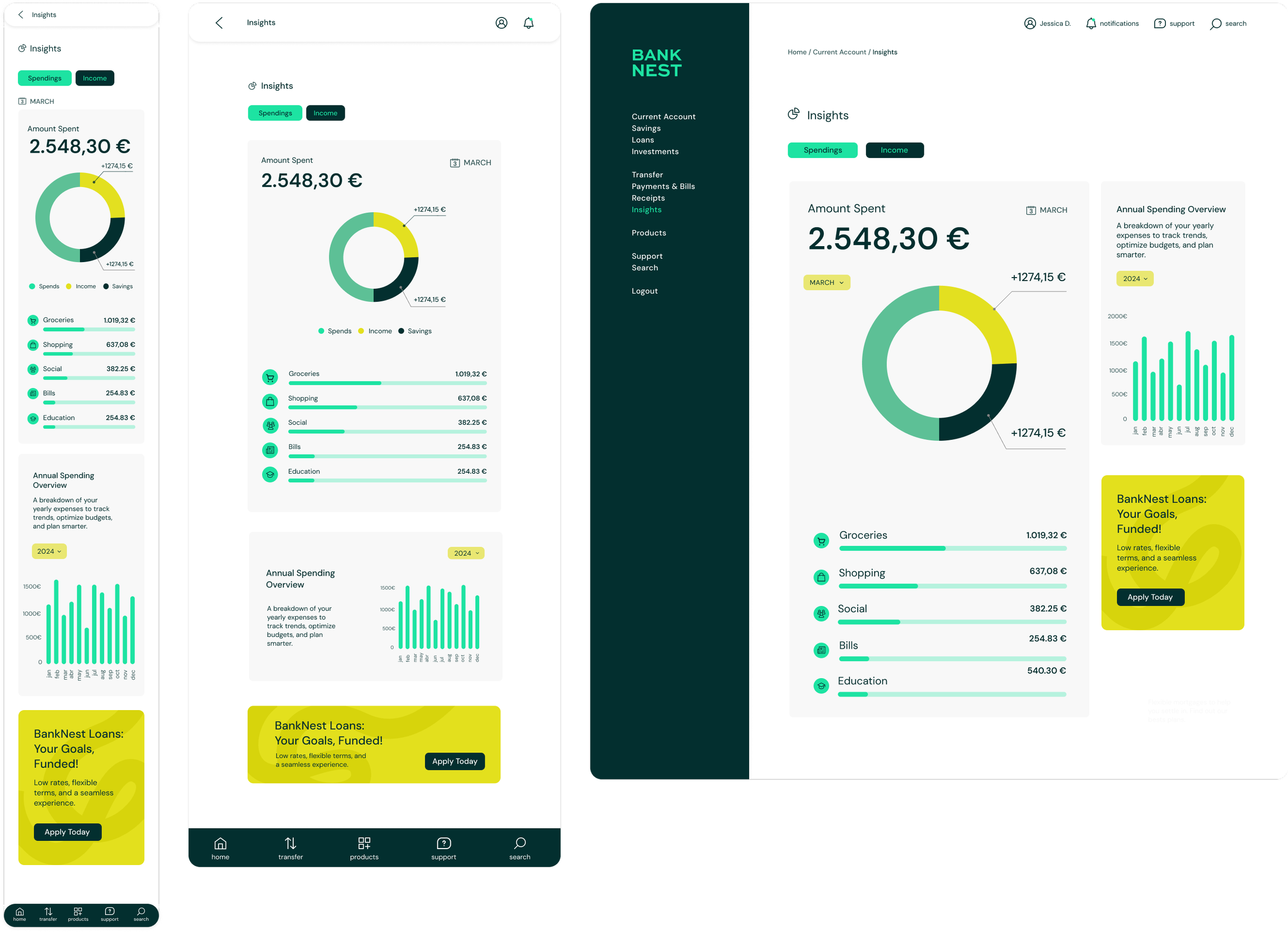
The interface combines electric yellow with mint and dark green to add warmth and playfulness, while typography and generous white space maintain clarity. Consistent patterns and familiar interactions reinforce trust across 9 responsive screens for desktop, tablet, and mobile, creating a friendly, clear, and reliable experience.